Hi! So I have an icon-button that can optionally show a tooltip on hover. At the moment, I have the tooltip component nested inside of the button component, to make prototyping easier.
There are two obvious problems with this: The tooltip to one position (if I need it to display above instead of below, I have to suppress the tooltip that was included with the button, and then put an extra tooltip on my screen). And of course I have a lot of hidden layers in my file.
I couldn’t find much info on whether it’s actually bad practice to include the tooltip inside the trigger component or not. The alternative would be to just keep the button and the tooltip separate, and manually place them on the screen together to spec it to dev. But this of course makes prototyping a real pain when you have a lot of buttons on the screen and each one of them should have a tooltip on hover.
What is everyone else doing?
Thank you for the insightful post! As you mentioned, there are always trade-offs involved in design decisions. I’m also very curious to hear how others are managing this.
I keep them separate. This way I don’t have to fight overlapping issue that are common for nested overlays. For prototyping I made another one, a simple frame with a tooltip inside that is hidden by default and revealed in hover. This way I can layer it on top of any other UI element I like and have both hover and click interactions.
2 Likes
Thank you for your proactiveness in the community I’ve been read a lot of your responses. Can you explain me better? You place your tooltip on each place needed on your prototype, is it? I’m trying to learn a better way to prototype without having to disconnect each instance or do a component for each use, but it might be the best, at last a definitive solution. I’ve been having a lot of difficulty learning how to apply variables, conditionals and modes to create my prototype.
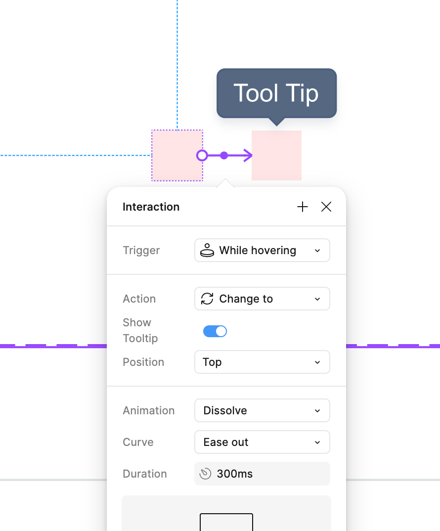
I made special interactive component for prototypes. It’s a simple frame with hidden Tool Tip component which I reveal on hover
When I prototype I wrap a design into a frame and simply layer this interactive component over the spot where I want it to appear
This way it is always above everything in my design, it supports both While hovering
and Click
interactions
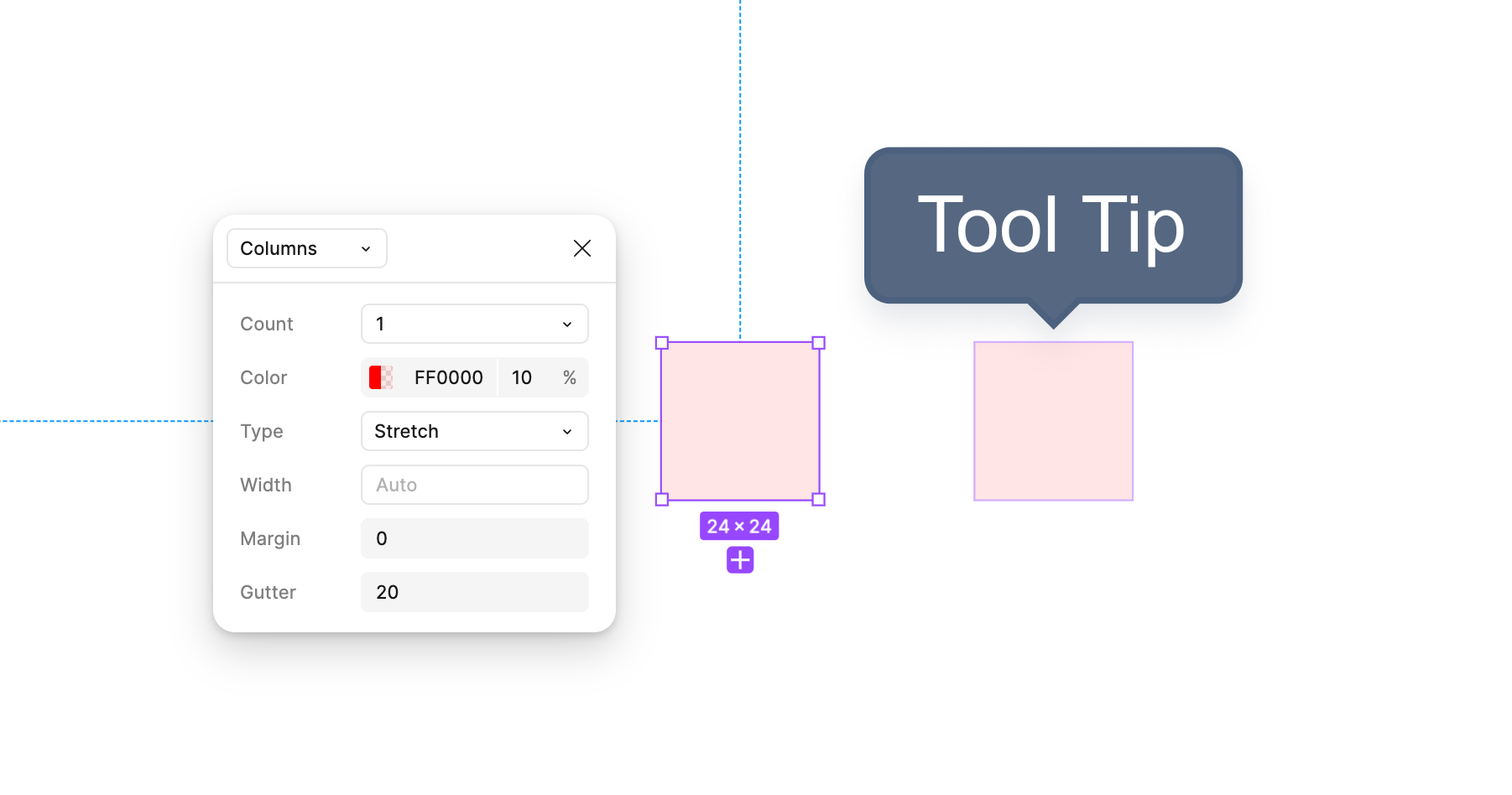
Also I have a single column layout grid there, this way I can toggle layout grids with Shift+G
and locate invisible elements, just easier this way
Hope that helps!