Review updates tool: Issues + improvement suggestions

Hello folks!
First of all, thanks for all the great work you constantly do on Figma. It’s really an amazing tool and keeps getting better and better. :heart:

With that said, I would like to point some issues with the “Review updates” tool, mostly related to how Figma theme interface sometimes make things unusable. :sweat_smile:

1. Enable user to toggle background color.

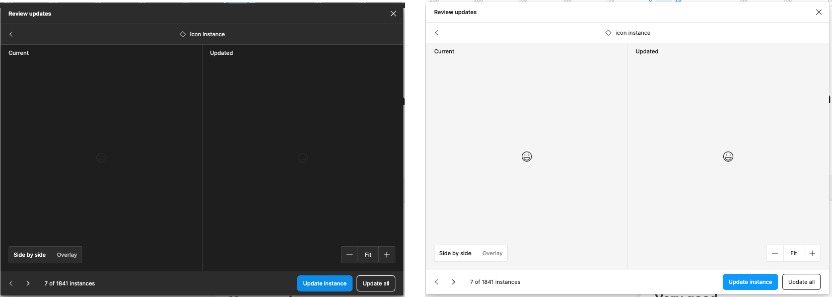
The images above are from exactly the same component. As you can see when we have the dark interface theme enabled, it’s impossible to even see the component in order to review it’s changes. As you can image, the same is truth in case you have light colored components at the light Figma interface theme.

The simple solution / patch here is probably add, near to “side by side / Overlay”, an option to toggle the preview background color. If you really want to go MVP, you can simply change the entire Figma theme with this toggle, kinda like a shortcut of “Preferences > Theme” menu.

2. Hidden elements that need update

I love the fact we move over the file every time I navigate to the next component so I can see it in it’s real place. The problem I see here is, in a lot of situations components to be updated are actually hidden elements so, when the canvas navigate to it, I can only see the “selection box” but not the real component (Since it’s hidden).

For this it would be great to have some options like “Skip hidden elements” or simply made the component visible when it’s selected during the review update process.

3. Review updates window size

I work with a big screen (And I believe a big portion of folks using Figma as well) and one thing that frustrates me a lot is the fact I cannot resize the “Review updates” window. The current size works fine with smaller components (Like atoms) but when things start to get more complex, and bigger, it fills kinda claustrophobic to review a component in that small window with so much screen real state available around… I mean, look at all this space around the modal…
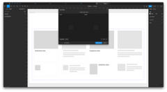
Shared with Droplr
(Sorry for the external link but as a “new user” I can only embed one image to the post. :frowning_face:

4. Improve navigation options

If I have 1841 instances of a component (True story), I can check one by one using “<” and ">"chevrons at the bottom left corner of the window. This kinda work. But sometimes, specially in larger files it may take some time to move between instances (I’m not going to dig into performance issues cos I assume this is a constant area of improvement from Figma team side).

My suggestion here is to give users a list of all instances (Kinda like the layers view) so I can select what instance I want to preview instead of have to click multiple times and go one by one, wait it load to click in next until I find the one I want to check.


That’s it for now. I hope it can help you somehow.
If you need more information about any of the items, feel free to answer here or reach me out directly :slight_smile:

Cheers!
Idmar

P.S.: The original post had multiple images to illustrate things but when I tried to post I got this error:

“An error occurred: Sorry, new users can only put one embedded media item in a post.”

Honestly it was extremely frustrating to get this error at the end not at the beginning :frowning:

1 Like

Hello! It’s great that now we can adjust the window’s size.
On top of what Idmar said, with the new Figma update, when reviewing the updates the page doesn’t go to the respective instance of the component like it used to (it only appears in the preview, which doesn’t always show the actual impact of the update in the page). This makes me not accept any changes to designs that are in development to not risk ruining something and not use the design library as I used to.

+1 for preferring the ability to jump to the design on the canvas. If I see that accepting the change would result in something broken, like a text label being reset, I would like the ability to fix it real time after accepting the change. I often don’t know where the instance resides.

@Dana_J1 mention in her comment that now it’s possible to resize the review window. Until the moment this is not a possibility for me. I assume we’re probably in different variants of an A/B test. :slightly_smiling_face:

With that said, the thing @Sonburn mentioned about not automatically go to the canva instance of the review component is something I can see. Since recently the canva does not change when navigating from component to component in the review panel.

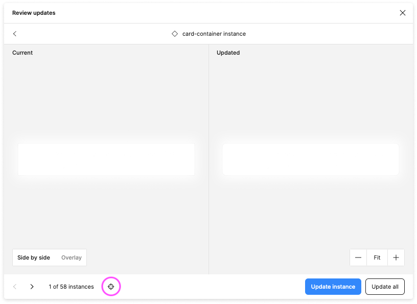
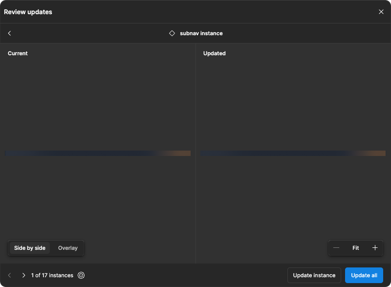
In the other hand I noticed a “crosshair” icon in the bottom left that select the component and move to it’s position in the canva.

I understand it’s “one more click” user need to perform but it’s something I appreciate as someone who manage really large libraries and this “automatic move to component” sometimes increase drastically the loading time to load the next component in the review panel.

Anyway, I hope it help :smiley:

1 Like

I would prefer the ability to enable or disable auto navigate to the instances in the composition, really frustrating having to click each time on large documents.

And, why are there no keyboard shortcuts available within the update dialogue?

I didn’t notice the “crosshair” icon before you pointed it out. Even with an extra click, it helps me a lot. Thank you very much.

1 Like

Same, completely missed this icon somehow, exactly what I needed.

Hi everyone,

Was just wondering if there was a way to expand the popup when you’re updating your branch from the main file?

I have a larger second monitor but the pop-up only uses up a tiny amount of space and it gets really tedious when you have to look in details about the minor changes that are done.

Thanks in advance!

:star_struck: I’d love to see the “Review updates” modal get a resize update.

Complex components from external libraries are difficult to compare in a fixed size window that is fixed to showing the component in an area of 400x450px. The components that the user is being asked to review can vary in complexity and this limited size really makes it harder to review the complicated component from someone’s library, in a meaningful and rapid manner.

I know that we can use the bullseye icon to jump to the component in the document and then further zoom and observe the context, but it takes extra time to do this, or zoom in on the component within the update modal, every time we review it. Having the “Review updates” modal use the full canvas area would be useful. This suggestion has been around a while, consider folding it in to this thread.

Perhaps a toggle for this function as I’m sure it’s been at the current size for so long, that changing the modal to fill the canvas might disrupt some other user’s workflows. But honestly both this “Review updates” modal and the origin “Libraries updates” modal could really be fullsize items at this point. The ecosystem of components and their management deserves better than a 460x415px preview.