Resizing Variable Box

Hi everyone
When i’m using variable box, this box have flexible height.
If i select a variable category with much variable, this box resize to max size
and after that when i want to click on another category with less variable, suddenly box resize to min height and this height change is annoying.
Please make fix variable box height and give resize option.
Thanks

Thanks for the feedback about the Variable feature, @Pouriya_Rezaie ! We’ll pass this onto our team for consideration.

1 Like

Was just about to make a post about this. It’s really annoying.

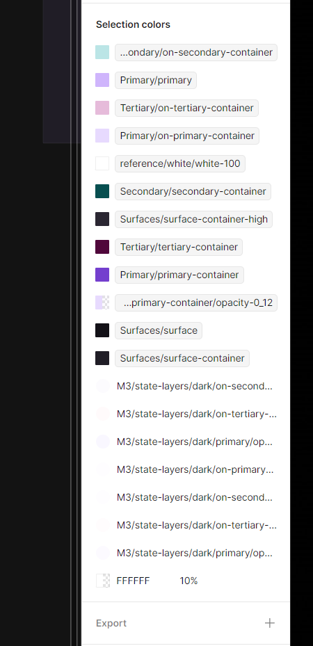
There’s no way for me to tell what variable or style I’m looking at when it gets truncated. Either allowing me to resize the panel, a tooltip on hover that shows the full name, a setting somewhere that allows text wrapping, or some other solution.

It’s very frustrating as I’m trying to remap some colors and I have to make an educated guess or am forced to change naming convention to something shorter.

Thanks!

This topic was automatically closed 90 days after the last reply. New replies are no longer allowed.

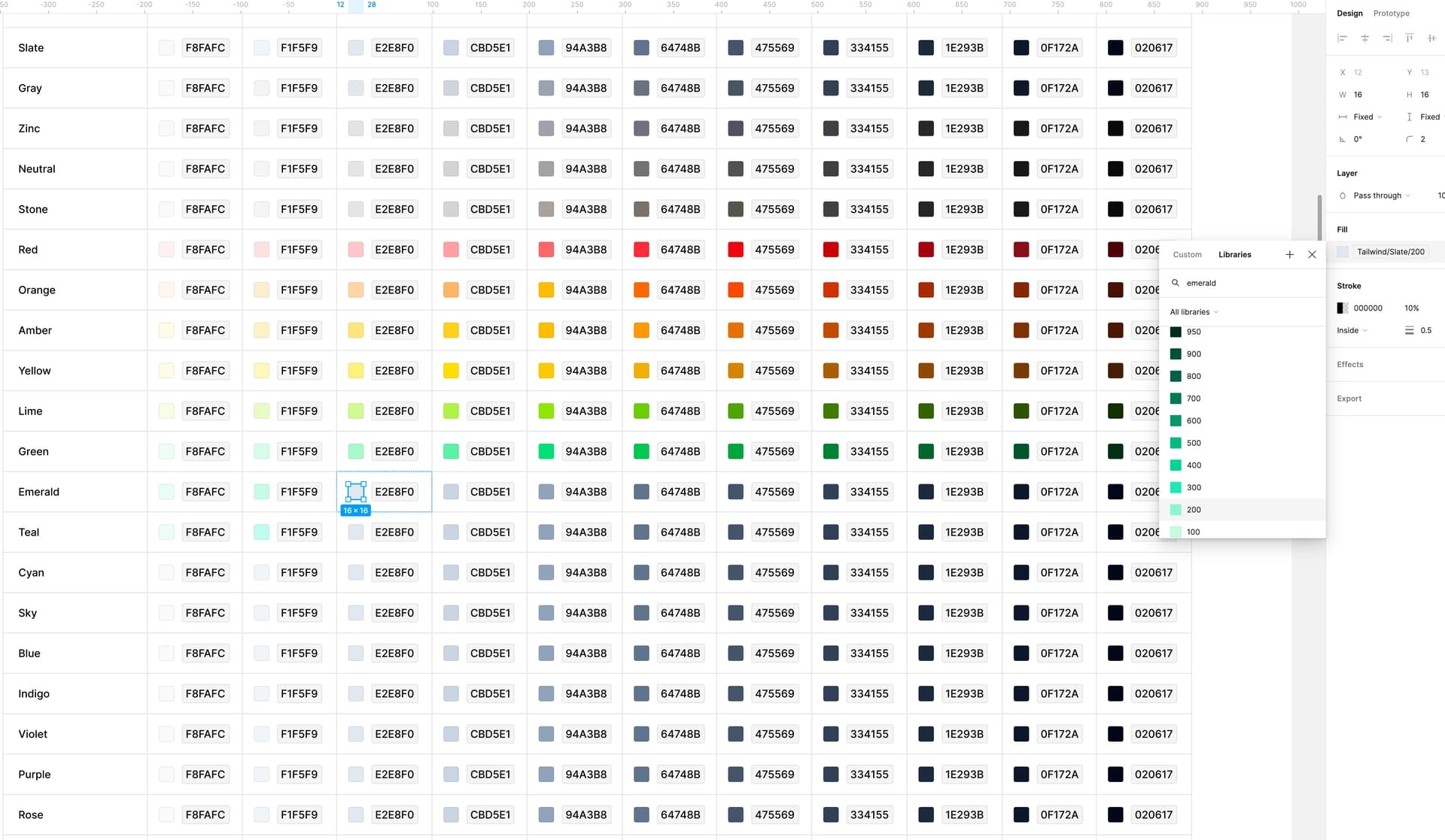
Hey everyone, new to Figma and hope there is already an solution to this that I am unaware of. It would be super helpful if we could resize this style / variable window and pin it open - It would cut down on a lot of clicks, typing and scrolling.

Screenshot here showing the window in question:

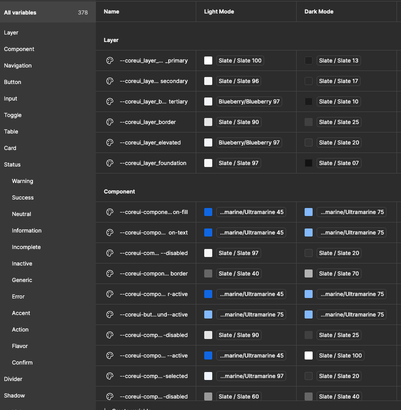
:small_red_triangle: Can Figma makes this a priority!? Anyone using theme token names knows this is a pain point. It also needs a search. It hasn’t seen much love since launch. Our team has theme names that cannot be easily read because we can’t expand the first column’s width. (Same when applying themes with the color tools.) Also, searching for themes within the variables window would be helpful in updating, organizing, and maintaining system themes. Please reach out if I can be of any help. Thanks!

Most project i work with, have a big amount of colors with their aliases etc.
Browsing them is not optimal with an unresizable small window