Resize two different elements inside of an instance

Hey everybody! Hope you all are doing ok.

I am not sure if this is possible, but, is there anyway to make two different elements from a component instance be editable?

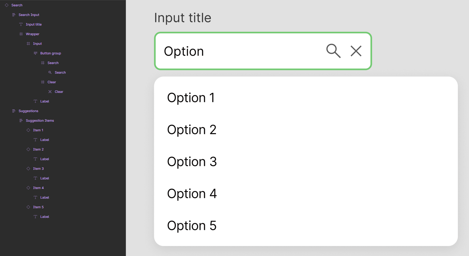
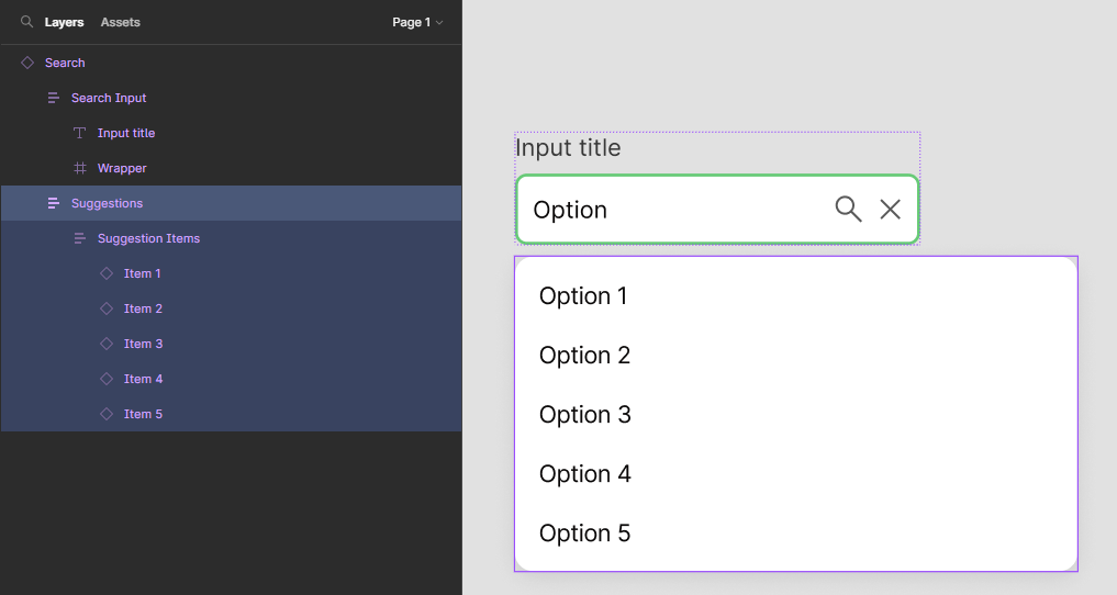
Context: I have a search component and I would like to make both search input and the suggested results under it editable.

Currently, the component structure looks like this:

Hope someone can help me with this :slight_smile:

Thank you!

2 Likes

Hi malta,

You can use text component properties on the master component and create one property for each of the options
So you will have 6 props:

  • search
  • option1
  • option2
  • option3
  • option4
  • option5

And these props will be editable on the instance

Here the link to component properties : https://help.figma.com/hc/en-us/articles/5579474826519-Explore-component-properties

Hey Stephane! Thank you for the answer, I appreciate that :smile:

The texts are already editable. What I wanted to do was to make the Suggestions container editable, not only the texts, so I could have the search input have one specific width and the Suggestions with another:

For that you should turn the Suggestion container into another component and use it as an instance prop.

Therefore you’ll be able to change it easily

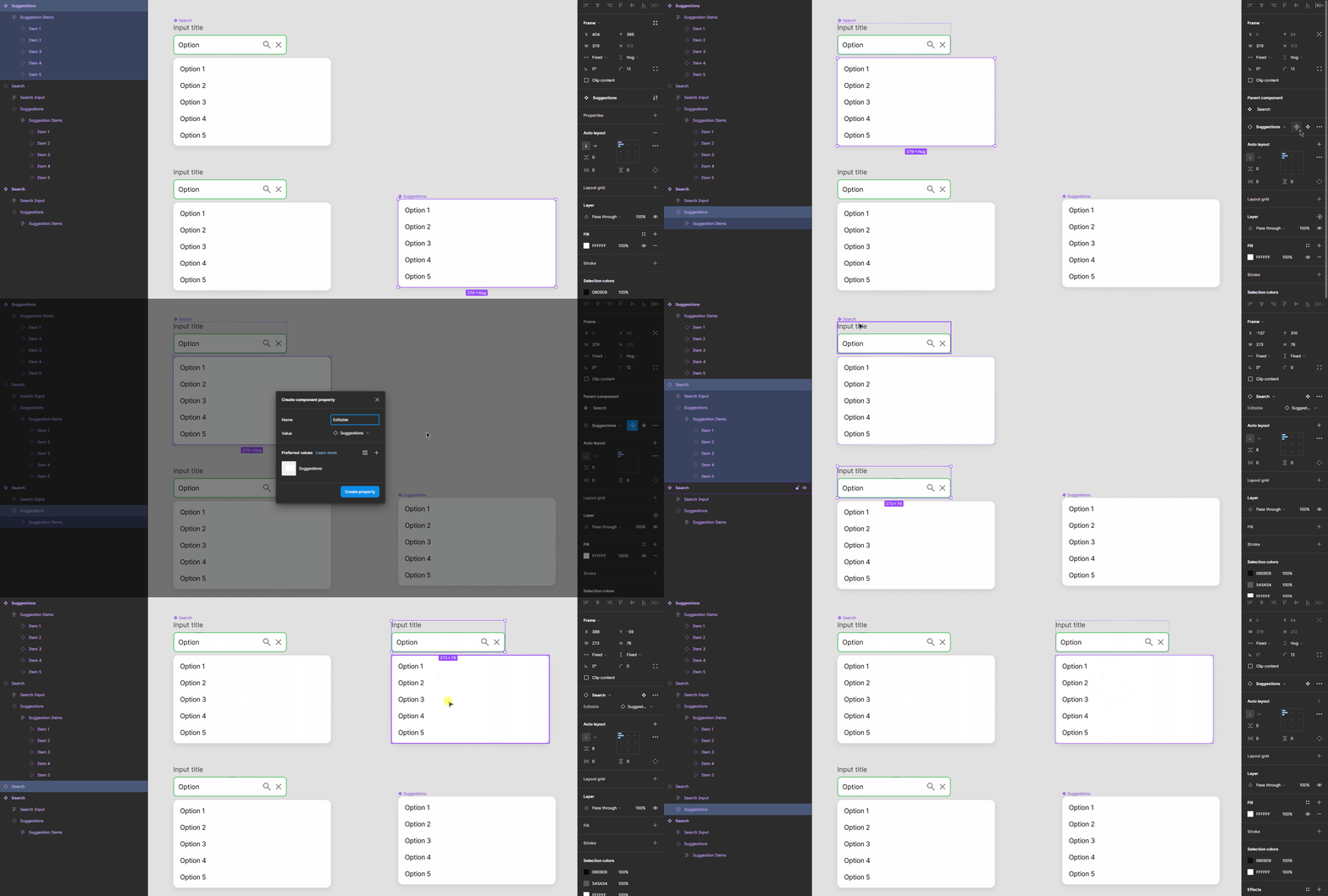
Oh, that was a nice tip. I made a quick test here to check if it would work but I think I am missing something, could you confirm if I did the way you suggested?

search-gif

The Suggestion container is still not editable

Oh I tested and I understand now.
The dimensions cannot really be modified in instances :cry:

However a hack could be to play with autolayout and set the Suggestion width to Hug
Then you can create different suggestions components and swap them
Then you just need to fix the width of one option in order to change the width of the suggestion component used :slight_smile:

1 Like

This is a nice hack! Thanks for your help and kindness, Stephane :smile:

I came up with another hack of making the input adjustable by adding an auto layout in the input label. It’s not perfect but it works :stuck_out_tongue:

But surely I will try the way you suggested too, I think this is a more intuitive approach for users.

You could also use variants and define 3 or 4 styles
so the user could choose among 3 and 4 variants

1 Like