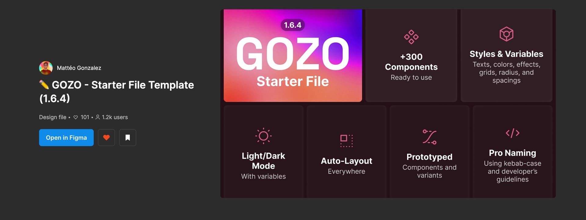
Previously it was set to be 1920x960, and now is supposedly 1920x1080. This wouldn’t be a problem if the remaining width of the cover was ignored in the actual thumbnail in the file explorer just as before, but now all my covers have black bars up and down. Why this sudden change?
The files in the community still have the previous behavior where the search results showed a thumbnail a little bit thinner than the actual cover size when you open the file.
Thanks for flagging. The thumbnail size was unexpectedly changed for a few hours, but it should be fixed now. If the problem persists, please try to reload Figma app after a while.
Hello, in Figma frame template it’s still 1920x1080px and when you publish something on the Community it’s still 1920x1080px even if half of the cover is crop ahah
Thank you for the follow-up. Just to clarify, this post pertained to a bug that resulted in strange black bars appearing at the top and bottom of the file cover, causing the file cover thumbnail to be unexpectedly cropped from 1920x1080. Fortunately, this bug was resolved within a few days.
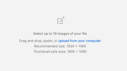
So there is actually still a problem with cover sizes, because on the first screen it seems to be 1920x1080px but on the second it is 1600x960px
It would be great to have only 1 cover size for everything, with correct guidelines on the Figma’s website that tell about the safe zone too (if there is one), in 1920x1080px i think it’s 1800x1080px right ?
Thanks for sharing the screenshots. I understood what you’re saying! As you say, the safe are for the community cover is 1800 × 1080 according to the modal.
If possible, could you share the original image of the thumbnail? We hope to investigate further.
I’ve touched base with our internal team and they’ve clarified that the information about the safe area needs to be updated, so you can disregard that for now. Instead, they’ve requested to maintain a 16:9 ratio. If it’s feasible, could you adjust it to 1600x900? However, please note that this might result in a slight pixelation of the image.
Using 1920x1080 or 1600x900 wont change the problem because the ratio used for file cover is not 16:9, it’s 16:9,6. This the main point of my previous messages
Here an exemple with 1600x900. I would love it work with 16:9 so we would have only 1 ratio but :
I just logged in today and noticed I’m having a similar issue. It seems like I’m not the only one experiencing this (saw others mention it here: Reddit thread).
Does anyone know if the only solution is to manually update every thumbnail, or is there a quicker fix?
Hi there! Welcome to the community.
As the Reddit thread also mentioned, I confirm this is intended,. The only workaround is to manually update their thumbnails to 16:9 ratio.
For the context, we recently updated the aspect ratio to 1920 x 1080 (16:9) for all file types across the file browser and Community. Thanks for your understanding!