
Please Improve Components Panel UI

  • February 1, 2021
  • 3 replies
  • 626 views

Aalok_Trivedi

Simple but so frustrating.

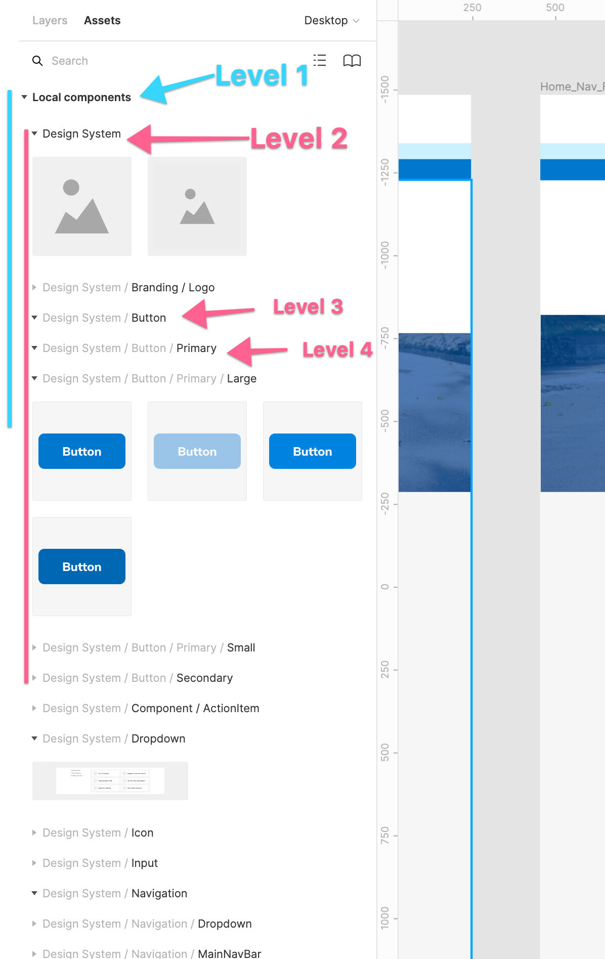
It is incredibly difficult to navigate and scan the Assets/components drawer due to the UI and (lack of) hierarchy. All the nested levels look the same and there is no clear grouping or substructure since every group has the same alignment. This makes it incredibly frustrating to work with and find what you are looking for. I hope you are exploring ways to improve this.

Screencast: Screen Recording 2020-07-14...

Gleb
  • New Participant
  • February 1, 2021

Yep, it could be much nicer if it simply had the hierarchy and look similar to the layers panel.


wgo
  • February 11, 2021

+1 Yes please. I think it needs some improverments regarding hierarchy and also color! Finding components for a dark UI can be quite frustrating.


Antoine

+1 the Assets panel looks great with 1-layer structures but unfortunately such a structure is hard to maintain with large design systems.


Reply


Cookie policy

We use cookies to enhance and personalize your experience. If you accept you agree to our full cookie policy. Learn more about our cookies.

 
Cookie settings