Hi Figma. First of all, thank you so much for introducing nested instances feature! It’s a very good feature for a team that handle design systems. It gives our consumer a clear clarification what they can do with components without the need to dig deep into the layers of the component.
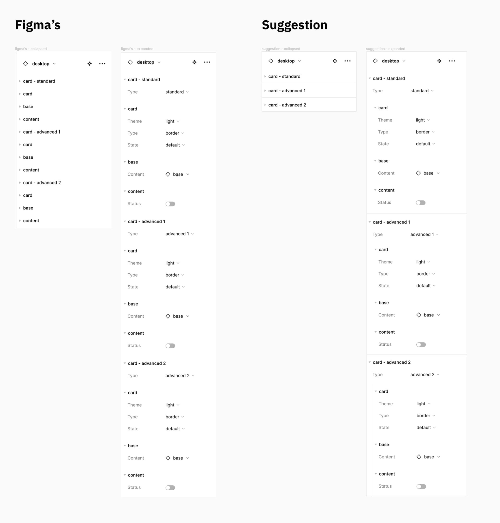
There’s one thing I think it can help this feature to be a lil bit clearer on the right panel. It would be best if Figma can add a separator between each of the parent group and have an indentation for the children nested instances. With this, it’s much easier to identify the grouping, especially on complicated components with many nested instances. Please refer to the image attached.


