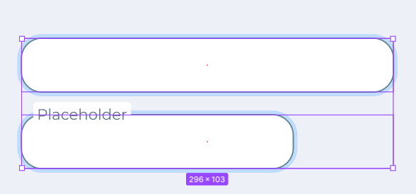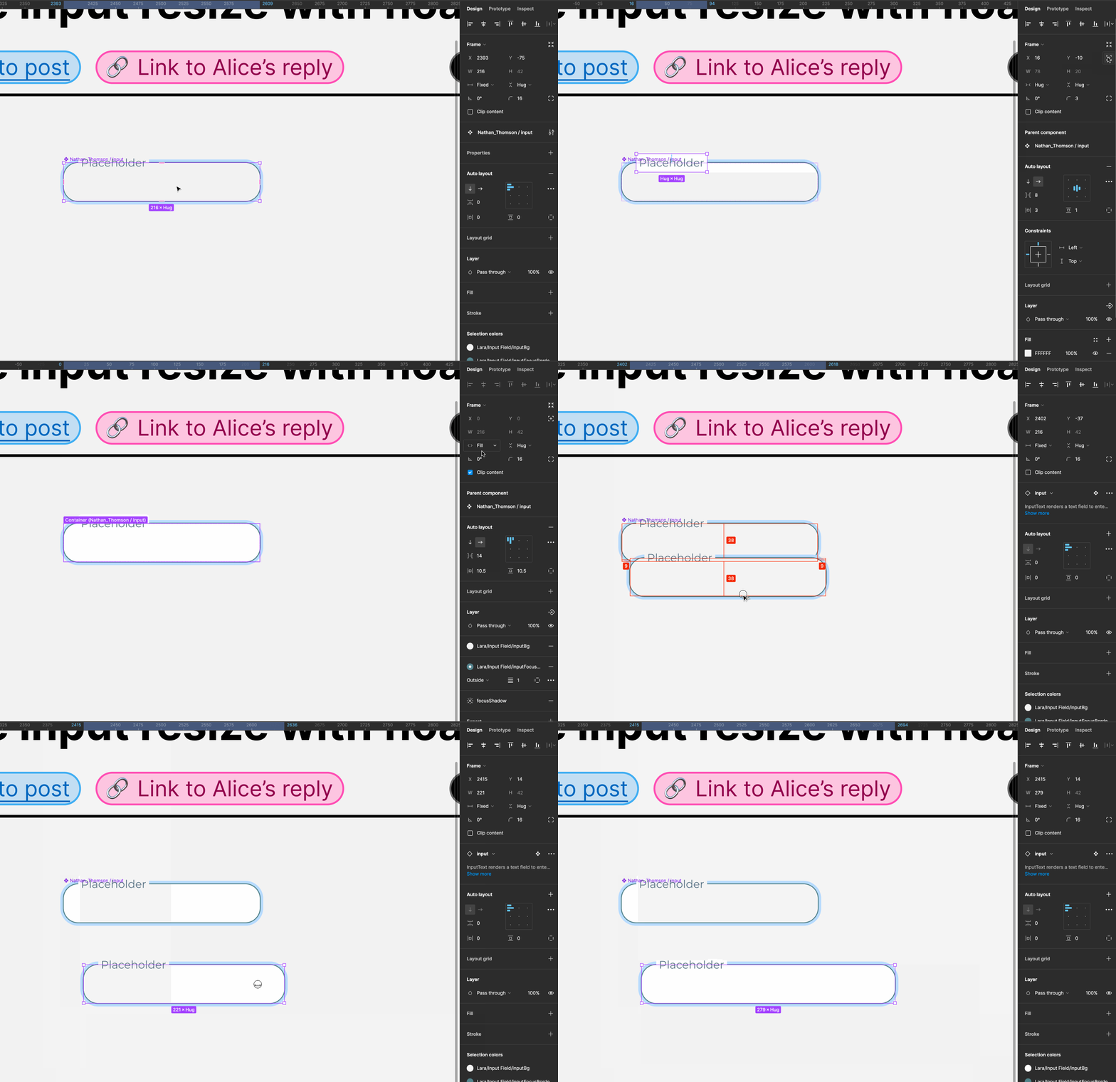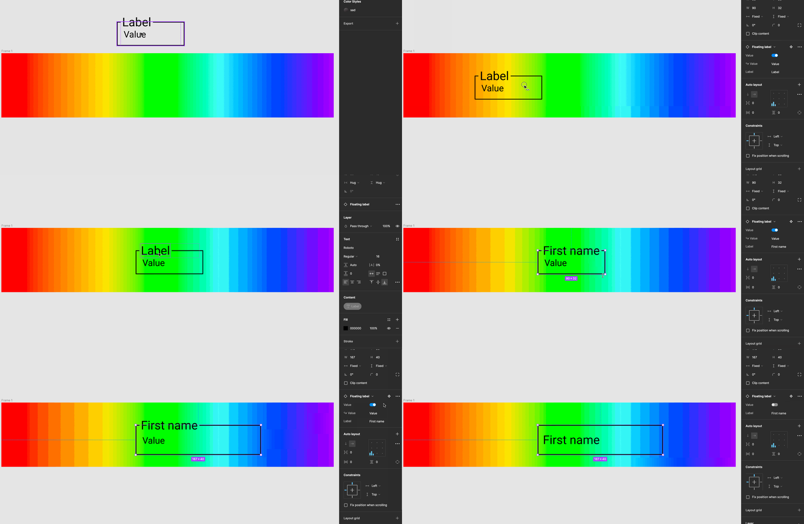
I can’t seem to get this input component to resize when I add the floating label to the component.
Solved
Need help to make input resize with floating label
Best answer by AlicePackard
Hey Nathan, you were already really close with this! The fix I came up with in your file only required a few steps:
- Add auto layout to the “Input” component
- Use absolute positioning on “Frame 2” (the input’s label) to manually position it
- Set the nested “input” frame to fill horizontally
Here’s a GIF of the result:

Here’s view-access to the Figma file I used to take these screenshots and GIFs, in case you’d like to have a closer look at the layers and auto layout settings.
This topic has been closed for replies.
Enter your E-mail address. We'll send you an e-mail with instructions to reset your password.

