Managing text layer inside an auto layout

Hello,

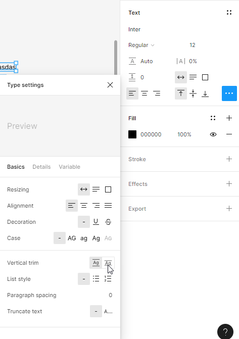
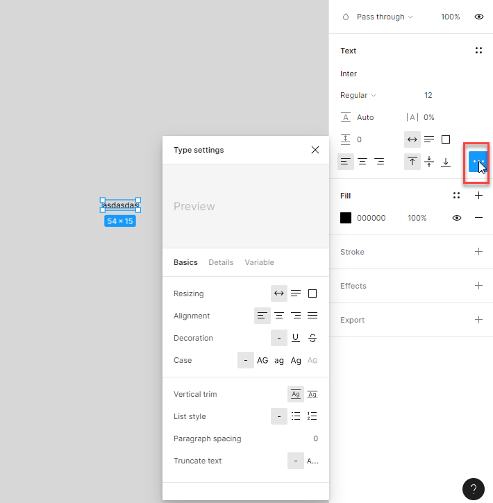
I have a paragraph that i need to place into an auto layout, alongside other objects such as buttons or input fields etc - rectangles, essentially. the problem is that i need to have the same spacing between all of these objects, paragraph included. As long as they are all inside the same auto layout, its obvious that there will be a single value shown in the space between box in the figma UI, but visually, around the paragraph, there will be more space than between other elements, because of the text bounding box, which extends beyond the point where the letters start or end. Furthermore, i cant mess with the line height of the text, because i want to keep the space between rows of text as it is.

So, is there any way i can ensure to have the same spacing between the paragraph and other elements as between any other two elements, that have a fixed and “clear” height?

I really hope someone has a solution, thanx.

can no one answer to this? :frowning:

I have the same problem with a flexible button. It is not possible to allign the text in the button horizontally centered, because of the text bounding box. It really sucks.

Hi.

You can set the Text’s vertical trim to cap height to baseline.

But, remember that there’s no such thing as cap height to baseline on web or apps in code. So if it’s a multiline text, it’s better to not use this cap height to baseline feature.

1 Like

Hey Raphael, Thanks a lot for your reply! I found another solution for “my” problem. I didn’t know that I can set 2 different values for the top and bottom padding. I missed that little icon on the right and only saw vertical padding.
Bildschirmfoto 2024-03-01 um 09.03.24
Maybe that’s also a solution for Stefan…

Sorry Stefan for ripping your topic

And by the way…I don’t see any of these options:
Vertical trim
List style
Paragraph spacing
Truncate text
:thinking:

Hi, Holger.

You have to click this button on the Text panel to open the Type settings box.

that vertical trim solved it for me. well, for the most part. its a powerfull tool, but its not always 100% accurate. sometimes you will see that after vertical trim, the text bounding box is a little higher or lower than the cap height. anyway, in photoshop, for instance, u can have a text layer with any line height and that layers bounds are exactly the visual bounds of what is written, no vertical space is added or taken from it. this should be the case in Figma, also. might i even say the web (CSS). because for designers ti is important, thats how you space out text layers or text layer to box layer, based on the visual dimension, not the line dimension.

1 Like

Yeah, I know, but I only see the first 4 options.
Resizing, Allignment, Decoration and Case. I’m on the latest version of Figma…

That. I’m not entirely sure. In my case, I always see it :sweat_smile:

  1. Create a Frame: Wrap your paragraph text within a frame. This allows you to control the padding around the text without affecting the line height.
  2. Adjust Frame Padding: Set the padding of the frame to a specific value that provides the desired spacing. This way, the bounding box of the frame will determine the spacing rather than the text’s bounding box.
  3. Align Within Auto Layout: Include the frame with your paragraph, along with other elements, in the same auto layout. Align them accordingly, and now the spacing will be consistent as it’s determined by the frame’s bounding box.
  4. Fine-Tune Padding: You may need to experiment with the frame’s padding to achieve the exact visual spacing you desire. This method allows you to control the space around the paragraph independently of its internal text bounding box.
    regards : onlinenames
1 Like

sure, that works, but… its a workaround. and its kind of messy, not that elegant.