I’ve spend considerable time searching for a solution and I keep coming up short. I’m building a responsive prototype in Figma and plan on using the Breakpoints plugin. I can’t seem to get the typical 12 column grid where the content sits on the left with a sidebar area to work.
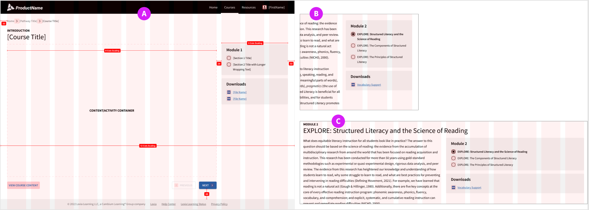
I’d like the main content to be 9 columns wide and the sidebar to be 3 columns wide. Each area would respond accordingly reflowing the text, etc. It seems Figma’s auto layout works great for when you have areas of equal column width next to each other. Three areas at 4 columns each works great, but when the blocks are different, like the 9 and 3 combo, not so much.
Item A in the pic is the layout I’m trying to achieve:
Item B you can see when I resize the page, the sidebar no longer aligns to the 3 columns because the sidebar is fixed width.
But, if I make them both fill container, I end up with Item C.
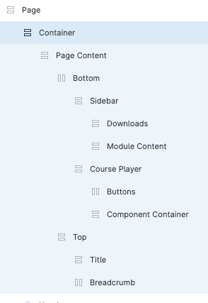
I’m curios what your layer hierarchy looks like, which constraints they have and which uses autolayout and grids because, to me, something doesn’t add up.
AFAIK objects can’t ‘Fill container’ unless the parent frame is an autolayout, but your screenshot shows a 12 row column grid, and grids aren’t available for autolayout frames.
When I replicate a similar setup, the only way to make it work is by constraining to both left and right. It doesn’t matter if the sidebar itself is an autolayout frame or not, the only thing that matters is that it constrains to left and right, which if it is an autolayout needs to be fixed size.
I have the layout grid applied to the main frame/page. Then I have the page content setup as such with all items set to fill container horizontal and hug contents vertical except the Sidebar layer which is set to fixed width to keep it to 3 columns wide.
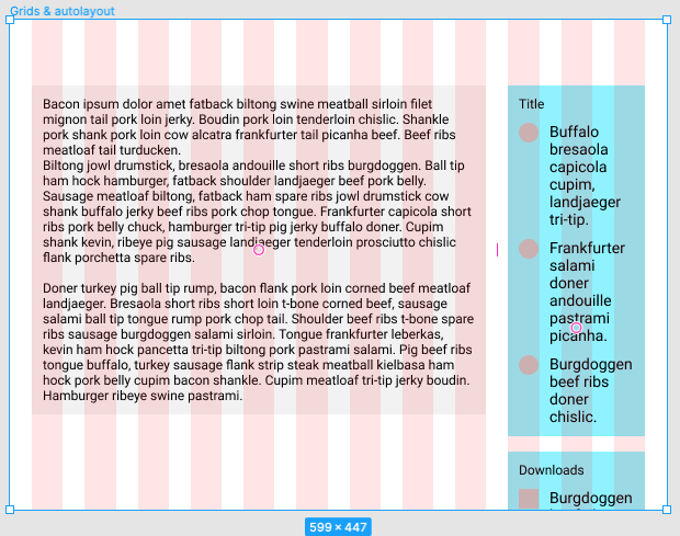
If you have snapping turned on you should notice that when you adjust the size of the sidebar it doesn’t snap to the column edges. That’s because only children of frames with grids respect them, not grandchildren.
I prefer autolayout so I also encourage them, but if you need stuff to constrain to grids then you need to ditch autolayout for the children that they are meant for. But I suspect for the design you’re going for you don’t even need autolayout for everything. You can still use autolayout on the sidebar but that needs to be a direct child of the frame containing the grid.
When I tried to just use frames or groups on that main container, I couldn’t get the text to automatically reflow and fill the container as I resize the screen. If there’s an example somewhere or an article that might explain something I’m missing, I’m happy to check it out. So far everything I have found doesn’t show how to do this using just layout grids or auto layout, or both. The closest thing I found is when the sidebar is set as a fixed width area on the left and the layout grid is applied to only the content area on the right.
Thank so much for this Klesus! This works well keeping each area aligned properly to the grid. The only issue I’m still having is when I reduce the screen size there’s a point where the height just bleeds off frame. There may be no way around this since this option works well for the horizontal adjustment but the auto layout works best for the vertical adjustment. Seems like each option has its limitations. Would be nice to have the best of both so you could build a realistic responsive prototype.