
Hi, apologies if this has already been brought up in the Ideas forum, but I’m a developer who only works with Figma in view-only mode in order to pull specs from designers. I’ve never used Figma as a designer, and only need to consult Figma files maybe a few times a week. The other day, I went to a design file and was presented with this:
As a casual/occasional view-only Figma user, this appeared to be a completely blank file. I tried clicking anything that seemed like it might be hiding other pages, ran through all the app menus, and checked other files that showed pages. I bugged the designer, asking why the file was blank, and got increasingly frustrated. The designer was also confused, being able to see the pages on their end, and we investigated account permissions, version history, etc. trying to find the issue.
I googled for answers, and found a post in the Ask the Community forum where someone experienced the same confusion that I did: My design system file is empty, the pages are gone and I cannot add any new pages and figured out that the page tree was collapsed. The person who asked that question felt “silly” for missing it, but I see this as a UI issue rather than a user issue.
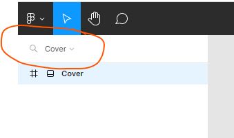
a) The most noticeable indicator in this row is the search icon
b) The colors are light gray on white
c) The carat is incredibly small, and easy to overlook, especially on a large screen, or with high brightness, or for users with low vision
d) It is left-aligned with the more-prominent Cover page below (and shares the same name) with no other text to indicate what it does
To my eye, as a front-end dev with 12 years experience, this has all the affordance of a probably-disabled search input. Light gray, not prominent, no higher in the hierarchy than the Cover page item below it. The magnifying glass has such strong affordance as a search input that it’s the only situation where an doesn’t always need a visible to reach WCAG compliance. The colors in this row are all very similar grays, so it appears to be one interactive element, not two.
So my suggestion is to enhance the carat/dropdown interaction so that it’s more visible and understandable to casual users who only use Figma to refer to designs.
a) Visibly separate the dropdown from the search input
b) Give it visible text to describe the interaction, like “Expand/Collapse Pages”
c) Increase color contrast
d) Make it clear that it’s at the top of the page list hierarchy
Thanks!