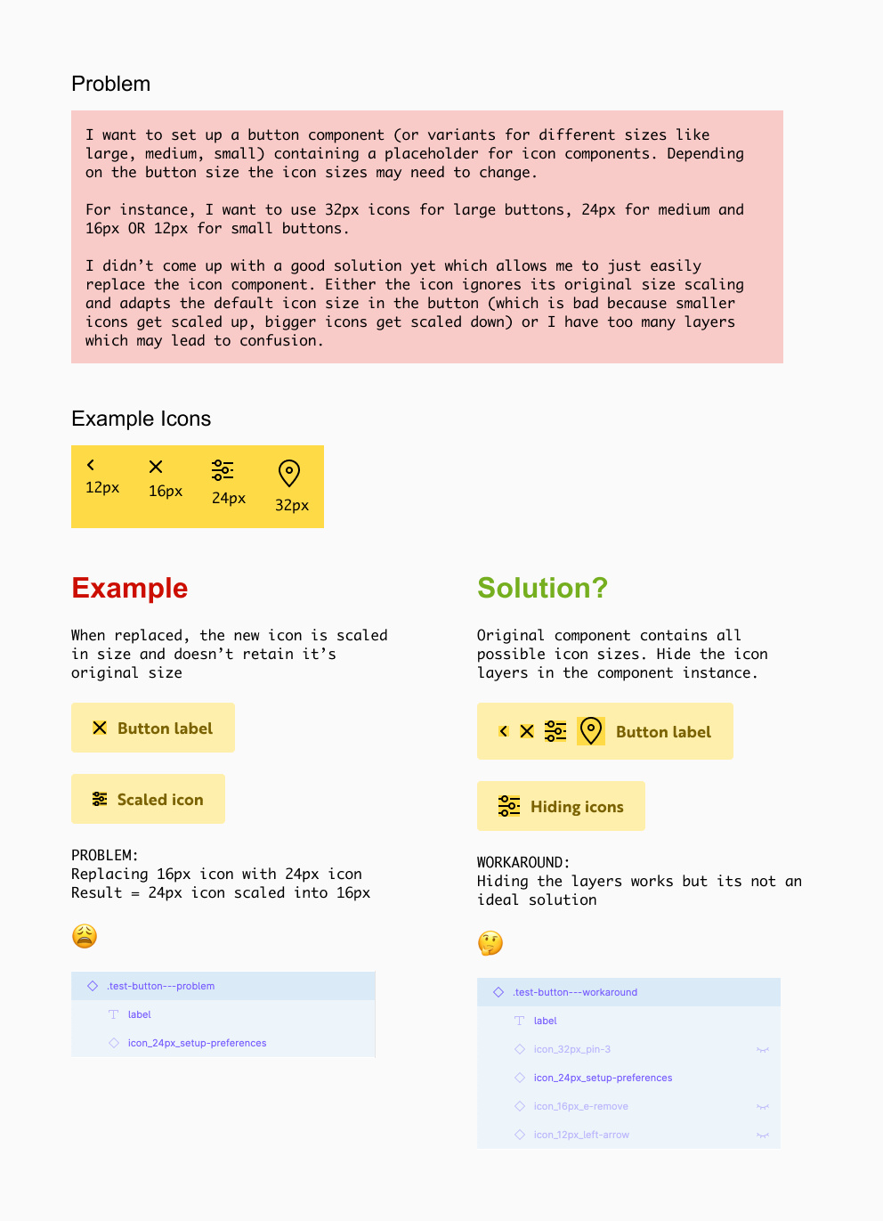
I need your help because I’ve run out of ideas when building Button components.
For a project I have to figure out how to effectively integrate nested icon components with different sizes.
I already built quite complex Button variants containing options for type (primary, secondary, …), color, size (large, medium, small), icon (left, none, right) and state (normal, hover, active, disabled etc.). But I could not solve different icon sizes properly.
I’ve already tried that but unfortunately, that doesn’t work either.
The icon still keeps the original components size values.
It seems the width and height cannot be changed as an override.
Ohhhhhh! The icon component itself must be set as an auto-layout container!
I only tried it with a surrounding auto-layout frame inside the button where I placed icon components inside.
I’ve tried this today and it did not work for me.
But I think I also found out why.
In my situation I have Icons with different with I want to swap.
This works fine (regardless if the icon itself has autolayout or not) until you nest this icon into another master component.
It also seems to make a difference wether the icon is a vector or a union.
If its a vector your method worked perfectly.
With the icon being a vector I had to use the autolayout frame at the icon component already - otherwise it would not work.