How to Fix Dropdown Menu Overlapping Issue in a Table with Auto Layout?

Hello Figma Community,

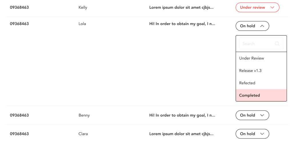
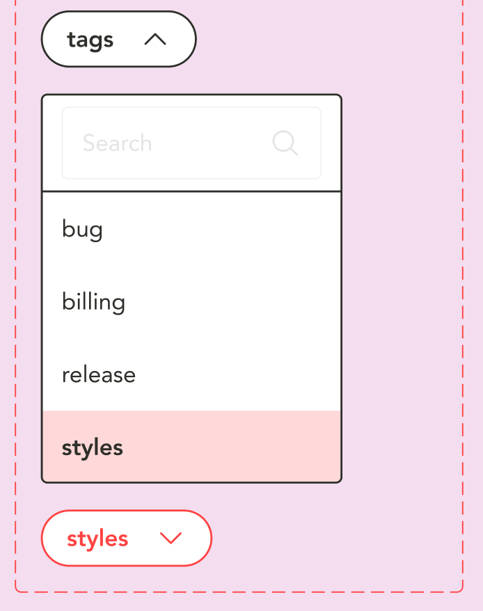
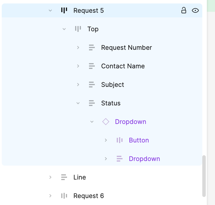
I’m working on a table with 8 rows, where each row has 4 columns: Request Number, Contact Name, Subject, and Status. The Status column includes a dropdown menu component with variants (Inactive, Active, Hover, and Selected).

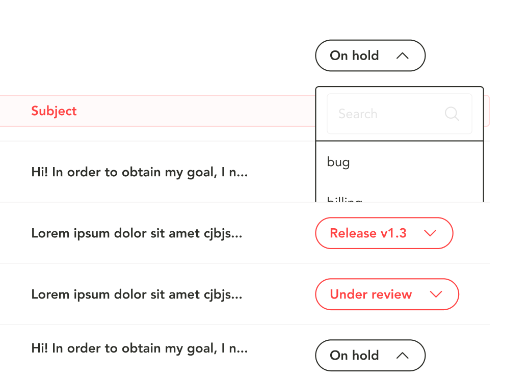
When I trigger the dropdown, the row’s height increases (since it’s set to hug content), and the dropdown menu doesn’t overlay the rows below as I need—it stays within the row, pushing content down.

I’ve tried the “Canvas stacking” solution, but it didn’t resolve the issue. How can I make the dropdown overlay properly without affecting the layout? Any professional tips or advice would be greatly appreciated!

Thanks in advance!


3

This method will always expand the row.

You are basically replacing an object with a taller object.

I would suggest to try making the select menu field as your trigger, and create the menu itself ON your page. Not in the component.

Then set the interaction onClick of the field, to “show overlay.” And manually position the overlay where you want it to appear off the select field.

If you upload your file or grant access, I could show you a working example after work this evening (CST).

Here it is the link to the file in Figma.

Thanks in advance!

I did this super fast at lunch. If you need some more explanation I can do that this evening. Just message back.

  • What I did was created a component for your menu item (option).

  • Then I created individual menus frames for the top two different select menus.

  • Drew an interaction noodle to the proper menu, set it to “on click, open overlay” and then positioned it manually for where to open. Just click on one of the noodles and you will see the highlight of where the menu is positioned to open.

You could easily do this with a single menu. You just could not easily set the states of selected items in the menu. It would be the same for all. But that might be fine.

There are advanced ways to create variables for each text item and set conditions and math to change the variables of things when they are clicked. That is a bit advanced though.

As for making the button text change when you select a menu item, that is the same crazy math and variables thing. Way too much to learn in a quick forum post.

But this should give you an example of one way you can accomplish this.

Hope it helps.

Issue EDITED.fig (107.8 KB)

1 Like

Thank you so much for the detailed explanation and the prototype! I really appreciate the effort you put into this—it’s incredibly helpful and will definitely come in handy when I start prototyping.

However, my main question was about how to make the dropdown options overlap other rows (so they stay above and don’t push the content around). Specifically, in my example, when I change the variant of the “On hold” button to active, it doesn’t stay in its initial position, and the dropdown options end up moving the entire component up instead of staying above the rows. Do you have any tips on how to fix this?

It does not work that way.

Like I said, you are repolacing an object with a taller object. It will push the row down or it will get clipped if you have that set.

If you want something to appear OVER something else, you have to create an overlay.

Sorry I couldn’t help otherwise.

1 Like

Thanks for the clarification! Even though it didn’t solve my issue, your explanation was really helpful and gave me a better understanding of how it works. I appreciate your time and help!

1 Like

There might be an easy way to fix your issue.
In the auto layout of your rows, go into the detailed settings, and find the setting “order” which can be set to “first on top” (this is what you need) or “last on top”. This will render the first row on a higher z-depth, drawing the row containing your overlay on top of all other rows.