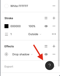
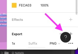
It is really annoying that the question mark button is fixed there.
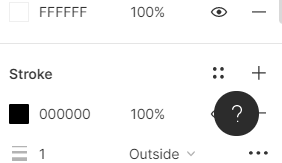
Can’t it be moved to somewhere else manually when I do not need help for the moment  ?
?
This bugs me every time I use the app. +1 to remove/relocate this icon, please.
It would be better to change the “help button” position because it is in the bottom-right and the user has to scroll in order to export the files

Please, bad UX, floating HELP icon is above Figma UI important things. Always I need additional scroll to reach action that i need, and HELP button should be low priority location.

You have place in upper toolbar, maybe right from ZOOM selector, this is better place then to float over Property UI.
Please, software for UX/UI should have good UX/UI 😉
Totally agree! This button gets in the way when I have to export things.
Figma team should consider moving it to the top right, beside of zoom/view options.
I know this button can be hidden but, that’s not really a solution in my opinion. The button shouldn’t be used very often, if I hide I’m sure I will forget about it and forget to unhide it when needed. Instead I’ll waste a fare amount of time looking how to contact support via google, doesn’t sound like an ideal userflow.
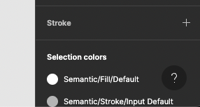
On top of that, when using Figma in darkmode, the button is barely visible which ends with you forgetting that it’s there too.

I really think it could be placed somewhere else and keep all of its usefulness!


 ?
?