Dev Mode: how to inspect component properties and variables with modes properly?

I’ve been setting up a design system for me as a designer, but ultimately I would like to give developers proper insight into the way I have set up my design system. What I like about Figma’s Dev Mode, is that it allows to dive deeper into the variations of components, for example. What I miss, or what I didn’t discover yet, is that developers should be able to inspect the intricacies of component properties. Here is an actual example:

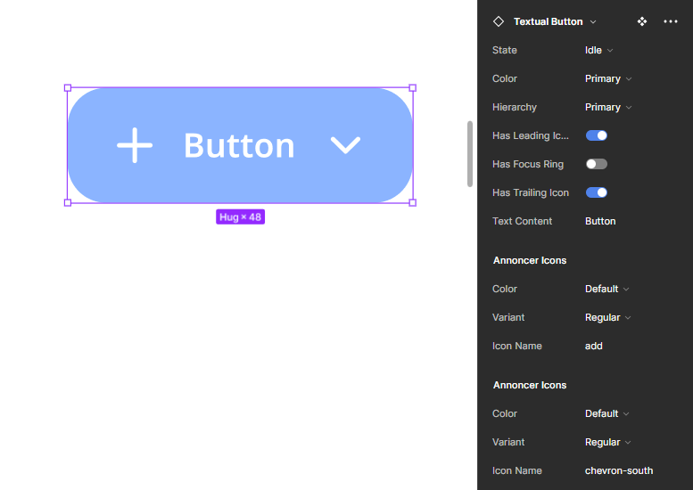
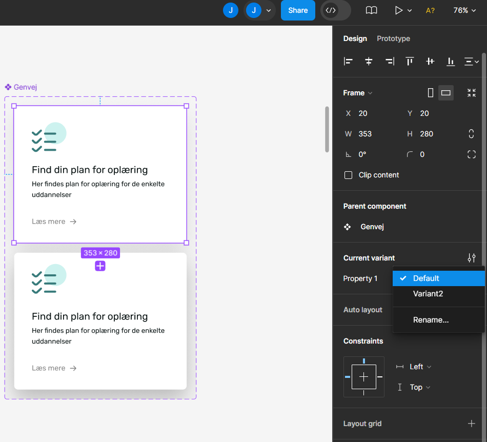
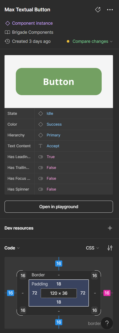
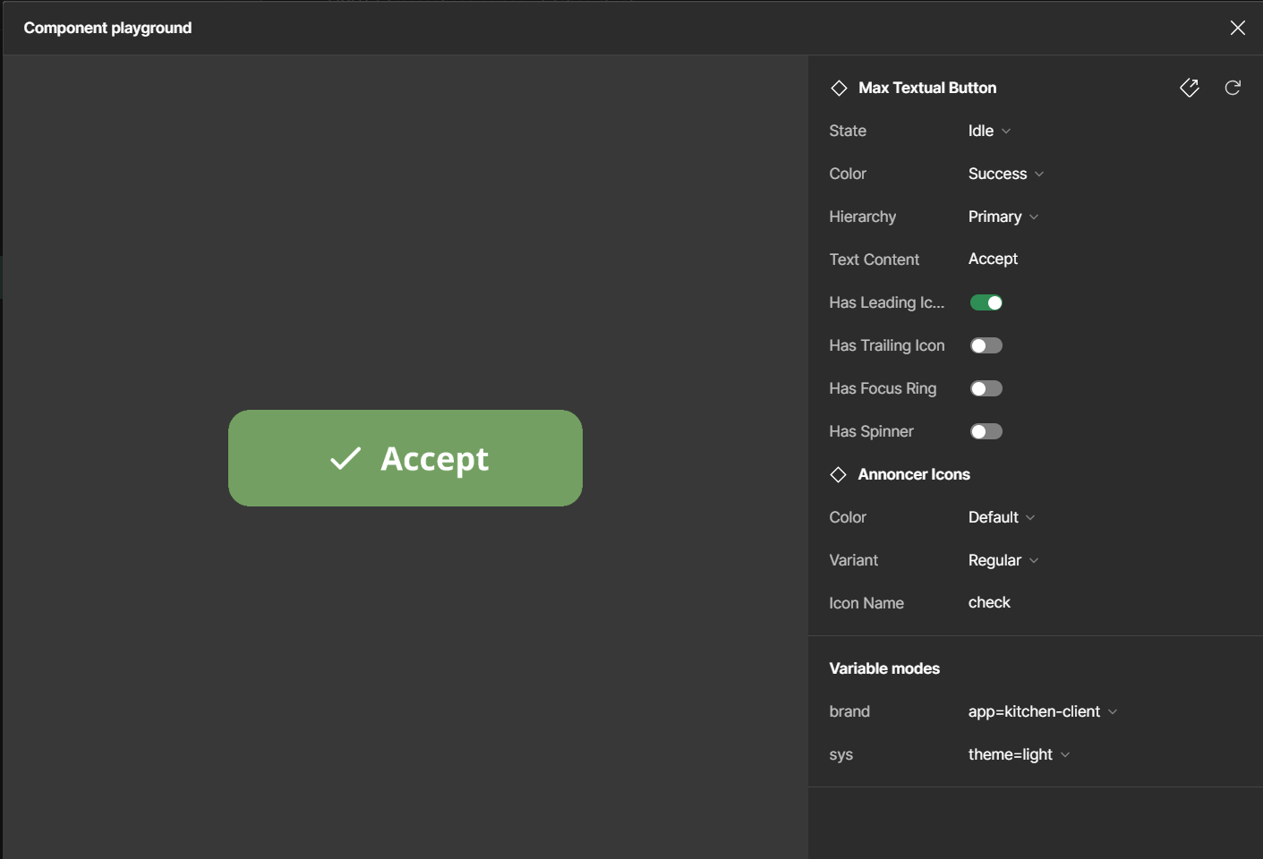
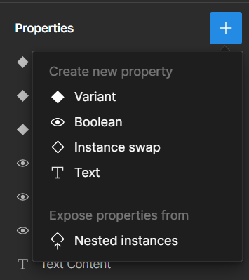
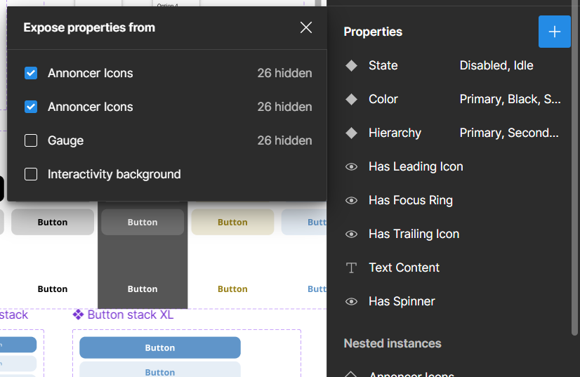
A button, which has 3 states, but also a prefix icon and a suffix icon. This button, with states and optional icons, is available in three hierarchical levels: primary (dominant styling), secondary (less dominant styling) and tertiary (subtle styling).

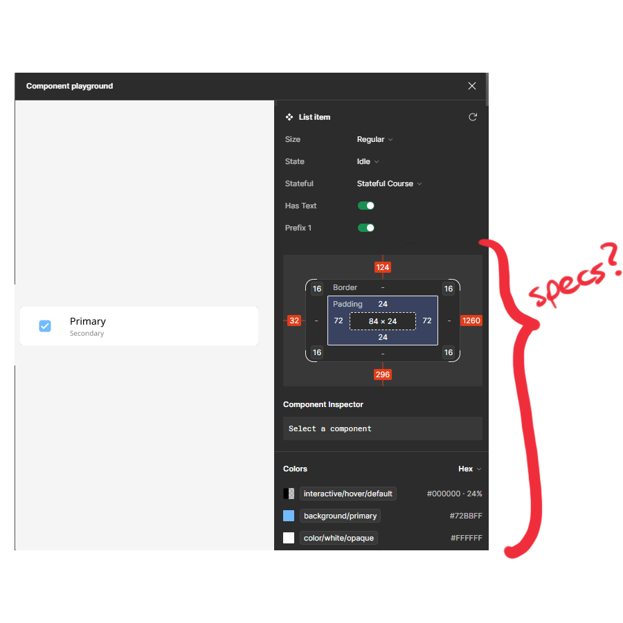
The Playground is a nice way to discover all of the available variations of a component (including boolean/enum properties). But you can’t really inspect what is going on. I would like developers to be able to easily discover metrics and style properties of any of the variations.

Question 1: how can I achieve convenient inspection of component properties for developers?

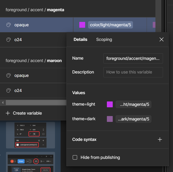
Additionally, we designers can utilize variables smartly by setting up modes per variable and variable aliases. I have created awesome variables that respond to light/dark mode frames, as well as component mode selection like statuses (“danger”, “success”, etcetera). An actual working example in design mode:

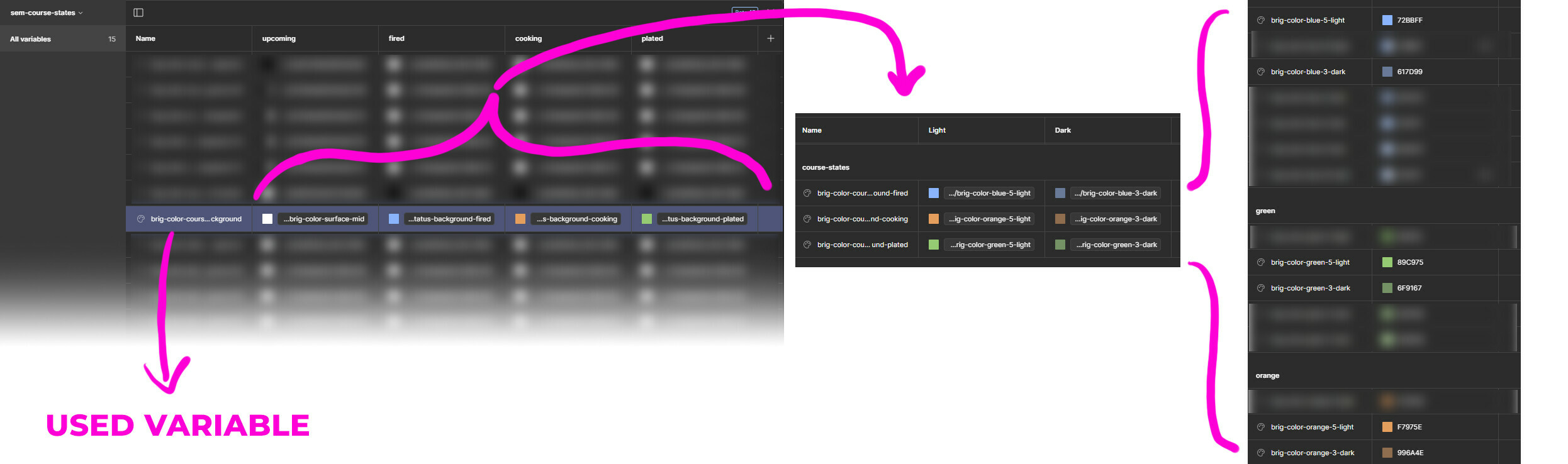
A variable named “color-status-foreground”. This variable has 4 modes: “upcoming”, “fired”, “cooking”, “plated”. These are occupied with aliases to variables that contain light/dark modes, which in turn are aliases to reference colors.

There is a related question to this: For Dev Mode we need to show all variable states.

Question 2: how can I ensure the developer interprets “color-status-foreground” as a variable that has in total 8 values based on different modes (4 status modes, each having light/dark mode)?

I do think that my questions might end up in the “share an idea” category, but I wonder if there are any pragmatic solutions to use Figma as it currently is.

1 Like

It seems like the Component Playground has received an update. Right now, I am able to review all properties and their values of a single component. This is great! It allows me to much better communicate the intricacies of a component.

The final thing I am missing in the playground, is inspecting the component instance. What are the dimensions, text styles, color styles or applied variables?

The sketch as illustrated above may be a bit of a stretch, but it would come down to having the ability to review every detail from the instance in the way one would be able to on the canvas (either in design mode or dev mode).

I wish there was a way to change state right from the dev mode instead of having to go into the playground and see the change within the design instead of having to see the element independently.

The other issue I have ran into is the playground background is light. For dark theme components it is hard to see them sometimes since they are also light.

Any news on this?

We’ve recently started using Figma in the company I’m hired in and we’re still trying to understand how to use it properly. I don’t have a good way to compare variants, and the difference between them. Having to go to main component 300 times is… Not cool when trying figure out different states/variants of components. And manually clicking on both of them, to figure out the difference… I don’t even have the option to go to the playground, to get view you posted @Jeroen2 - The best way right now is being in the “design” mode, while having edit, and swap properties.

Component Playground is one of the Dev Mode features.

How I access it, is to activate Dev Mode, click a component, and on the inspect panel you’ll find the “Open in playground” button.

:warning:View-only, non-full seat members won’t have access to Dev Mode, and won’t be able to use the component playground (at least, I think so).

This is what I see when I highlight a component (including CSS specs and variables/assets):

…and this is the component playground (which has all the properties and variable modes “playable”):

@Jeroen2 The only thing i see in dev mode is literally the two variants in the component set in my screenshot, where i can swap between them visually, nothing else :smiley:
I can see that in interactions in dev mode, it’s going from variant “default” to “variant 1” while hovering. I would like to see the difference between them. (Designer added hover, moved icon, added box shadow etc.) -

Depends on how the component is set up, I think. You could check with the designer.

Maybe there are no more properties/variables in use. Or: maybe the component contains nested instances of other components that may have properties themselves which are not exposed in the component currently being viewed in the playground.

image

Regarding variables, it could also be that variables are being used that are hidden from publishing:

Another possibility, is that the component is created in a Figma file which references a library for variables, but the document you are viewing currently does not reference the same library for variables? (forgive me for the wonky screen shot, this is a screen shot from my own design system’s user documentation)