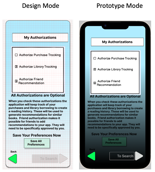
Design mode vs Prototype mode screen appearance

I am a new user, taking a UI Design bootcamp course at eCornell. In my project app, when running the prototype a couple of screens are displaying with what appears to be a dark overlay with minimum opacity. Here’s an example of a screen in Design and the same screen in Prototype:

Does anyone have an idea on cause or correction?

Thanks, David D.

Hi there,

Thanks for the post! It looks strange. Would you be able to share your link with us? Happy to take a closer look. When sharing, please make sure we can view the design file.

Thanks!
Toku

Maybe your design have a transparent gradient background. Canvas color in prototype mode is black instead of a grey in design mode, so it’s visible though your design

Nellya’s suggestion was spot on. The two offending screens were lacking the opaque, iPhone scaled background at the back layer. Once those were added, the problem was solved. Thanks to the community for the quick responses.

dd