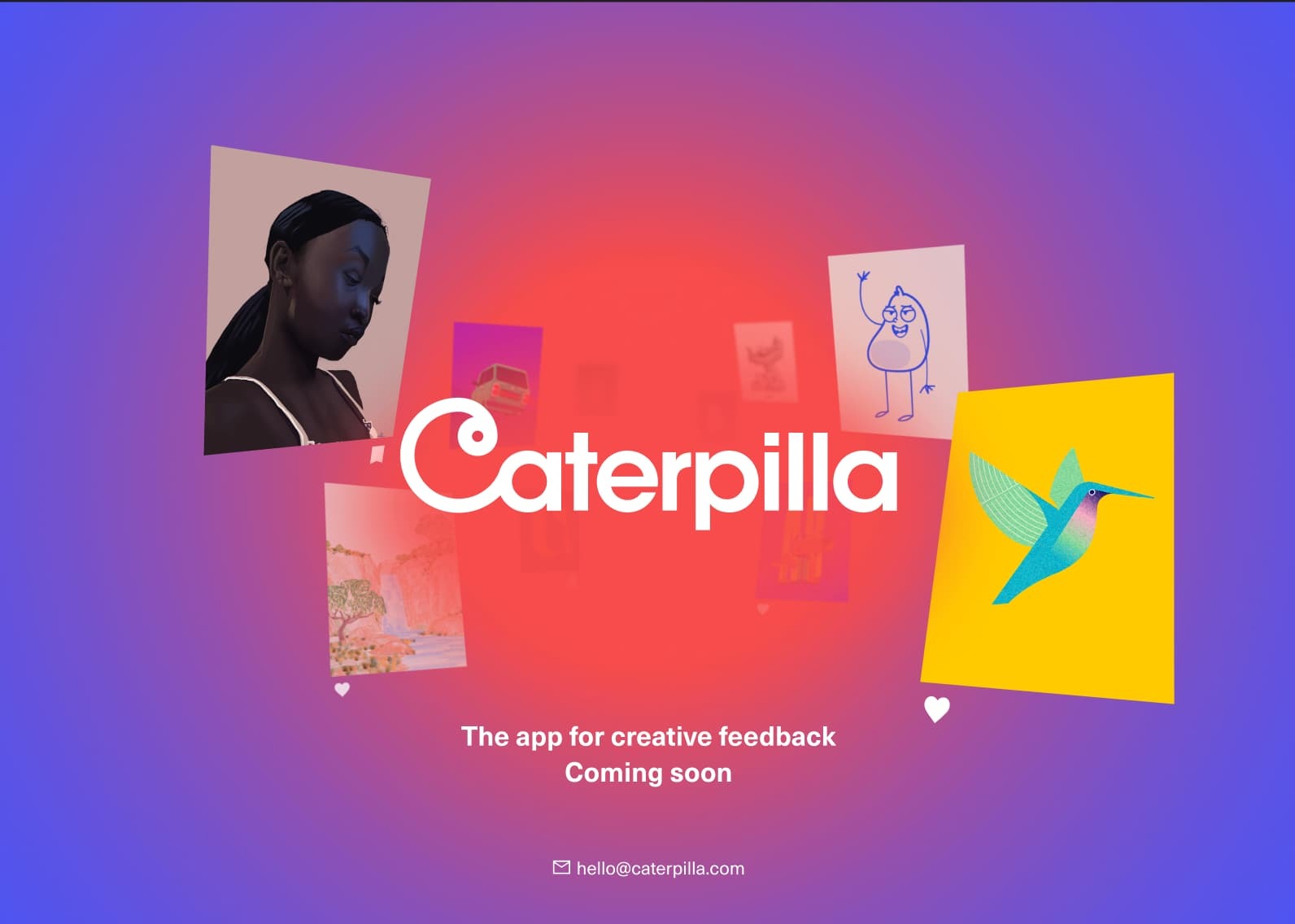
Hi, I’m trying to create a responsive layout for my design and would love some help.
As the display size reduces, I want the images to push in towards the centre however at the moment they are just getting cut off the screen (I’ve attached an image to show what I mean).
How can I make it the the images cluster more evenly together and dont get pushed off the screen?
Thanks for any help 🙂


