Changing hover color based on primary color style

Hi all,

I work with local color styles in a document and the buttons I use in the document are always based on primary and secondary color. For the hover I’ve made styles named “primary alt” and “secondary alt”. However, the document will be used for multiple clients, so the primary and secondary colors will constantly change. Is it possible that I base the hover colors on the primary and secondary colors, but make them slightly darker. So when I change the primary color from green to red, the hover color automatically changes from dark green to dark red.

Thank you in advance!

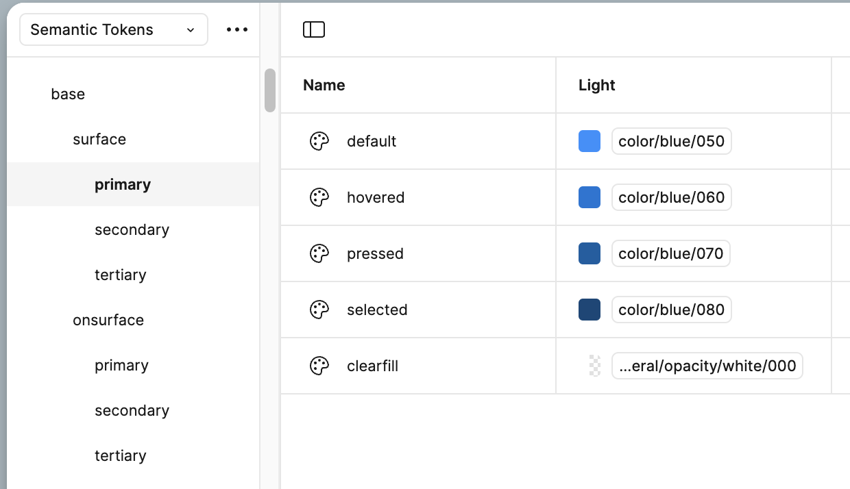
Doing this with variables is very easy. But you could set up styles to work the same way if you organize your naming properly.

This screenshot shows how I set mine up. The “primary” button has colors for each state. When designing the variants, just assign the “hovered” color to the hovered state variant.

Maybe that is what you are saying in your post? Not exactly clear.

But this is how most of use handle it with variables.

1 Like

Another option that we have done in the past. A long past that is…

Is creating an opaque black layer in the hover variant that sits on top of your button.

This way, whatever color you have underneath it, just gets darkened by the opaque overlay.

This really is obsolete since variables, variants, and better practices. But it used to be a good way to just use an overlay and whatever brand color was applied to the button, wouldn’t matter.

Old school workaround.

Thank you! Will try it out.

1 Like