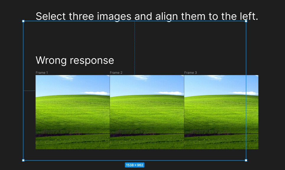
When using the alignment function on content across multiple different frames on the page, it did not align them with each other as described in the documentation, which worked correctly in previous versions.
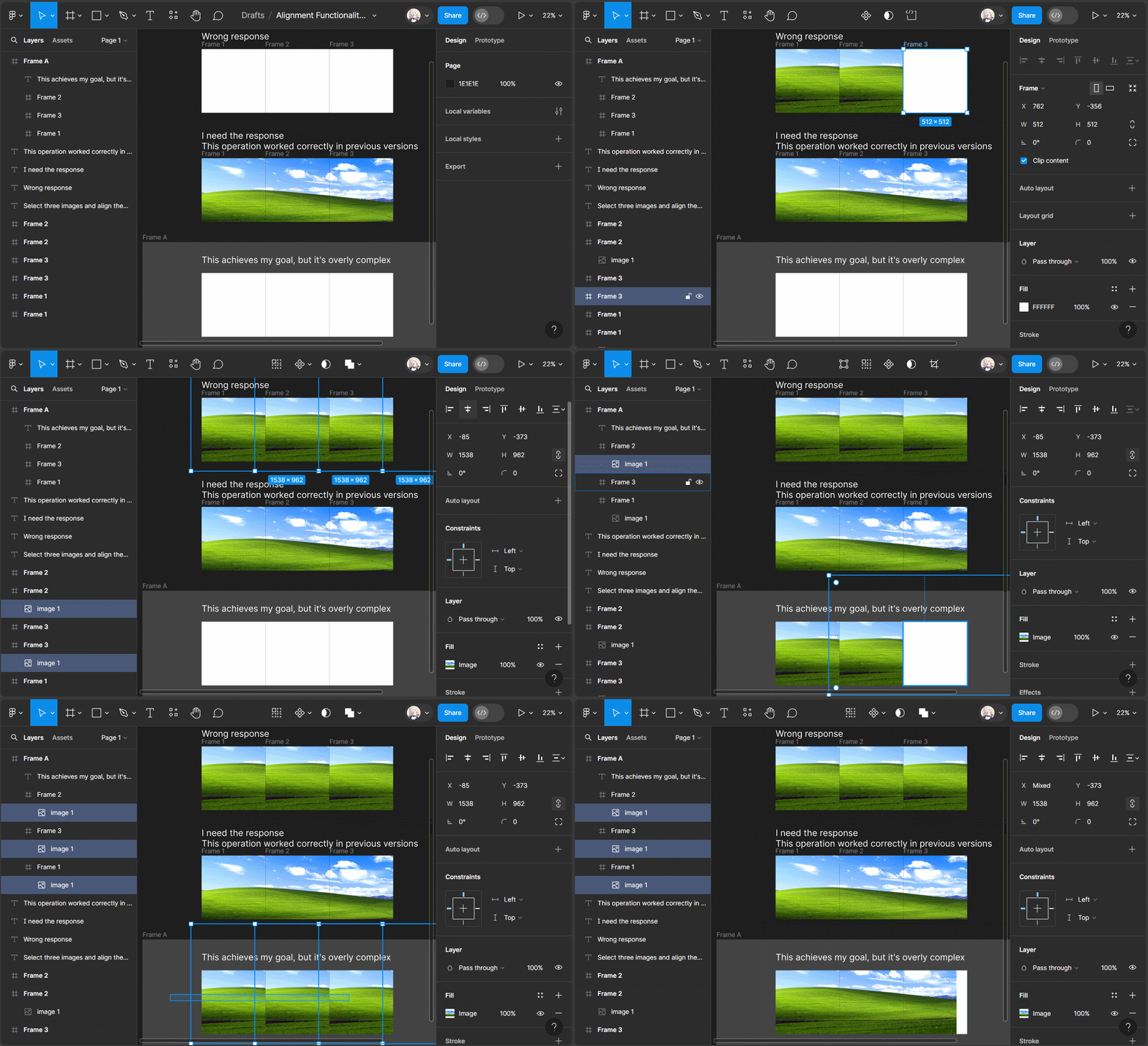
However, if these frames (Frame1, 2, 3) are nested within a parent frame (FrameA), it is possible to align the elements within Frame1, 2, 3 with each other.
Hello @chyn_N, Thank you for reaching out regarding alignment. I really appreciate the helpful screen recording you shared. I understand how frustrating it can be when things don’t work as expected.
I conducted a test on my end and confirmed that if the images are already nested in frames, they will align to the parent frame. One possible workaround here would be to apply alignment to the images and then nest them in each frame. Please take a look at the recording for reference.
Additionally, could you please specify the document you are referring to? This way, we can review the description in the document and seek internal assistance if necessary.
I hope this clarifies the situation a bit. If I missed something, please do let us know!
We also welcome any insights or suggestions from our community members, feel free to join the conversation!
According to the documentation provided on help.figma.com, when selecting multiple layers, Figma should align the layers in relation to each other, or in relation to their parent frame, or in relation to selected layers in an instance. However, in practical operation, when selecting layers within multiple frames for alignment, none of the three alignment methods described above seem to occur.
As shown in the image, after selecting three layers and pressing alt+a (align left), the resulting position of one of the images is displayed. Clearly, it is not aligned in any of the expected ways.
Hey @chyn_N, Thanks for clarifying why you brought up this issue! I really appreciate you sharing helpful information. I apologize for not being more attentive.
Also, Thanks for @Snehal_Bhargava for flagging this.
I looked carefully again and came across similar issues internally, so I’ve escalated your case to address that. While we can’t make any guarantees, please know that we’re actively working on it.
Hi there, we are currently in the process of confirming the details regarding this. We will provide an update once we have any information. Thank you for your patience!
Hi there, Thank you for your patience. I have escalated this to our product team, and they have confirmed that this is the expected behavior.
Thank you once again for sharing this use case; it is very helpful for our product team. For now, please try the workaround I mentioned earlier. However, we understand that these are not permanent solutions, and further work is needed to enhance clarity in this specific situation.
Thank you for your time and assistance in our community!
@Junko3
Thanks for the update, However, directly removing the usage logic of certain tools from the old version will cause a lot of confusion. I agree that multi-select is a good idea, but I would like the product team to retain the reliable use of existing functionality when adding new features, rather than directly replacing it.
Here’s a suggestion: introduce a toggle switch that allows users to choose between the new multi-select editing logic and the traditional editing logic. When the switch is turned on, the multi-select editing logic is enabled, and when it’s turned off, the traditional editing logic is used. This way, users can switch between the two modes based on their preference and familiarity.
Indeed, implementing this toggle switch would enhance the convenience of editing elements across frames. Users would have the flexibility to choose the editing logic that best suits their needs, whether they prefer the efficiency of multi-select editing or the familiarity of the traditional editing approach.
Hi @chyn_N, Thanks for sharing your thoughts with us!
To assist with this, one thing I can do is move this post to the “Share an idea” category. This will give our product team the opportunity to review it for potential future updates, and other community members can vote on your suggestion.
Please let us know if you agree with this. We truly value your support.
I went ahead and re-categorized your topic to be “Share an Idea” – others will now be able to give a +1 to it if they are looking for something similar