Is there a setting somewhere in Figma, where I can set the prototype up so that there is some extra space on the top of my designs for a phone status bar? Without me manually always putting a fake status bar on all my designs?


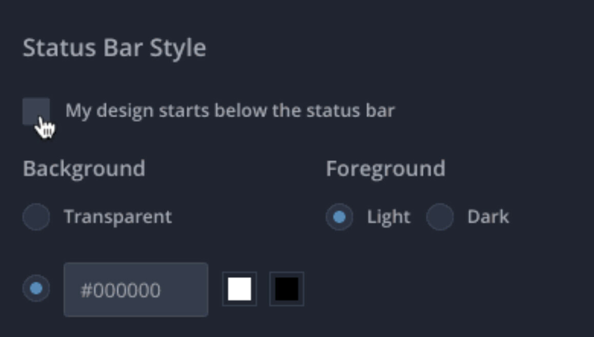
I’m basically looking for an equivalent to InVision’s lovely prototyping setting called “My design starts below the status bar”


I’m interested in setting this up for both, when I’m previewing my prototype:


  1. on my device in the Figma Mirror app; or

  2. in the ‘Present’ mode in the web browser or Figma desktop app - when I place the prototype into a device.


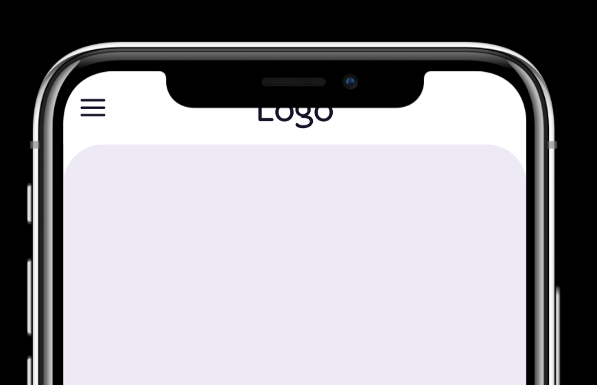
Basically, I want to avoid this situation on iPhones 11, 12 etc:


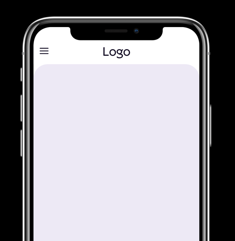
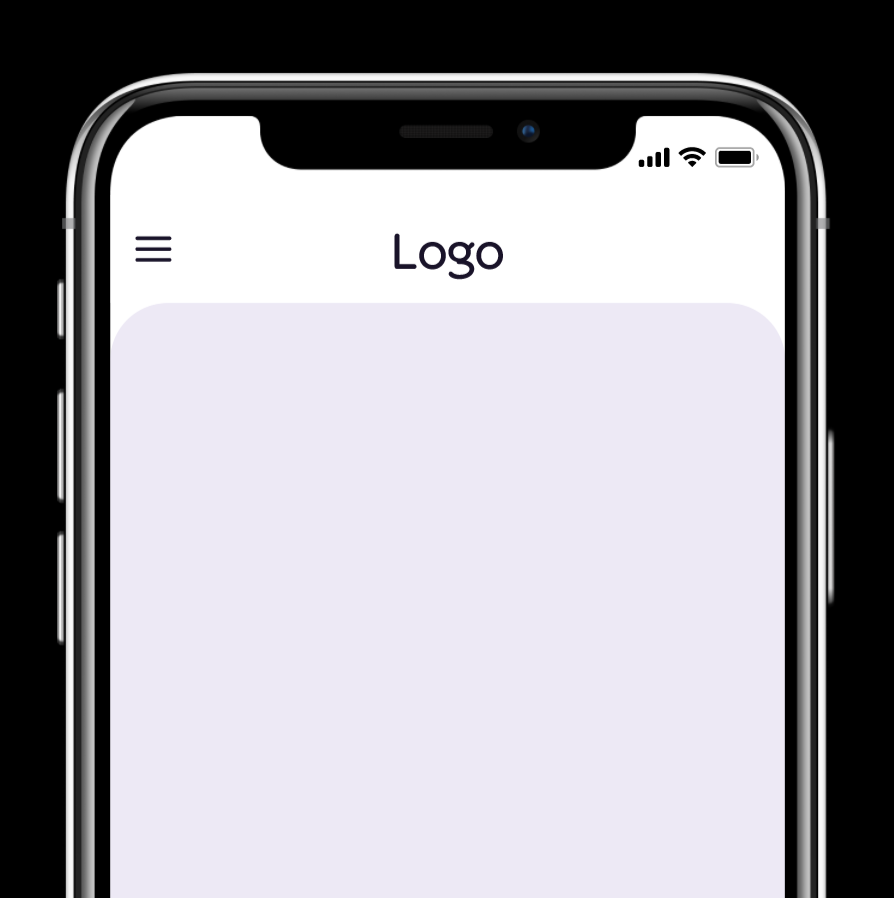
And have an option to automatically set the prototype in either of the two ways below, without me manually moving the designs lower, or putting fake status bars in my designs:


Any info much appreciated!

There is no option like this.


Come on, when using Figma prototypes in other platforms such as UserZoom or Maze you should be able to set this because each platform for usability test purpose behaves differently.

So PLEASE make this happen, otherwise the prototype will always look differently when testing and when grooming with engineers.


Hey Figma, did you plan to add this in the future?? will be great to see in future updates.


Does anyone have any tips or tricks on how they avoid this issue? (I.e. any standard dimensions that someone knows of, or a trick they use to put a buffer zone between the status bar and top of the page.)


I wish Figma supported this natively even in the Figma beta this doesn’t work. But when you watch the config demo it appears to start the design below that status bar. 😭


This topic was automatically closed 30 days after the last reply. New replies are no longer allowed.