Initial thoughts
Overall – really impressive feature that has a lot of potential. However, here are a few observations that I think are worth noting.
The good
The potential of this feature is huge! I spent 5 minutes making an interactive radio button that can be re-used. Bish bash bosh.
When designing a long service before this feature - this tiny interaction would have taken me hours. This feature will speed up the prototyping workflow 10-fold. Great work 👍
It’s a a super easy feature to pick up. Very small learning curve.
The could be better
Auto-layout and nested variant interactions
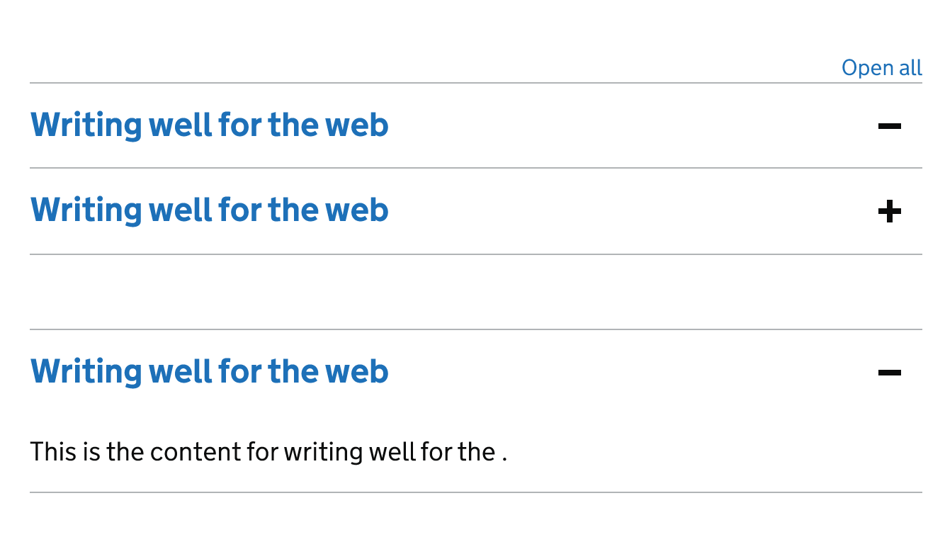
I’ve noticed that auto-layout components containing interactive variants that expand and collapse does not respond well.
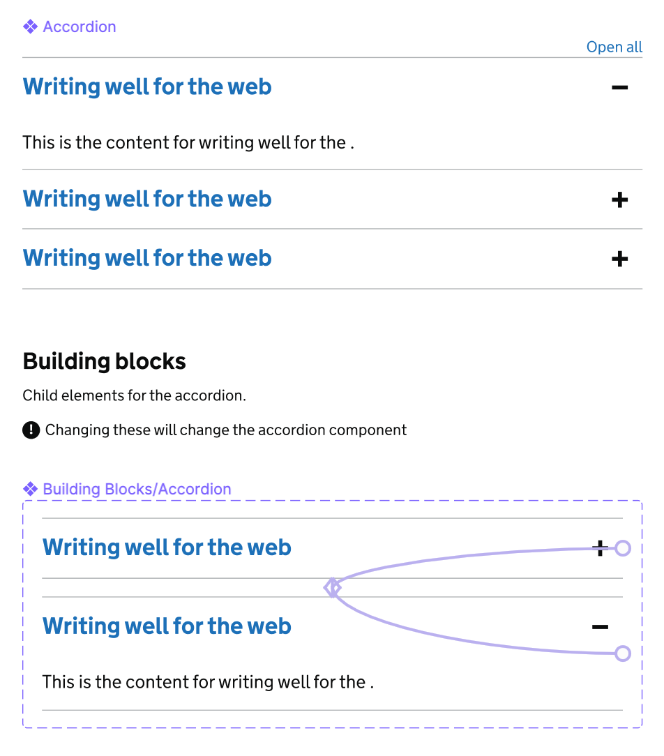
Example of component and interaction:
Example of component failing to adapt to nested interactive variants, leaving blank spaces and hiding expanded states:
I was expecting it to behave in a similar way to how when I toggle the nested variants in the master component within the editor.
Need for click-off event?
In order to imitate a browser experience it would be great if there was a click-off event to remove the active state for inputs.
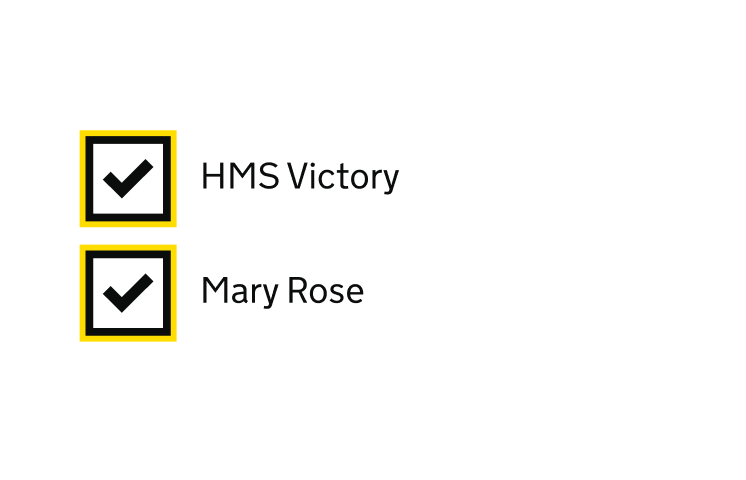
Example of not being able to remove focus state once user clicks-off:
Rule for the active/selected item in regards to navigation/lists
Thinking in terms of navigations… what would be really useful and the icing on the cake would be the ability to rule one variant as the selected/active state. Thereby when an inactive item is clicked on, the previously active item switches to the default state of inactive.
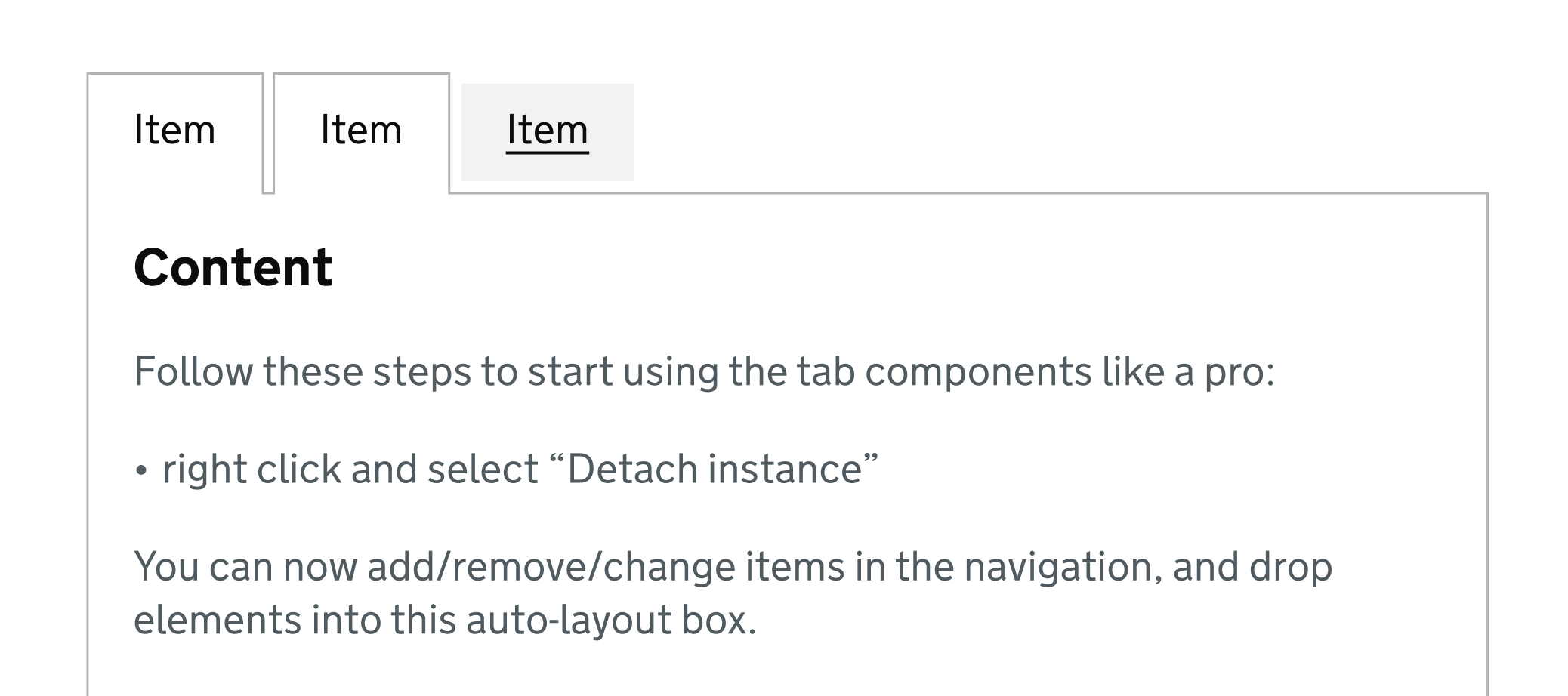
Example of current problem: multiple navigation items in the active state when clicked on:
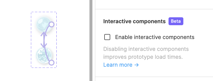
Toggle for interactive components
One small bug I found was in the toggle of turning interactive components on and off. I made quite a few components interactive, toggled the feature off to see if it changed the speed of the prototype preview - to only find all the interactions to have been removed when I toggled the feature back on again.

