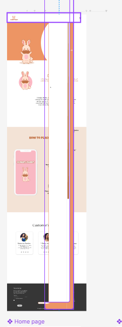
I have been learning about auto layout for the past few days and understand that breakpoints allow you to create a more responsive layout. I was trying to implement that until I noticed when it was time to transition from the mobile design to the tablet design, the header’s design got distorted. I don’t know if I didn’t use the correct auto layout method which has caused this issue that I can’t solve or if it is the breakpoints method that I am still trying to learn.
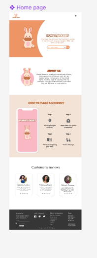
The first upload is how it looks when I stretch or make the frame wider to become a tablet size. The second upload i show it should appear (auto layout and breakpoints aren’t incorporated on the second one but this is how it should look).