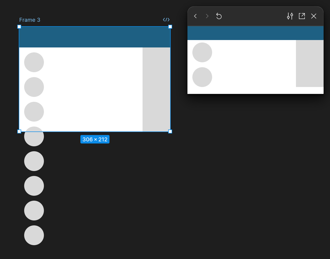
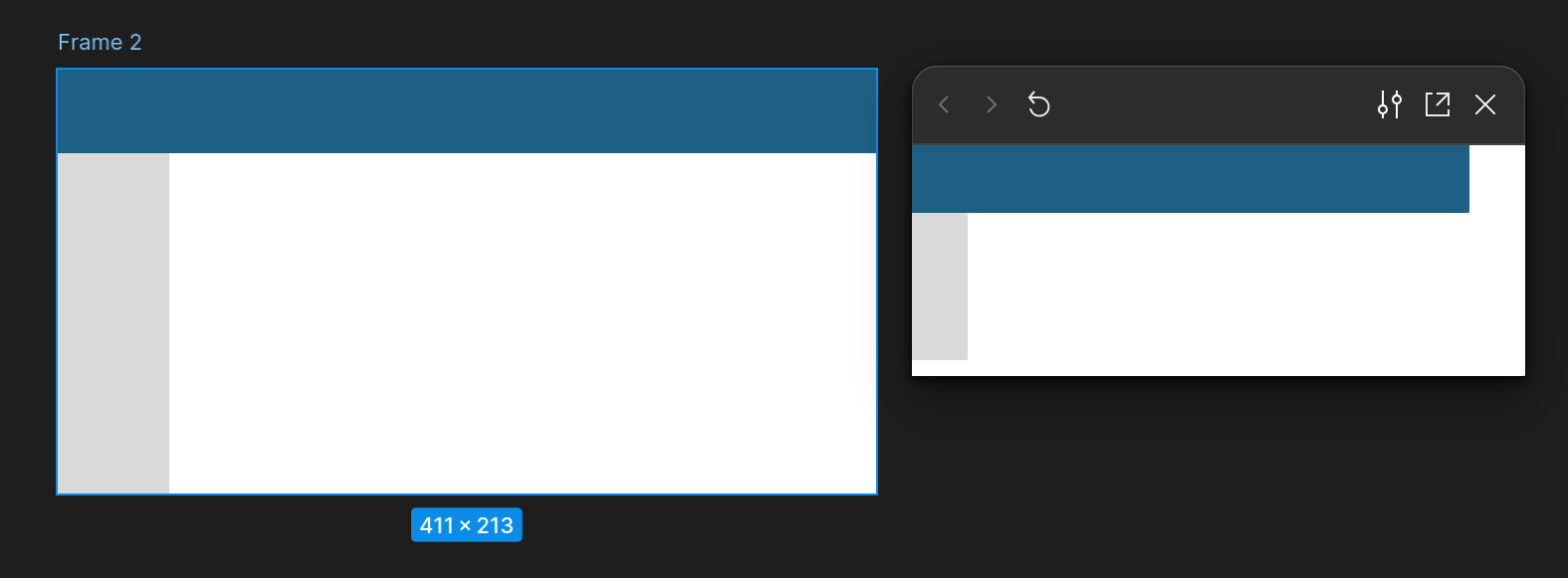
When viewing a prototype in responsive mode it enables scroll when the viewport height is less than the designed height. Even when it’s set to No scrolling, there is no min width or height etc.
I want the prototype to be responsive, have it adapt to the size of the viewport of the user, whether the viewport is bigger or smaller. When I need a min size I can always define a min width/height.
Making the initial frames of prototypes much smaller than what’s common is cumbersome because it’s makes it harder to work with the page. You’d always be looking / working with what’s an edge case.
It can lead to weird issues, where once you’ve scrolled through a child element it will scroll the whole page:
Example file:
Figma – 1 Oct 24Is there a workaround?


