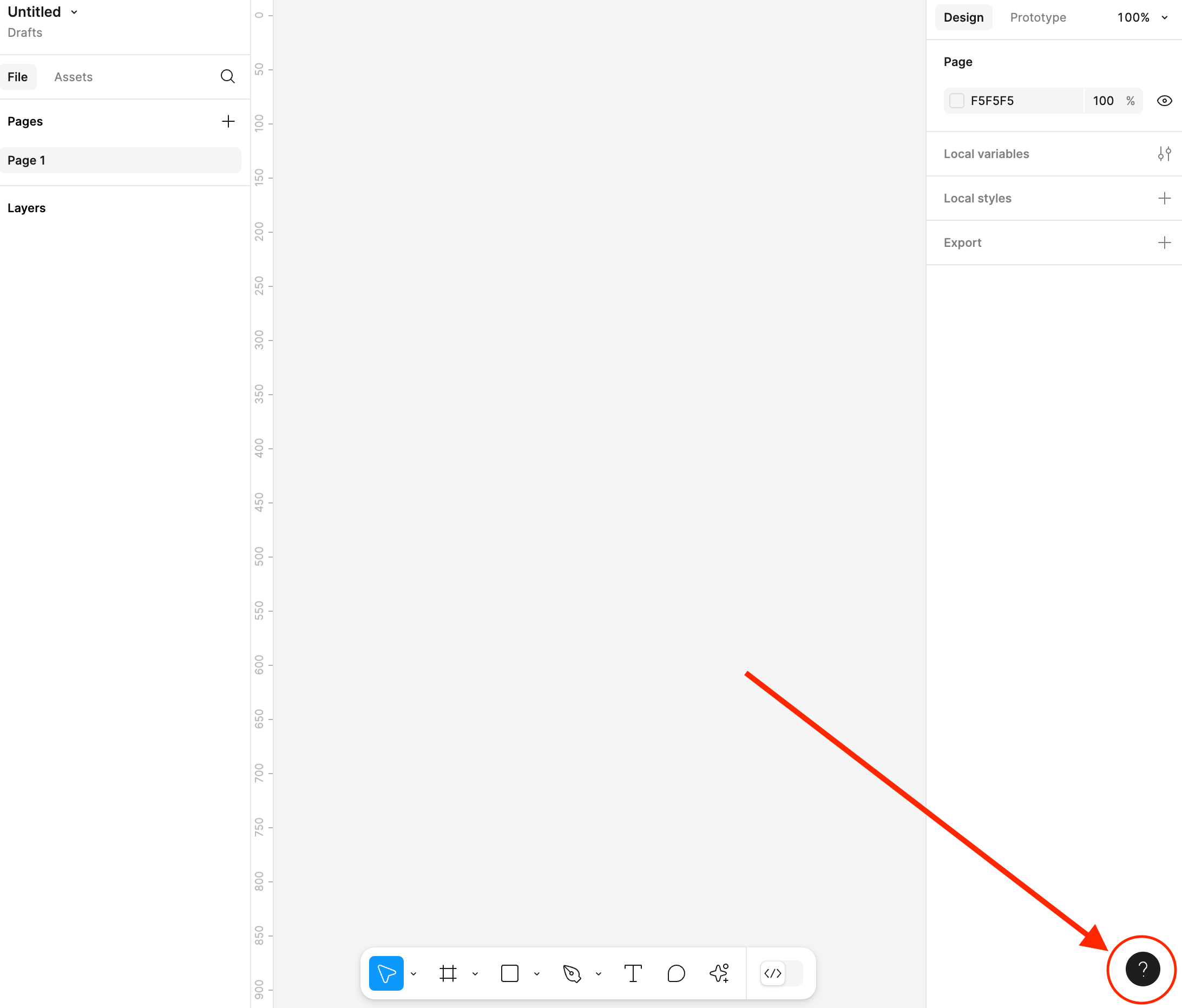
The toolbar is now a floating bar in the centre of the bottom of the page making it look like something has been put in the way of the design space, the same for the left and right sections of the interface, these now feel like immovable boxes on top of my design rather than having a solid, neatly contained design space - I appreciate the extra space, but if that’s what we want, just allow for greater collapsibility of the left and right sections or make things slightly smaller to fit more into one space without compromising on readability. Seeing a tiny sliver of my design on the far side of each sidebar is useless to me - push them flush to the sides. I struggle to navigate the right-hand sidebar, it doesn’t feel intuitive even after 2 weeks of constant use, navigating so many changes brought about in this new layout, slowing me down amid a time-sensitive project.

Hey @Jennifer_Don, thanks for the feedback!


Everything you’ve mentioned is already on the UI3 team’s radar for improvement - stay tuned!


x.com

Another vote for letting us move the bar back to the top if we want to. Figma is a powerful tool, but often falls down on the UX basics. I don’t think it’s unreasonable to expect a tool for UX folks to offer a more nuanced UX. It would be beneficial to journeymap various typical UX tasks and see how un-streamlined they are. You want a learnable tool, not one that requires us to watch a video if we haven’t performed a specific task in a few weeks.


Can we choose between the interface before and UI3? Everything has changed so much, and the library arrangement is so frustrating. I miss the older version.


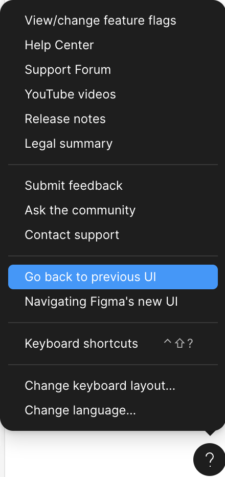
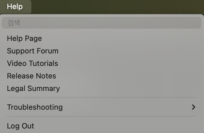
Hi there, you can toggle between UI2 and UI3 from inside a design file, open the help menu and click “Go back to previous UI”.


I can’t find it…


😵‍💫


So sorry for any confusion!

Thanks for sharing screenshots.


  1. When you open a design file, you will see a (?) icon in the bottom right corner of the file.

  2. Click on the icon, and it will open the Help and resources menu.

  3. Within that menu, you will find the option “Go back to previous UI.”


Found it. Thank you!!


Great! I’m relieved.😊


The worst thing about the new UI is moving the order of the right sidebar items. Alignment occupies too much visual space, I can’t find position / width / height easily…


It’s all those grey containers around every element: not only they’re too wide, they create a huge cognitive load everytime I have to find a UI item. Even the ‘Selection colors’ section: why does each color item need a border around it?


I’m honestly relieved that I can continue using the old UI.


Another vote for the ability to dock the toolbar at the top (vs. having to switch the whole interface back to the original design). This would respect Fitt’s law by co-locating controls and reducing the time spent trying to move around the interface to find controls. Also, most users of Figma are working in browsers or desktop apps, which also tend to organize their controls at the top or sides (like the tab bar in the browser).


Reply