I am a developer, and we’re trying to figure out if Figma is something we want to use in the company I’m hired in.

The designers started using this recently, and made the button states as variants, which i guess is how it’s done in Figma, so it has a variant for hover, focus etc. But it could’ve been any component with different variants, doesn’t matter.


I am wondering if there’s really not an easy way to see the difference between two variants, preferably while in dev mode? Here i would think i could click, and somehow compare them.


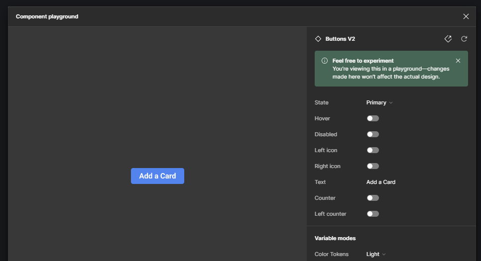
Going into the playground i can swap and visually see the difference, but only visually…


Going to the main component, i can try to figure out the difference, but it doesn’t seem “safe” and it’s also just very time consuming and annoying having to leave the main page of the design 300 times, when trying to design an entire page.


Is there really no easy way when on the “main” page of a design in dev mode, where you click on something, to tell that it has different variants/states, and the difference between them… Or just swap between the components variants?


I can be on the main page in non dev mode, and swap between the variants in the dropdown, but that will alter the design as well. Actually swap it to another variant, when i have edit access.

@Jesper_Ransborg


Hi there


Figma is the right tool when the designer knows how to deliver it to you. First of all seems like you guys want to design something new or not much grown. I suggest to tell the designer to follow atomic design systems.


Secondly, you can see the variants of the component in the playground, just hit the Open in playground to see the components other variants or settings, But if you want to see the coding styles it’s only possible when it’s provided to you currently though.


The designer must provide you with details of its master component states in a file and you guys can recreate that master component same as the design. This way both design and code have a same mentality and component base


@SohrabNiroo Everything we do is from “scratch”, we’re making new websites for customers. But our designers just switched from sketch(I think) to Figma. I assume it’s because the designer is making the elements in a different way than intended, or because we have limited stuff on our buttons etc. still.


Lets just take a button as an example, but it could be a card or whatever.

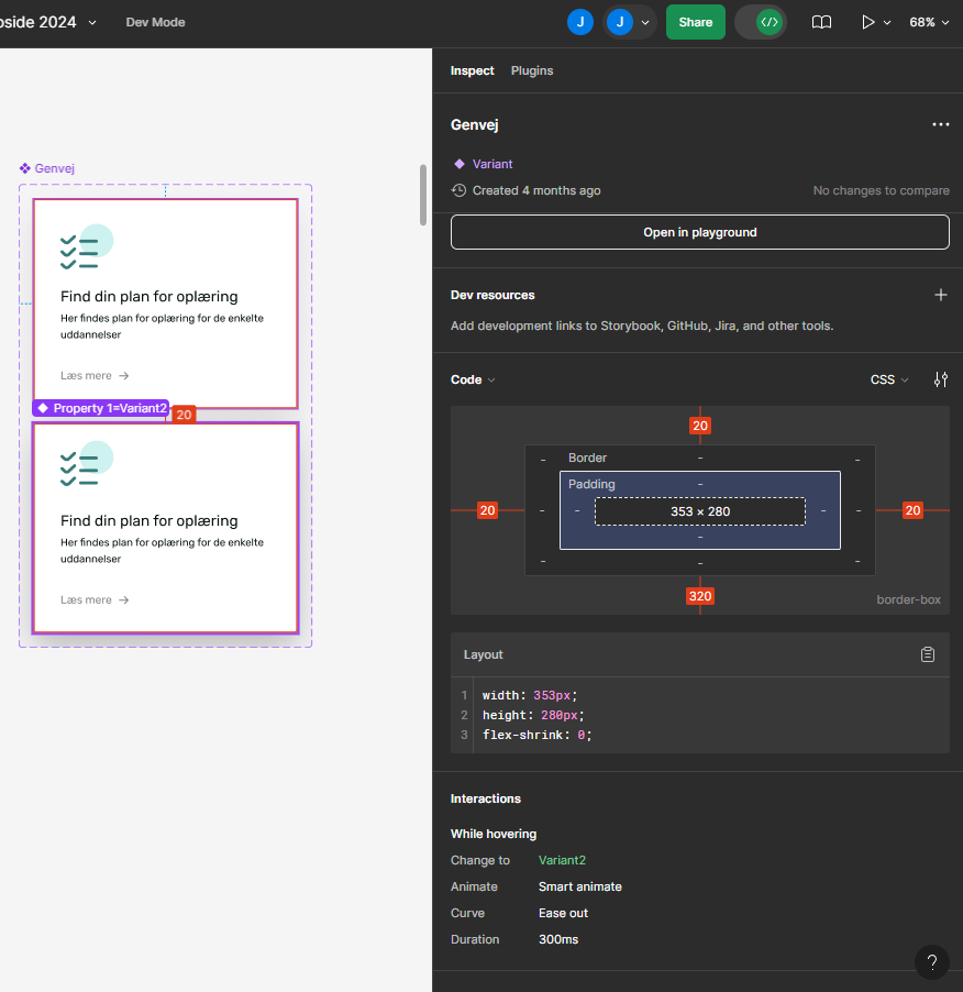
When in dev mode I can see the button transition is going from variant 1 to variant 2 in “interactions”, but not what the difference is. So i have to manually try to figure it out by clicking on both of the button variants inside a component set. But making an entire page doing this, I’ll spend more time trying to compare variants than writing code.


I’m only able to click on a single variant, and go to the playground with that. This doesn’t really give me anything except seeing those two variants visually, which i already can in the component set.


It’s like there’s something missing, I don’t think it should be this hard to see the difference between variants… If we are even supposed to use variants for changing between default/hover/focus.


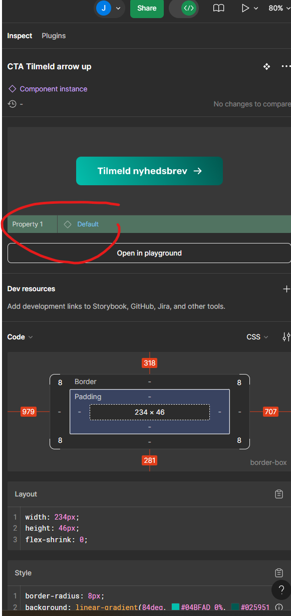
Hey Jesper, looking at your screenshots I think the issue here might actually be the file and property names. When designing components in Figma you can easily create and change the names of properties, and give them default values etc.


E.g. In your screenshot with “Property 1: Default”, the designer can double click the property name when selecting the component and renaming it to “State”=“Default”, then the other variants would get different values such as “State”=“Hover”, “State”=“Press” etc. I suggest you or whoever designs the components should name everything as clearly as possible to avoid ambiguity.


This can further bridge the gap between design & development if the naming convention used is based on a standard used by the company/client as a whole.


I got you, Yes you guys are looking at this in the wrong way a bit, Like @mugtaba.g said your designer must name the layers carefully. And this is a bit rookie job to leave them as default. It should be stated in booleans or other values. Once switched to Figma, you never go back to sketch.


And about the states, The designer must provide all the details of a master component in a file to you and you guys create the master component based on that and reuse it anywhere


The screenshot I shared (I know it’s blury), contains all the states of one master component and DEV will design these states and reuse it across your design based on the variant or settings from the main master component.


If you need me to help You deeper on this tread, contact me and I will give you more information on how to follow this kind of patterns so your products won’t fall into a messy environment.


Hope I have assisted you well


You can see here for example on one of our cards, it doesnt have many states, just a hover. But it’s not easy to see what is added/removed etc, when changing from default to hover. Like the actual differences between them… This is in our “component” page. Where when we use it on the page, it changes on hover from one to the other… but then i have to go here every time, and click on the default, and hover variant to compare the differences manually. I don’t really know how to explain it any better, but it’s very time consuming.


Do you mean that you expect to see some kind of git-like differences highlighted or just a notification of? From what I’ve seen elsewhere it seems like it does highlight changes made in an instance of a component, there might just not be visible changes in that last example. See this vid segment to run through some of the features that should be utilized by both the designer & devs. (I don’t have access to it so can’t look into it more)


As far as I understand, the point of Figma’s design handoff features is to make it so devs don’t need to double check those things every time and can just drop in styles & property values based on the labels and documentation Sohrab mentioned, and dev mode helps engineers review and push individual parts by further clarifying specific details of new designs and changes to old ones, if it’s executed well. E.g. naming the component variants & properties accordingly, setting the actual properties of the component whenever possible, adding notes about guidelines such as max or min sizes or flex scaling, using the annotation features in the canvas UI to highlight the important properties or changes, and marking ready for dev.


Also, consider Framer or Subframe for your dev/prototyping workflow instead which should offer better code inspection (most alternatives also have a plugin to migrate designs from/to Figma)


I would just expect to see what is being added or removed when one variant is changing to another. Instead of inspecting both of them manually, trying to spot the difference by clicking one and then the other.


Kind of like if you inspect something in Chrome Devtools and change a state to hover/focus, you can see all the styling changes.


Reply