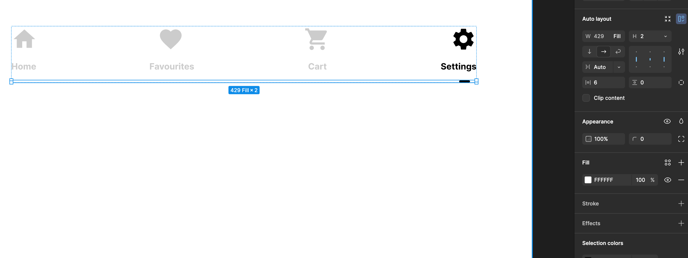
I am having serious issues trying to line up the Settings Icon with the text below, to be centered

I have 3 frames, all are on auto-layout, exact same width, the first 3 icons & text seem to have aligned in the middle, but the last one, only on the right


Attached images to all the 3 frames I have - the icon frame, text frame & slider frame

It’s an issue of the architecture:


  1. Add a frame around a set of one icon and one text

  2. Auto-layout the new frame with vertical layout

  3. (only if required) If the icons are different sizes you may need to wrap each icon in it’s own frame giving the frame a fixed height and centering the icon vertically

  4. Add your preferred gap value between the icon and text and add padding

  5. Pro level: make this individual set a component and add properties to swap icon and edit text and variants to support your required states (hover, active, etc)

  6. Duplicate and swap out icons and text for each one

  7. Frame the group of 4 sets and apply auto layout as you have in the screenshot above


This will also help your engineers when it comes to development because it will be structured they same way an engineer would need to build it, allowing them to inspect and get direct values for sizing and spacing.


Hi Ben,

Appreciate your response, I already tried that version.

I forgot to mention that I need the frame on the bottom (the one with the little line, spacer) to be aligned horizontally, in order to create that smart animation effect I am looking to achieve. When I line everything vertically, there is no animation, just a boring transition between the elements.


What animation are you looking to achieve?


The one where the little bar at the bottom moves gently, softly between the elements

I only managed to achieve it if the elements are aligned horizontally, in one frame


Can you share a file?


I managed somehow to pull it through

Thank you for your help, appreciate it


Reply