Solved

Why in MOBILE doesn't close my variants?


SoyDiego

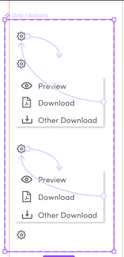
Hi people, I have two components and works perfectly when I look them with my LAPTOP.
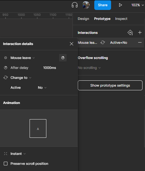
When you click, show a menu (other variant) and when mouse leave, disappear.

I sent the link of the prototype (this link https://www.figma.com/proto/XQXakrIJSWcsnws68ZKOrg/CitizenPortal?page-id=656%3A1992&node-id=656%3A1993&viewport=718%2C477%2C1&scaling=min-zoom) to my MOBILE and I have seen that when I click on my components, never close :(.

Do I need to do something different there?

Thanks

Best answer by MattyH

Ah I see! Thank you for sharing the screenshots 🙂

I always find it helpful when prototyping to think about where the final product is going to be used.

For example if the components you are making will feature in a prototype of a mobile app then you would not want to use hover/mouse enter/mouse leave as interactions for your prototype as this would not represent the real world scenario.

Think about how you would like this to interact on a mobile device, would you instead be using a click (tap) to interact?

When the component is in it’s ‘open’ state, how would you then close it from a mobile device? Would you have to tap the icon again?

I hope this guides you to a solution 😁

View original
This topic has been closed for comments

5 replies

SoyDiego
  • Author
  • 11 replies
  • August 22, 2022

Hope someone can reply me 🥹


MattyH
  • 15 replies
  • August 22, 2022

Hey SoyDiego!

What triggers are you using to open the menus that appear beneath your icons?

It looks like there is something happening on “mouse leave” which could be the issue you’re having when viewing this on a mobile.

Screenshots would be really helpful 🙂

Matty


SoyDiego
  • Author
  • 11 replies
  • August 22, 2022

Hi @MattyH thanks for replied.
I’m using mouse leave after 1000ms, here you have the screenshots:

I don’t know is because i’m using Mouse Leave and in my MOBILE can’t use this trigger.

I want to clarify that it is not in my browser adapting it to mobile size. I literally mean my cell phone haha

Thanks again!


MattyH
  • 15 replies
  • Answer
  • August 22, 2022

Ah I see! Thank you for sharing the screenshots 🙂

I always find it helpful when prototyping to think about where the final product is going to be used.

For example if the components you are making will feature in a prototype of a mobile app then you would not want to use hover/mouse enter/mouse leave as interactions for your prototype as this would not represent the real world scenario.

Think about how you would like this to interact on a mobile device, would you instead be using a click (tap) to interact?

When the component is in it’s ‘open’ state, how would you then close it from a mobile device? Would you have to tap the icon again?

I hope this guides you to a solution 😁


SoyDiego
  • Author
  • 11 replies
  • August 22, 2022

Thanks @MattyH! Now I did it 🙂


Cookie policy

We use cookies to enhance and personalize your experience. If you accept you agree to our full cookie policy. Learn more about our cookies.

 
Cookie settings