Okay, I know children elements lose control over it’s contents alignment and inherit their parent’s auto-layout settings. However, I find it would be really useful to allow anchoring for contents that have “Hug contents” ON when inside an auto-layout parent.
I’ll try to show an example of when that could be useful:
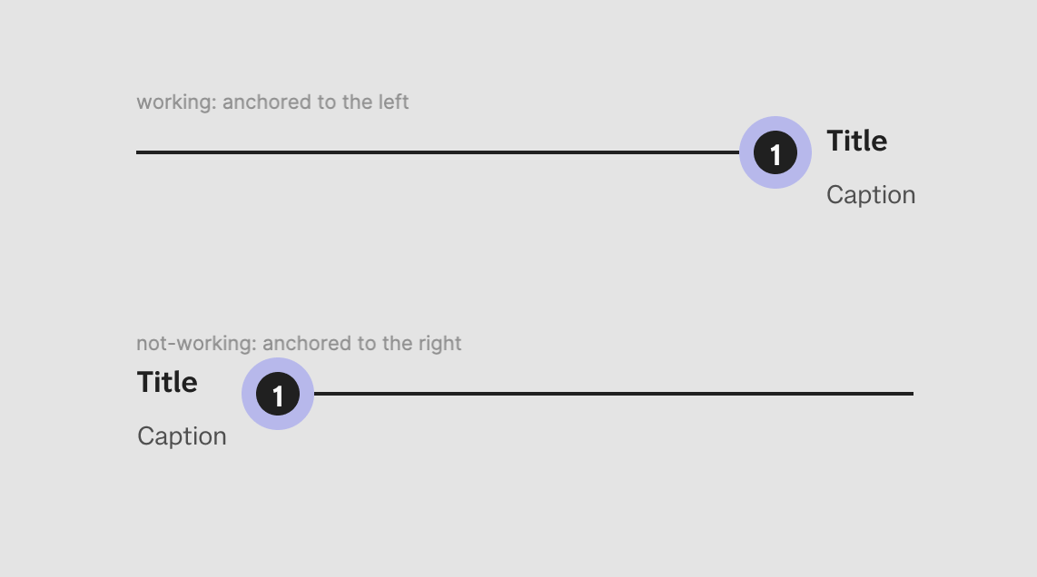
These are two components with the exact same structure, and settings except for the elements order and for the text alignment. The upper has text-alignment=left and the lower has text-alignment=right.
The text box stretches as I type because both texts and its parent have hug-contents ON.
The text box, however, preserves it’s size when I redimension the component’s width allowing me to stretch the line to pin more distant informations without losing the text formatting.
The same thing goes for the component bellow, with the exception that it’s text is aligned to the right.
You might have already started to see the problem: Shouldn’t that title be glued to the right next to the number bubble?
In fact I know the lower component’s text IS properly aligned to the right, but as its box is always hugging its contents I just can’t notice that. Nevertheless, the result is that I have a parent frame bigger than one of its text elements (the title in this case), but the element is anchored to the left and I can’t set it to the right side.
I know I could use fill container and that would visually “solve” my issue.
But that limits the width of my text box.
And incurs in a series of other problems such as:
The “description” frame width is still set by the content that has “hug-contents” ON. That means if I type a very short caption, it will break-up my title.
And if I set both to fill container, I will end up with a component that stretches both ways - the pin line AND the text box.
That will even break my text if I narrow it to much.
So what I’m asking is to be able to have both elements AND their parent with Hug-contents allowing whichever element is wider to control the parent width, ALTOGETHER with having my intended alignment (reads anchoring).
Probably there is another way to design this component to do what I want, but let’s look at this as a case study for what I’m proposing.
Thanks for reading!


