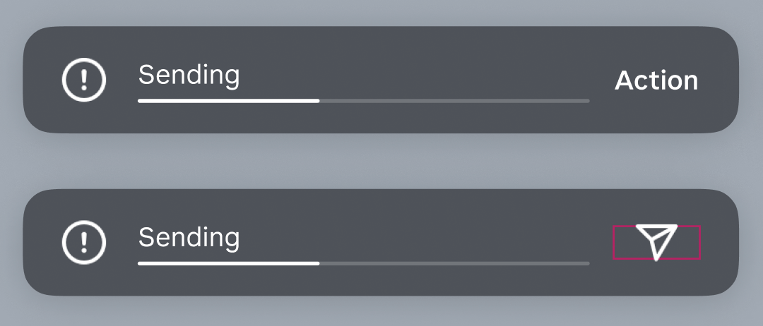
Hi there, I have an issue swapping between with two different type of nested components into a main component that is consist of a icon label that needs to swap between actionable text icon and a standard icon (it either stays in the text width or the icon width. What is the best way to handle it so that it is more flexible between the two component styles so that the padding on both sides will stay constant (hugging both icon and text width)?
The only way i can think of so far is separate the two instances (icon and text), which has more instance involved, not ideal.
Please advise.


