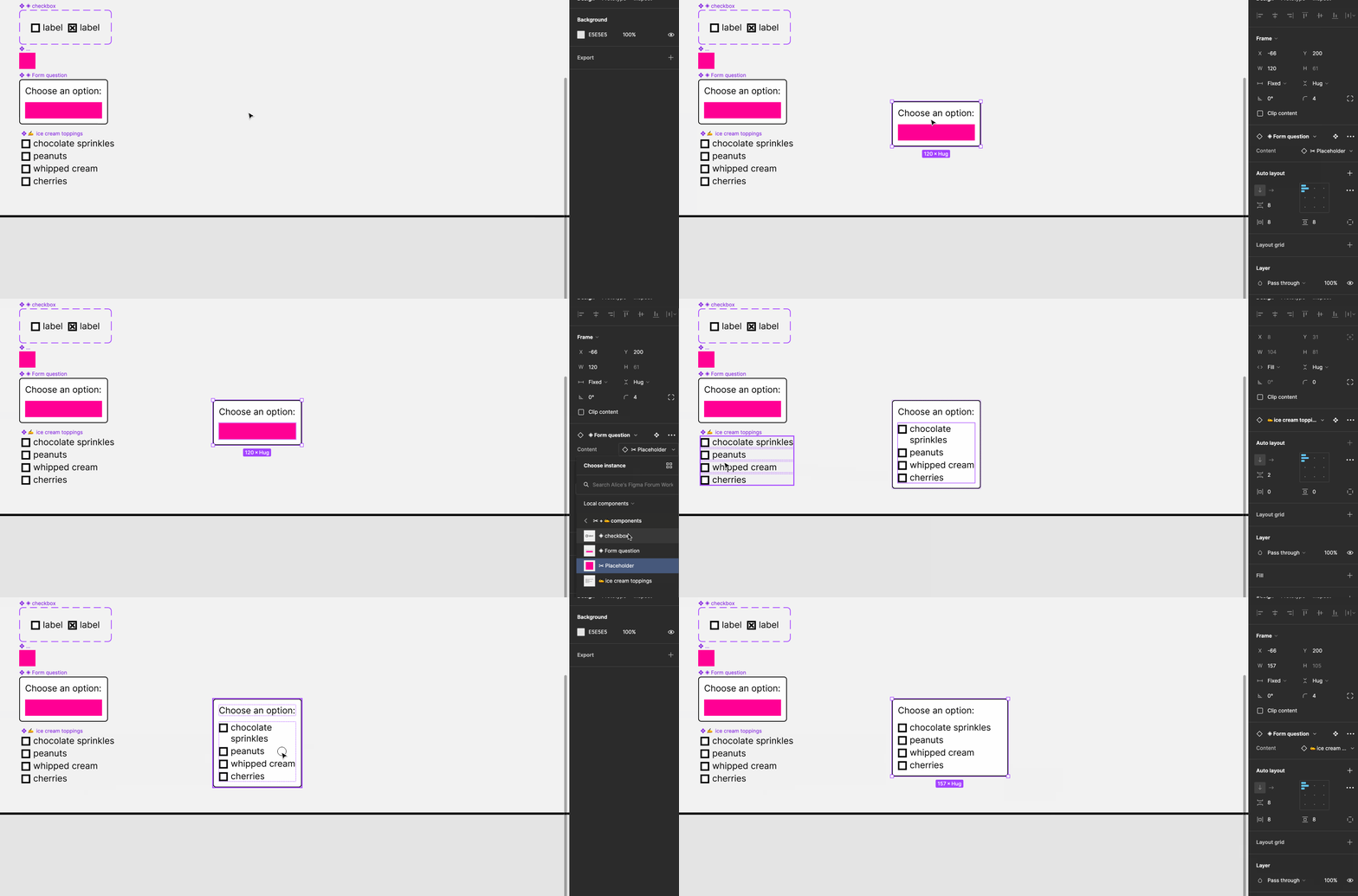
I work on a design system team and have an issue with creating components or patterns with multiple elements or utility components inside of them. (For example, multiple radios or checkboxes inside of a checkbox/radio group component.) As a result of designers not being able to have the amount of items needed within their specific workflow, they have to detach the component and copy the elements and utilities manually in order to accurately mockup a user flow.
This inherently creates a divergence between our components and the designer’s figma files as they’re no longer using the design system’s components.
Workarounds currently for this are to create a component with a massive amount of duplicate elements in order to solve for larger edge cases, or to make a massive amount of variants just for the quantity of elements or utility components inside of them.
That’s why I want to propose a new prop - A “Duplicates” Prop. What the workflow would be is that it would live as a prop alongside the Boolean, Instance swap, and text properties in the current component options. When a user selects an element or a utility component they want to duplicate, a modal appears giving a value range for a minimum amount of copies of the element (Optional) as well as a maximum value (Also optional, and unlimited by default.)
If a value range is left to be unlimited, the duplicates prop is set to be a text field where users can enter a number value to represent the amounts of the duplicates they’d like within that component (Can also set a default value from the master component). If a user selects either a maximum range or both a minimum and a maximum range, a slider appears that allows the user to easily add and remove duplicates based on the range set.


