I have made a group of components for a context menu. The idea is that the width of the context menu will grow accordingly to the longest item in the list. However the other list items have to grow as well in order to keep the trailing icons aligned.


This does work as detailed in the video as long as the group is a component in itself. However if it is a regular auto layout group it behaves unexpectedly with the traililng icon staying in place and the text layer going on top.

Hi Arvid, could you share the file? I’m just curious if this is really a bug and don’t want to reuild the layout from the video…


Hi, here you go:

Figma – 7 Oct 22

Thanks. It seems bugg-ish although it’s actually a nice hack to achieve this effect that you actually can have the container stretch based on one item. Which I thought was not possible because you had to decide to apply packed with hug or fill to the menu item. Applying “Space between” never occured to me because this setting automatically sets the parent to a fixed with (or fill) but would not work with hug…


However, when nested inside a component the “bug” allows the item to still keep it’s hugging behaviour, as if it was set to packed. It even keeps the initial value that’s specified in the list item componente but overridden with “auto” through space between.


There is no issue. The parent frame is set to hug content so when the child element grows it would also grow the parent frame. You can make it stable by setting fix width to the parent frame and make all the children to fill the container


I would argue that there is a bug.


The parent frame is set to hug content so when the child element grows it would also grow the parent frame.


I know. This is the behaviour i was going for. What confuses me is why the non-component variant of this lets the label container grow over the icon but on the component variant it doesnt.


This method is very hacky in general as it uses the spacing value I set when the spacing method was still turned to packed.


I guess the non-component behaviour would be the expected behaviour but it is still weird that it is different from the behaviour you get when you turn it into a component.


Thanks. It seems bugg-ish although it’s actually a nice hack to achieve this effect that you actually can have the container stretch based on one item. Which I thought was not possible because you had to decide to apply packed with hug or fill to the menu item.


It did take a lot of trial and error xD

I spent a lot of time wrapping my head around how I got it to work in the first place a few months ago, when I looked at it again today. The weird behaviour of the non-component version certainly didn’t help lol


Edit: Actually the longer I look at it the less it makes sense that it does work 🤣


This is an official video as far as I am concerned. Here Office Hours: Auto layout redesign - YouTube you can see a behavior that’s works exactly in the same way as your example. I guess Figma team made fill element stretchy for this exact purpose


I rebuilded Arvids example with the technique showed in the video.

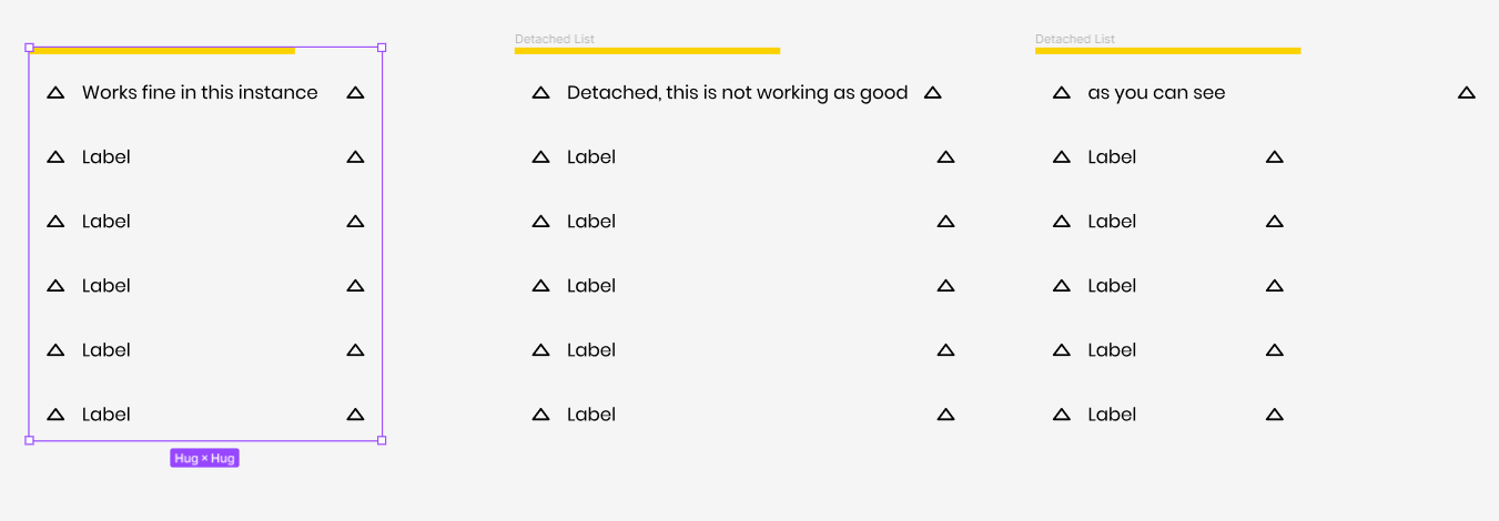
Works fine, as long you are using it’s instance. If you are detaching the component it behaves weird and buggy. Especially if you reduce text afterwards the width of the component doesn’t get updated properly as you can see here:


I already saw multiple threads where people were facing issues with this “fill” setting (myself included) and I’m sure this is another related one.


This topic was automatically closed 90 days after the last reply. New replies are no longer allowed.