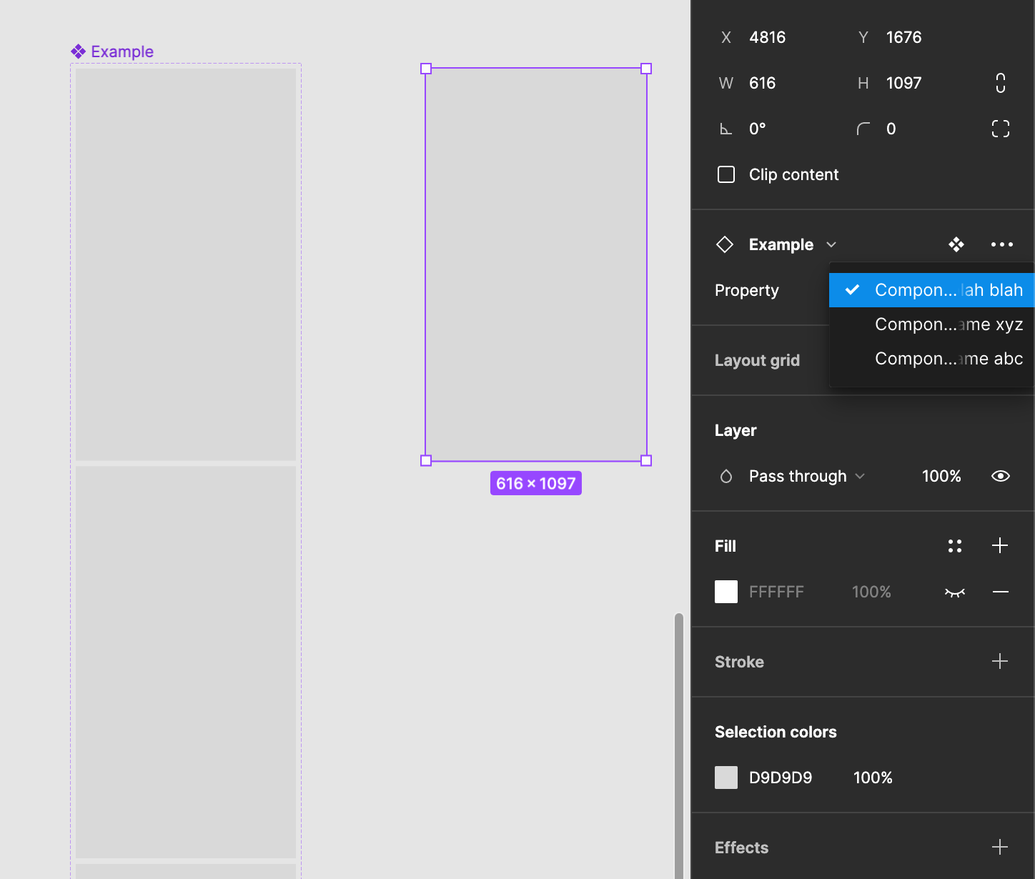
When working with components, variants with similar names, become difficult to differentiate between due to the list being cut off unnecessarily. Short names are not always achievable and it is counter intuitive to component swapping when you can’t read the variant names.
Additionally, Figma also doesn’t provide a tooltip when hovering over the title so it becomes a case of simply having to randomly click to find the correct variant you are looking for (which is of course frustrating).
To solve, can the list width be extended? Obstructing the UI behind it isn’t an issue because you can simply click anywhere outside of the list to close it.
Whilst the below example appears to be easy to differentiate the differences (abc vs xyz), it is also a very simple example. Real variant names are often much harder to read.