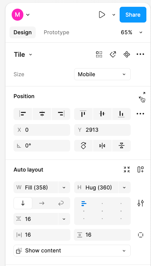
I appreciate the idea behind the menu updates in UI3, but it seems like the team made some decisions about what should be shown at the top level that users here are regretting.
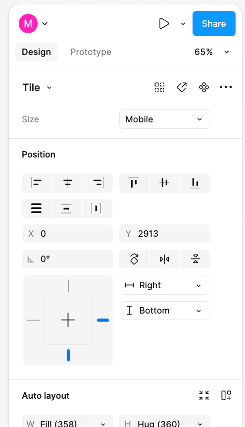
It would be nice to have an “expand” option on each section of the right menu, that lets you by default see all of the properties/tools available for that section, without going into the overflow menu.
Here’s a mock-up:


