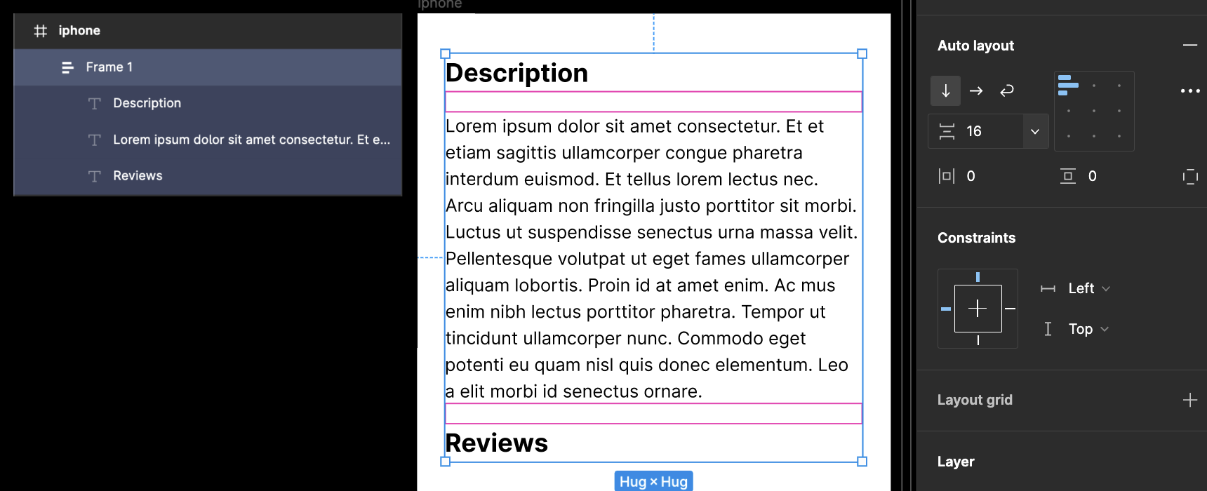
As shown in the picture, I am adding more text into the text box. However, I expected the text box will remain the space between the underneath heading “Review” by pushing the heading down. But the text just runs over the space in between and will eventually overlap with the heading. How may I create a layout to prevent this kind of problem from happening?
Solved
I am a Figma beginner, have question regarding how to remain the format of the layout when adding text?
Best answer by uxcal
Hi Jayan,
This is when auto layout comes in handy! Select your text layers and press shift + a to create an auto layout, so that the gap between your text is maintained even if you add more text.
This topic has been closed for replies.
Enter your E-mail address. We'll send you an e-mail with instructions to reset your password.


