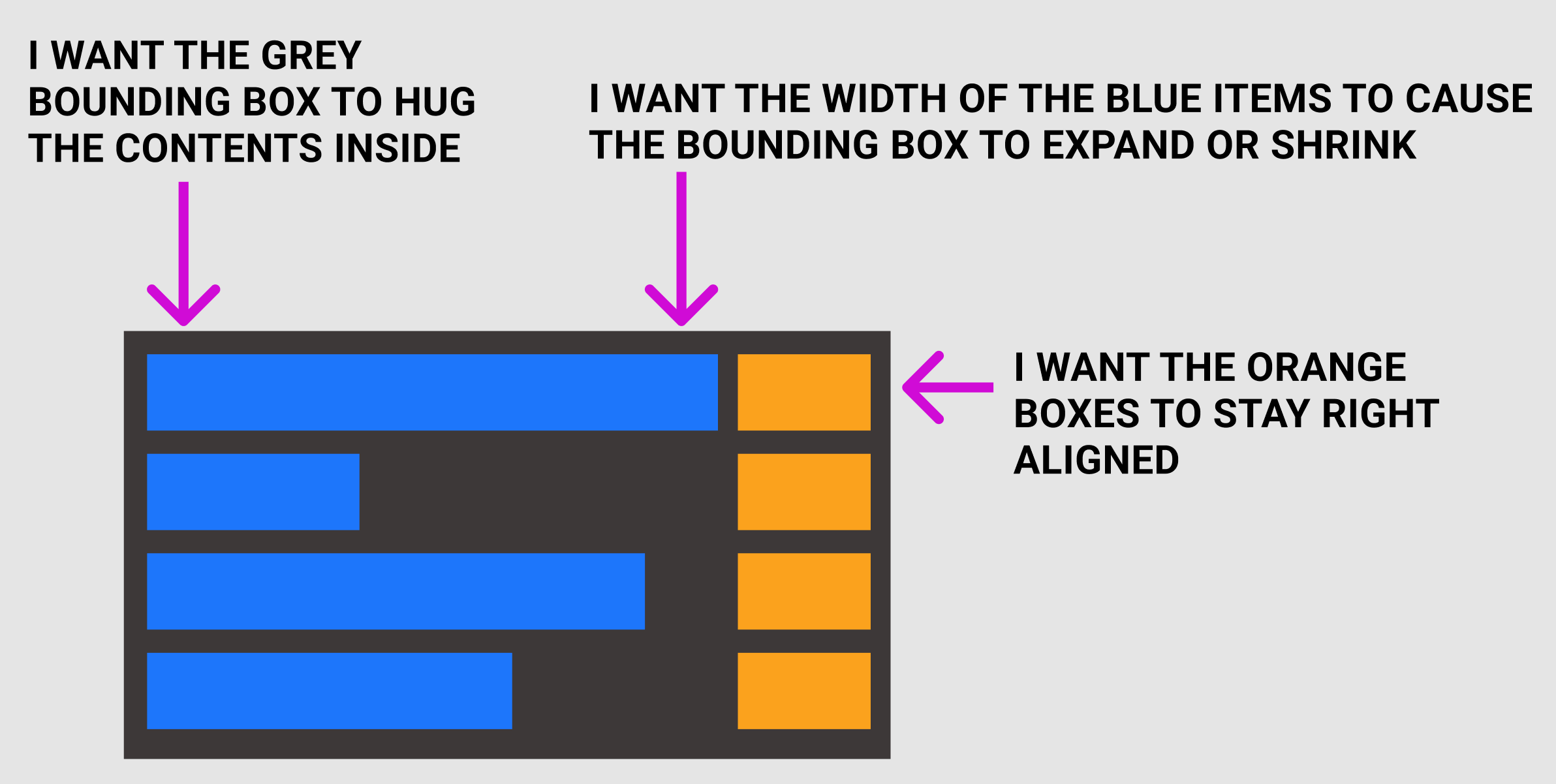
You can use Auto layout to achieve what you’re looking for :
Your Grey bounding box has to be a auto layout with a horizontal layout and a width set to hug.
The container of the blue boxes and the container of the orange boxes also have to be an auto layout, this time with a vertical layout and a width set to hug. With the hug constraint, those containers will be as wide as their wider child
I was actually able to figure it out - I had to create a frame for the left aligned items and one for all the right aligned items. Thanks for the response.
I ran into another problem.
This component that I’m trying to create is a left nav with a right aligned icon for a dropdown for sub nav. And I just can’t make it work. I need the right aligned chevron to stay right-aligned, but also for the whole thing to hug the length of the longest nav text. And then for the ‘active’ and ‘hover’ state, I need to have the whole row with a background color. Help!
With dropdown menus, I don’t think it’s a good idea to use a vertical auto layout for the texts and a vertical auto layout for the icons.
An icon is more related the text on its row, they should be in the same horizontal auto layout.
What will happen if you decided to change the font or the text size? Icon auto layout will not be at the same height as the texts auto layout, so you will manually fix the heights.
I suggest you to make each text in a horizontal auto layout with its icon.
The horizontal auto layout of the option that has the longest text should be “hug” horizontally, and the other options should be “fill container” horizontally.