It would indeed be game changing and important if we could get the option to automatically swap between variants based on the actual size of the parent frame. This could simulate real life complete web applications and be really helpful to show when and how a breakpoint should interfere with a component.
Hey @Niclas_Lundberg, thanks for the feedback!
We’ve updated your topic into a feature request, and we’ll pass this onto our Prototyping team for future consideration.
I second this feature as it would be a huge leg-up using FIGMA for responsive designs.
@Niclas_Lundberg you can do that with variables and conditions.
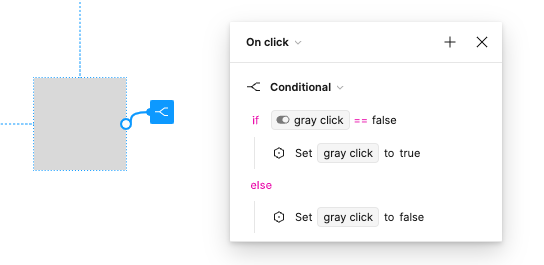
variable for min width and a variable that control the state of a component and a condition:
if “frame-min-width” == “number” then set variable to…
Yes, I guess that makes sense
Where would I apply this condition, as, as far as I can tell, the only possible way to “trigger” conditions is by input - there arent any “listeners” if you know what I mean
Would love your input to I can learn how to apply this and step up my responsive game
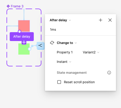
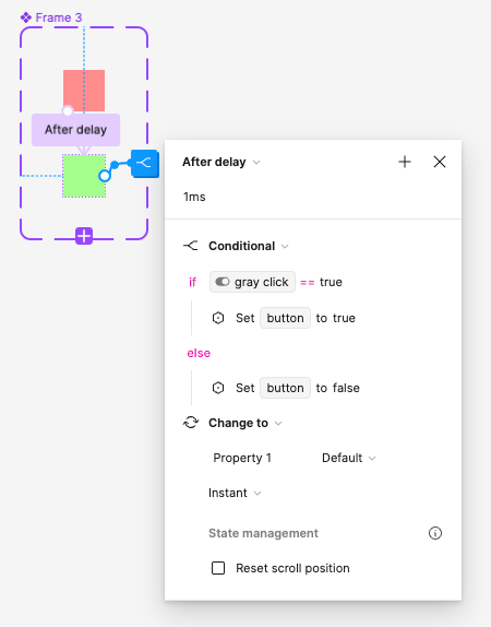
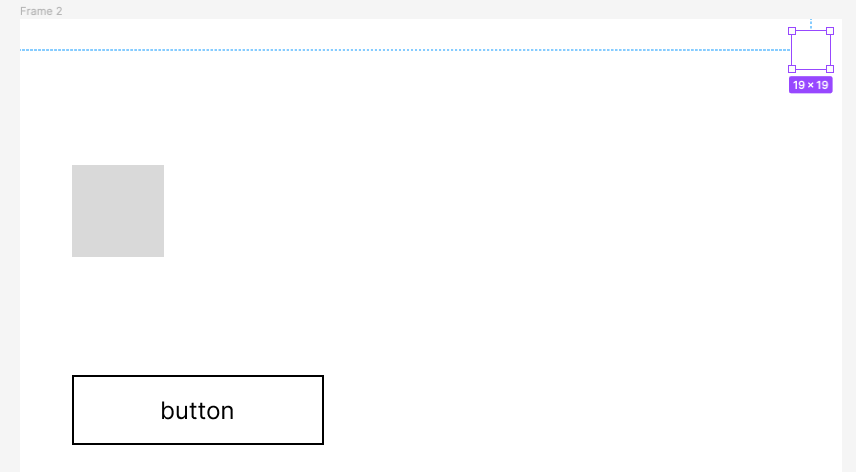
@Niclas_Lundberg you can create an event listener by creating a pixel component with two states(can be 0% opacity), the states switch with a delay interaction in an instant.
only on one pixel variant you will need to place all your conditions.
Oh I see, sort of lika null object just to hold information!
Thanks!
Hi Shaul, do you have any examples of this working? I’m having a hard time connecting this concept. I don’t understand where or how to set the variables for the frame width.
Hey @Jeffro, the main idea is to have a component in your main framework that continuously loops, checks conditions, and makes the necessary changes.
where/how to set a variable: first you need a variable that controls the state of your change. the variable needs to be in the type of the field that you need to change, example: width field is a number variable.
check here for more info https://help.figma.com/hc/en-us/articles/15343107263511-Apply-variables-to-designs