

Sean14
New Member
July 2, 2024

LAUNCHED: Toggle Constraints

  • July 2, 2024
  • 22 replies
  • 7358 views

I noticed something frustrating with the UI3 updates. The “Constraints” settings are hidden behind a tiny button within the Position section of the right sidebar. Maybe the Figma team felt like these settings were rarely used, but they are critical when you’re working with items that are absolutely positioned, and want to control how they resize relative to their parent.

It would be nice to see these settings surfaced at the top level when the selected item is either absolutely positioned within an auto-layout frame, or the child of a frame without auto-layout.
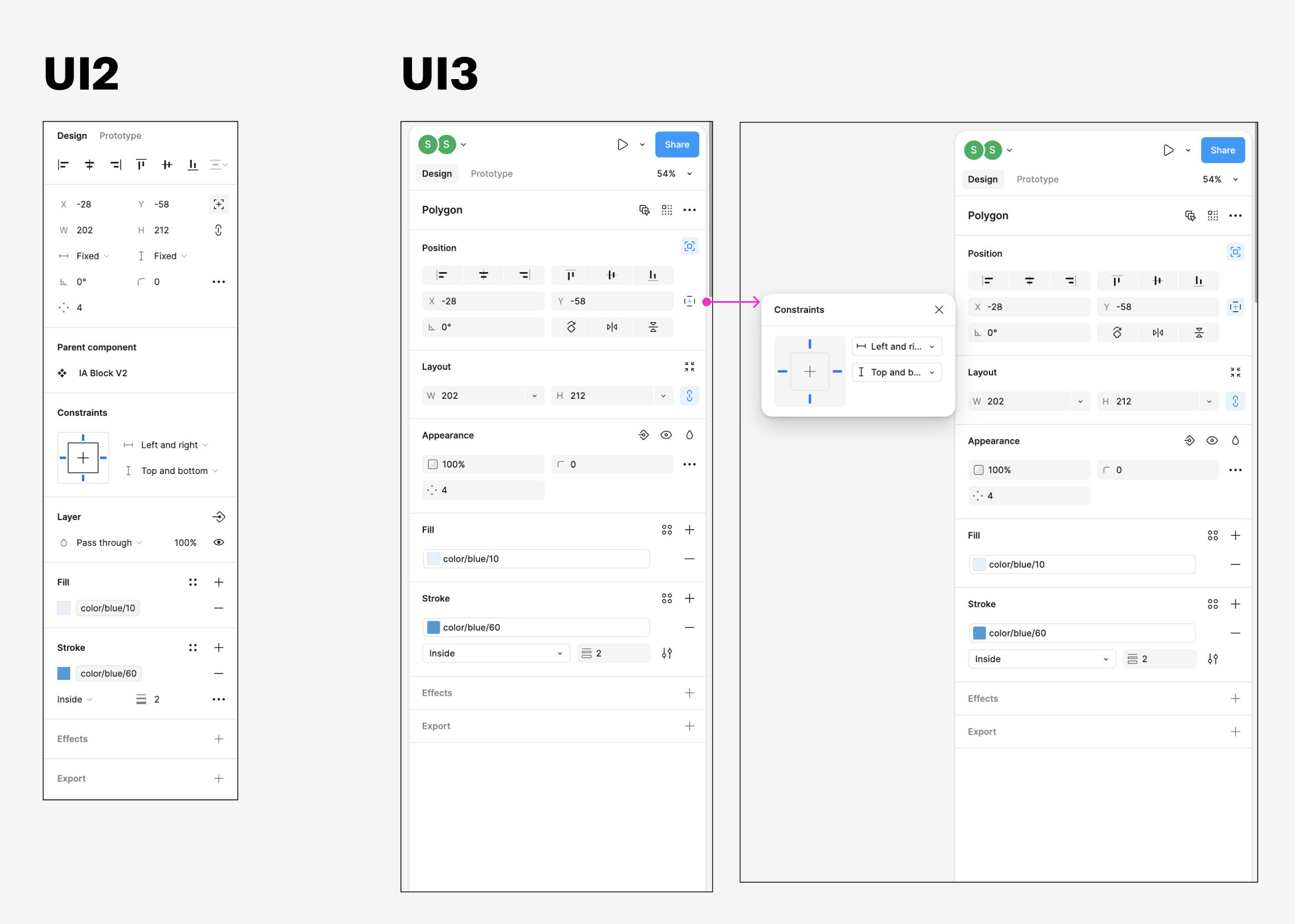
22 replies

megan25
July 3, 2024

new layout is sucks…

Raphael_M
Power Member
July 3, 2024

up for this. I don’t even know why they’ve hidden this.
But for me, I used constraints more than I use this (position):
image

Stefan_Holmqvist
July 4, 2024

I would love a setting for “advanced properties”

Show inline as section or popup

With this we can have the best of all world. For those who use it often it appears below the section where the button to trigger it is. For those who prefer a movable popup they can have it.

It also work in line with the new UI language where they are puttin title on the different sections in the inspector.

As example.

It means that pressed contrains button will show a section below. Looking exactly as the popup but always visible inside the inspector

Same goes for the corner radius. Before it was field inside the inspector now its a pop up.

Technically it should be easy as its the same layout and content as in the popup. They alread have the concept of sections anyway.

Sure it will be a longer panel. But for those who like it why not?

Also currently they are not consistent. There is a buttom for individual padding. Which just add fields. Why is that not a popup?

To make it worse you can only have ONE of this advanced properies panel open. Why? Also if you deselect the object and select it again those popup floating panels are gone so you need to press the button again.

Se attached how it would look with floating advanced property panels vs inline.
Heck for super users, one could even choose what setting to appear inline vs popup

Mia_Lomberts
July 4, 2024

This UI redesign is horrible step back in terms of usability. Im really disappointed in this update. Seems like Figmers been more focused on the way everything looks clean instead of handy. Big thumb down

Shawn6
July 5, 2024

I cant believe they tested this new UI with UX’ers. 😦

Huan_Z
New Member
July 5, 2024

100% this.
The new UI3 has severely impacted my work efficiency! I hope these issues will be taken seriously by the Figma team.

The
Active Member
July 5, 2024

Really, constraints are much more important than this positioning (but it would be great if they kept both visible)

The
Active Member
July 5, 2024

This is a pretty important panel for setting the positioning of an element within a frame. And it was needed not only to enter data, but also to check it. Now a quick glance at Constraints won’t work, you’ll have to take a closer look. Yes the dropdown icon shows this setting, but it does it in grey, which doesn’t help.

How would I solve the problem? Would leave that panel visible in its entirety. Honestly, I don’t understand the Figma designers’ desire to combine everything and hide it. There’s no benefit to combining and hiding important panels. In any case, even in the new interface there are so many of these settings that they go into the scroll. So the point of this freeing up space is simply lost.

David_Gouldson
July 9, 2024

Why would they hide constraints. I use it ALL THE TIME. Free me from your constraints Figma.

Theux
July 9, 2024

Okay, I understand the need to innovate, but why change something that already works? Every user uses that UI every day. There is no reason to hide elements or change positions. It’s really bad to use!