

Sean14
New Member
July 2, 2024

LAUNCHED: Toggle Constraints

  • July 2, 2024
  • 22 replies
  • 7358 views

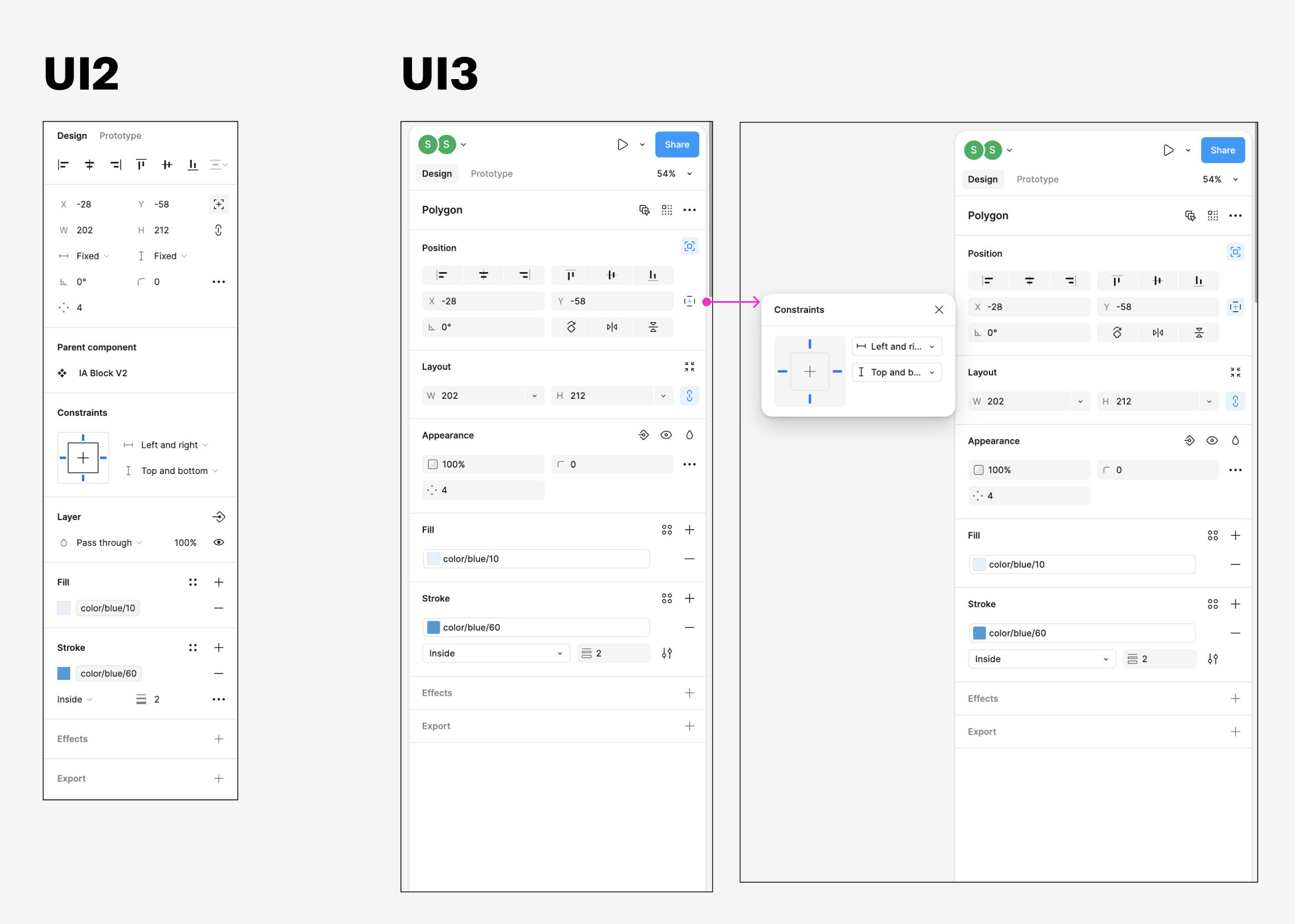
I noticed something frustrating with the UI3 updates. The “Constraints” settings are hidden behind a tiny button within the Position section of the right sidebar. Maybe the Figma team felt like these settings were rarely used, but they are critical when you’re working with items that are absolutely positioned, and want to control how they resize relative to their parent.

It would be nice to see these settings surfaced at the top level when the selected item is either absolutely positioned within an auto-layout frame, or the child of a frame without auto-layout.
22 replies

djv
Figmate
Community Support
July 9, 2024

Hey All, thanks for the feedback!

We’ll pass this onto our UI3 team for future consideration.

Direct_Access
New Participant
July 15, 2024

I also would love to see the constraints visible all the time, but I do not share the negativity in general.

I love how you can now minimize the sidebars and the bottom-toolbar is also a big plus for me (less mousetravel on big screens).

Things I don’t like are the extra click in the “interaction-context-menu” to change or read the state-props and the location of width/height of elements… I keep on searching where they are… they just don’t pop out or aren’t placed where I would look for them (even after spending some good hours working with it).

It’s a beta, so I hope the good bits stay and some changes will be done to mitigate some regression.

Jamil-EDX
New Member
July 15, 2024

It’s odd. You can even adjust the panel to be wider if preferred. That would be a great opportunity to show more settings in full, like Contraints, but sadly not implemented.

RCS
New Member
July 19, 2024

I don’t even find the “Position” Section!!!

Julia57
Active Member
July 31, 2024

Agree. I almost NEVER use the X and Y position, yet it takes up so much space right in the middle of the panel where my eyes go to by default.

The other thing is that depending on whether or not I have a component selected, the SAME SPOT is taken either by position OR by dimension – and they look freaking identical on first glance. I can’t count the number of times I’ve accidentally tried to use the position boxes when I wanted the dimensions.

I feel in general the new UI has zero sense of hierarchy at all and its really hard to tell one thing apart from another.

Julia57
Active Member
July 31, 2024

Agree, it was way faster to just scroll, than to aim the cursor on a tiny tiny box and open a popup

Michal_Kucera
New Member
August 5, 2024

Disabled the new UI3 thanks to this, I use constraints all the time

August 5, 2024

Adding my two cents:

I’d never use the buttons to align my elements instead of Option+WASD, but I understand that maybe this is good for new users or people who are used to working in PowerPoint.

Although, what I wouldn’t agree on is that these buttons are more important or deserve their screen real estate more than the positioning constraint buttons.
This feels really weird and I’d like these options to be
a) more visible / scannable and
b) easier to change.

A cool additional feature would be a possibility to change a constraint to “Scale” with one click instead of selecting it from the dropdown.

djv
Figmate
Community Support
August 7, 2024

Hey All, thanks again for your votes and continued feedback!

This is already on the UI3 team’s radar for improvement. Soon, you’ll be able to toggle on the control so that it displays inline - stay tuned! 🙌

x.com
Jowita
August 21, 2024

I’m with you. I loved the previous layout. It’s not a very accessible app now. I want to think that the more I use it the more I appreciate it (“users don’t like change”) but it’s very unintuitive (i.e. I used to be a new user when I used Figma for the first time in the past - loved everything about it then).