

Hey, maybe I’m missing something but making responsive designs seems to be quite a chore. In order to align the content (take a simple landing page for example), on both web and mobile breakpoints, I tend to work with both on the same Page.
For example:
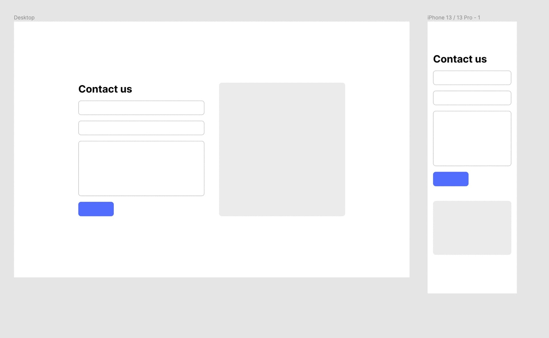
Now when Figma allows moving File/Prototype tabs into a new window (which I move on my secondary screen) could be fun to be able to choose a Device Frame for a specific Frame with the View (so in my example I will use Macbook Pro 16" and iPhone 13)
Currently, I need to do think about the strategy:
- Create separate Pages for Desktop/Tablet/Mobile and navigate through them back and forth to see the changes
- Toggle Device settings in the Prototype settings each time I want to preview Desktop or Mobile breakpoint.
Of course, this works for smaller projects. Sometimes I even use a locally created component (content composition) which has fully AutoLayout applied and then I put instances all over the place. In some cases, I use Variants for that.
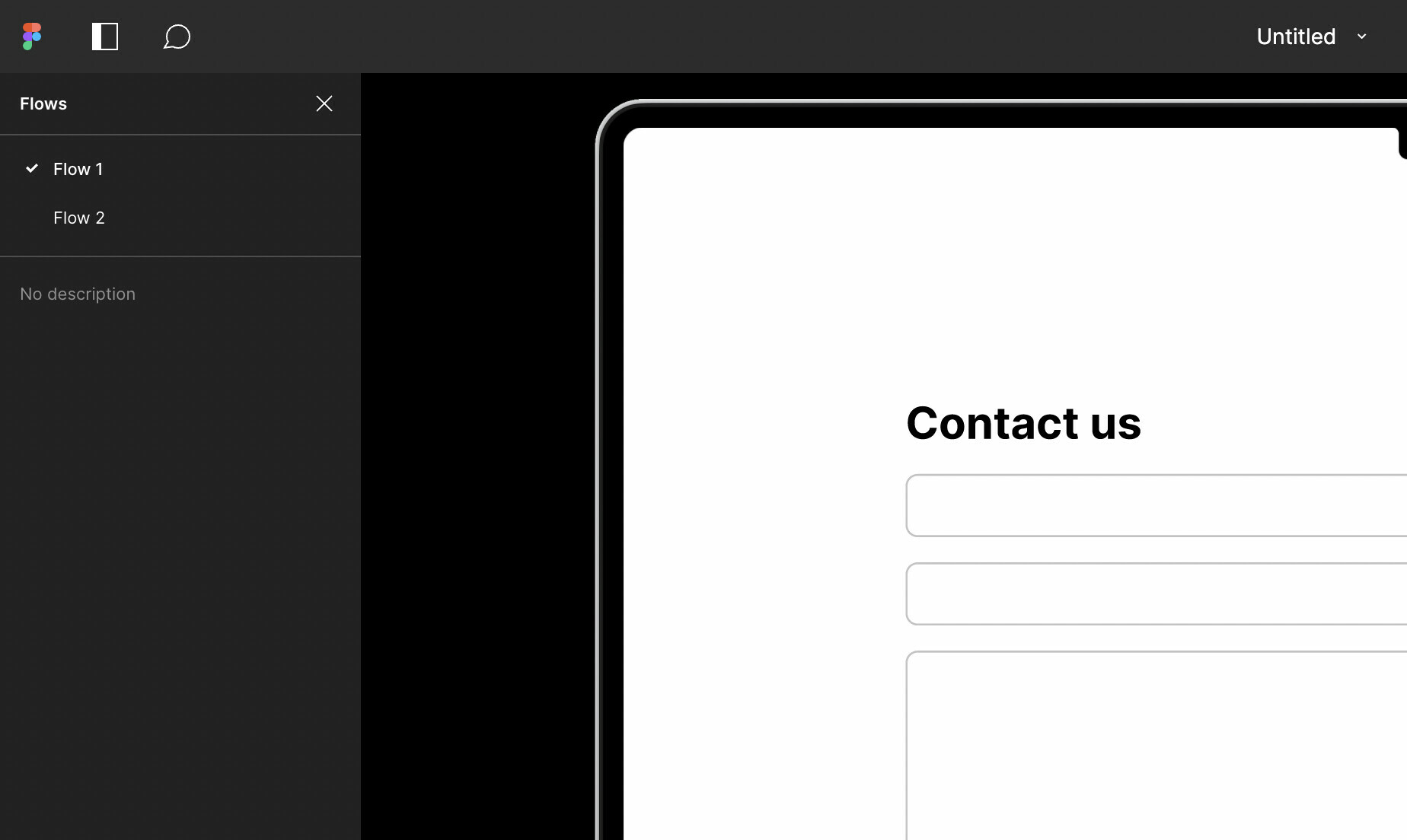
And I also see that the Flows could be something to use to assign a device. On one page I can keep a Desktop flow and Mobile flow, the only thing I’d need here is to set “Flow 1: Macbook Pro 16”, “Flow 2: iPhone 13”
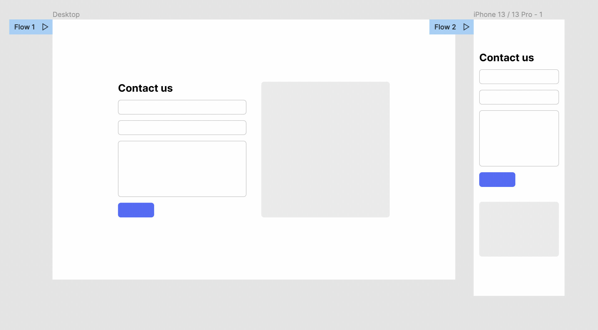
And then on the Prototype player split the list somehow to show multiple devices
Let me know what you think 😀
Cheers,
Greg