
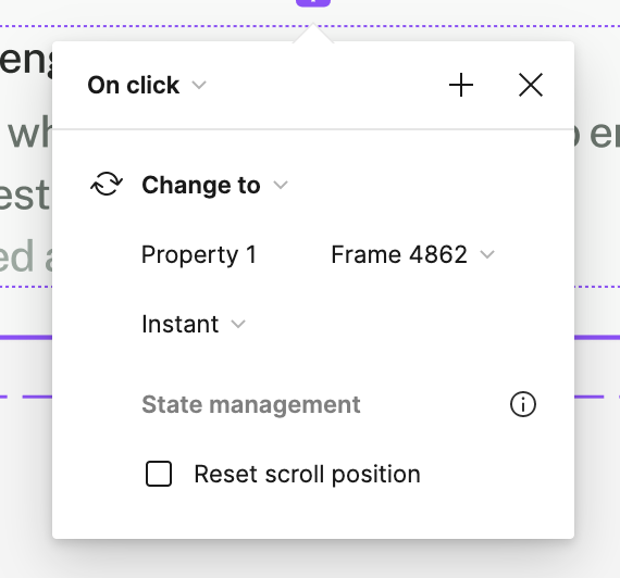
I feel like this modal could really do with some icons and work on the hierarchy to make it easier to quickly use - its so low contrast and everything looks the same. I’ve used it thousands of times (the pop up from the sidebar before it was this popup on the canvas) and do something wrong pretty much every time
More specifically ‘On Click’ looks like the title of the popup and I click ‘Change to’ almost every time when I want to change it to e.g. Hover but I think the whole thing could do with a rethink especially when there is so much space (since the popup is so tiny) to work with in adding labels, icons, etc!