

Jim_Muirhead
April 5, 2021

Frame selection dropdown in the Interaction details modal is too narrow

  • April 5, 2021
  • 19 replies
  • 2733 views

When I’m in the Prototype dialog (see attached screenshot) and want to select a Frame to navigate to, the menu that pops up truncates the names of top-level frames. It would make my life simpler if this menu auto-sized its width so I could see the entire name of all top-level frames on the page as I use a naming system that is quite lengthy, but useful to me.
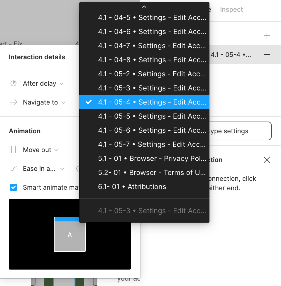
19 replies

Edwards_Jessamyn
New Member
June 16, 2021

Same issue here. Long frame names get truncated here but there’s no tooltip to expose the full name. When creating multiple frames with slight variations, the name usually varies at the end. It turns into a guessing game which overlay or dropdown I need to link to. Please show a tooltip on hover so the long name is shown in full!
2021-06-15_11-31-28

Darcie_Helsten
August 5, 2021
  1. Describe the problem your experiencing and how your idea helps solve this
    When trying to choose a specific frame to assign to an interaction, the drop down list is so narrow that most my frames names are truncated, thus I can’t see the identifying portion of my frame name to select the proper one easily.
    Solution is to just make the dropdown when open as wide as the longest name, or add a hover tooltip on the truncated names.

  2. Add as much context as possible (screenshots, Figma files, mockups, etc.)

  3. Ask questions to bring the community into the conversation

Fabrice
August 19, 2021

Flow starting points appear truncated in the following places:

  • On the canvas (blue label with the little Play icon)
  • In the Prototype panel in the Flows section

Not very convenient, considering no tooltip shows when you hover. Can we improve this? Thanks!

Matthew_Prina
September 7, 2021

The flow names in the right side bar are truncated (shortened) when they don’t need to be. They should be truncated when they are hovered over so the action icons can show (similar to how it’s handled with layers in the left side bar), but they shouldn’t be truncated when they are not hovered over.

Fabrice
September 8, 2021

Agree, very annoying. Would also be nice to have the full name in a tooltip on the canvas when hovering a flow starting point there.

Matthew_Prina
September 8, 2021

Thanks for responding Fabrice. This seems like it should be a fairly simple fix. Hope it get’s fixed soon! Have a good day.

Linda_Pham
February 22, 2022

On the prototype tab, where one can use On Click → Navigate to → Artboard name

That grey dropdown panel is too small and dinky. It needs to be wider to show the FULL NAME of the intended artboard. How can the designer see where to designate the interaction when they can’t even read the full list of artboard names?

The menu needs to be expanded in width so that it has better usability. It is too simple and small they way it is now. There are looong and unique artboard names out there. Widening the side menu would help us out a ton so we can fully read the length of each artboard name.

Contrast
March 25, 2022

Hello community,

Im dealing with pretty much exhausting issue in Figma opt. It is strictly connected with Figma UI. If someone possibly knowing the solution please refer to it. I appreciate a lot any kind of feedback.

Refering to issue, please take a look at att. image

image

Dave_Ackerman
New Participant
June 9, 2022

Upvoting every request that asks for “resizable anything” in terms of the Figma UI!

Matthew_Prina
June 17, 2022

I bet the Figma product team could knock this out in their next sprint 🙂