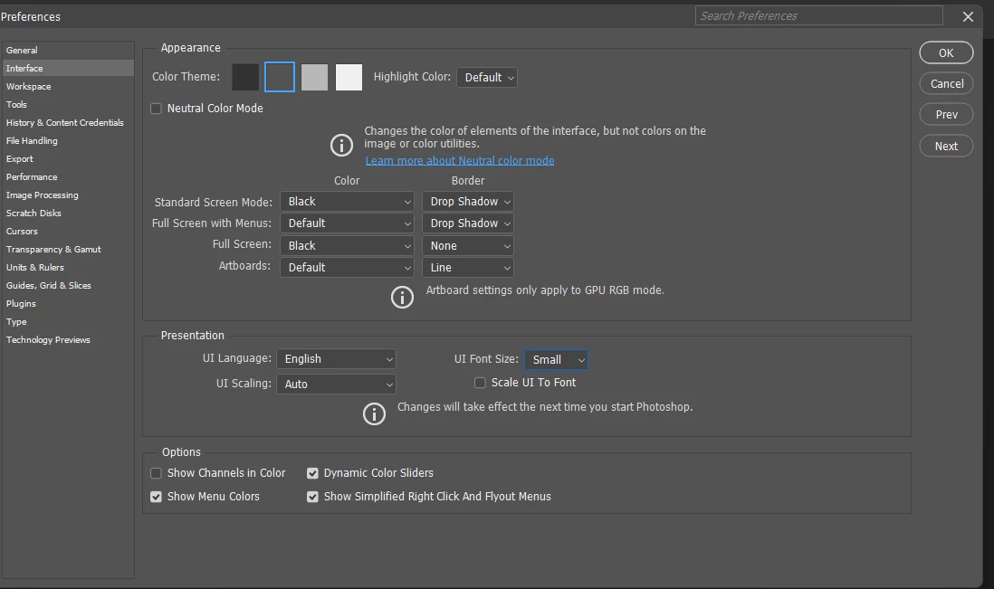
The default UI font-size is really small (icons are mostly okay), They so small that I can hardly read the comments and the page/layer names in the panels (maybe I’m a little old or my laptop is more zoomed out) but it would be great if they are some user-friendly feature for people with weaker eye power like things like thicker guide lines and zoom in on words similar to PSD preference UI font size
Like OMG how to read this? Japanese/chinese text are so small it is hardly readable on characters with more strokes