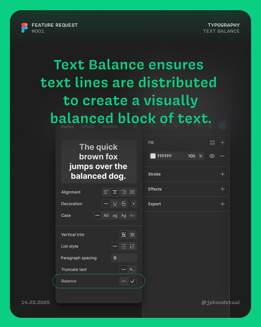
With "Text-wrap: balance" headlines could be made more readable and visually appealing.
Here’s how it could look:

With "Text-wrap: balance" headlines could be made more readable and visually appealing.
Here’s how it could look:
Enter your E-mail address. We'll send you an e-mail with instructions to reset your password.