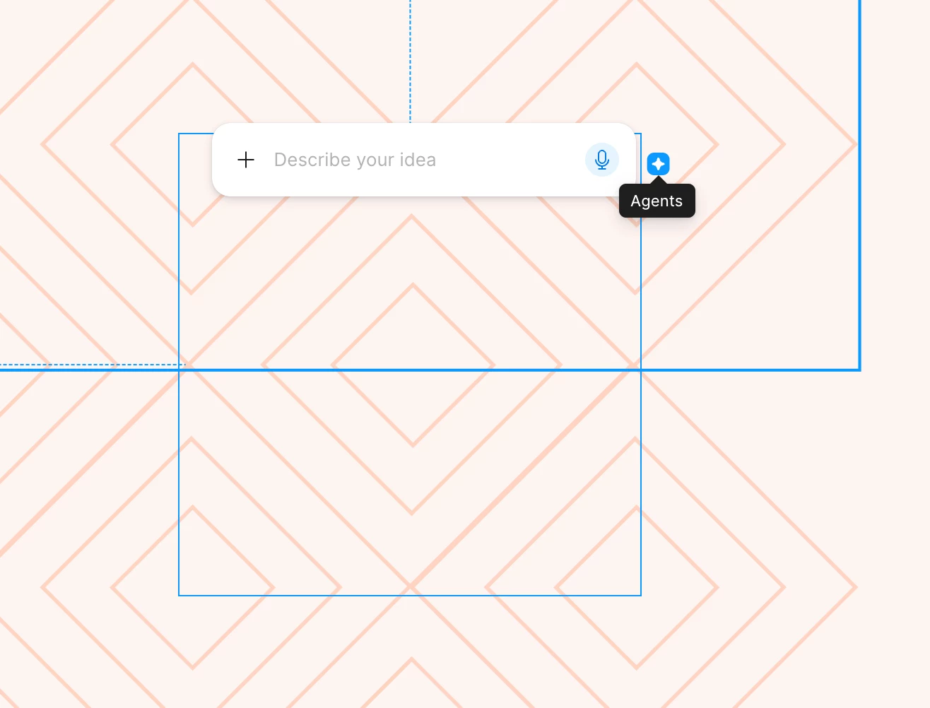
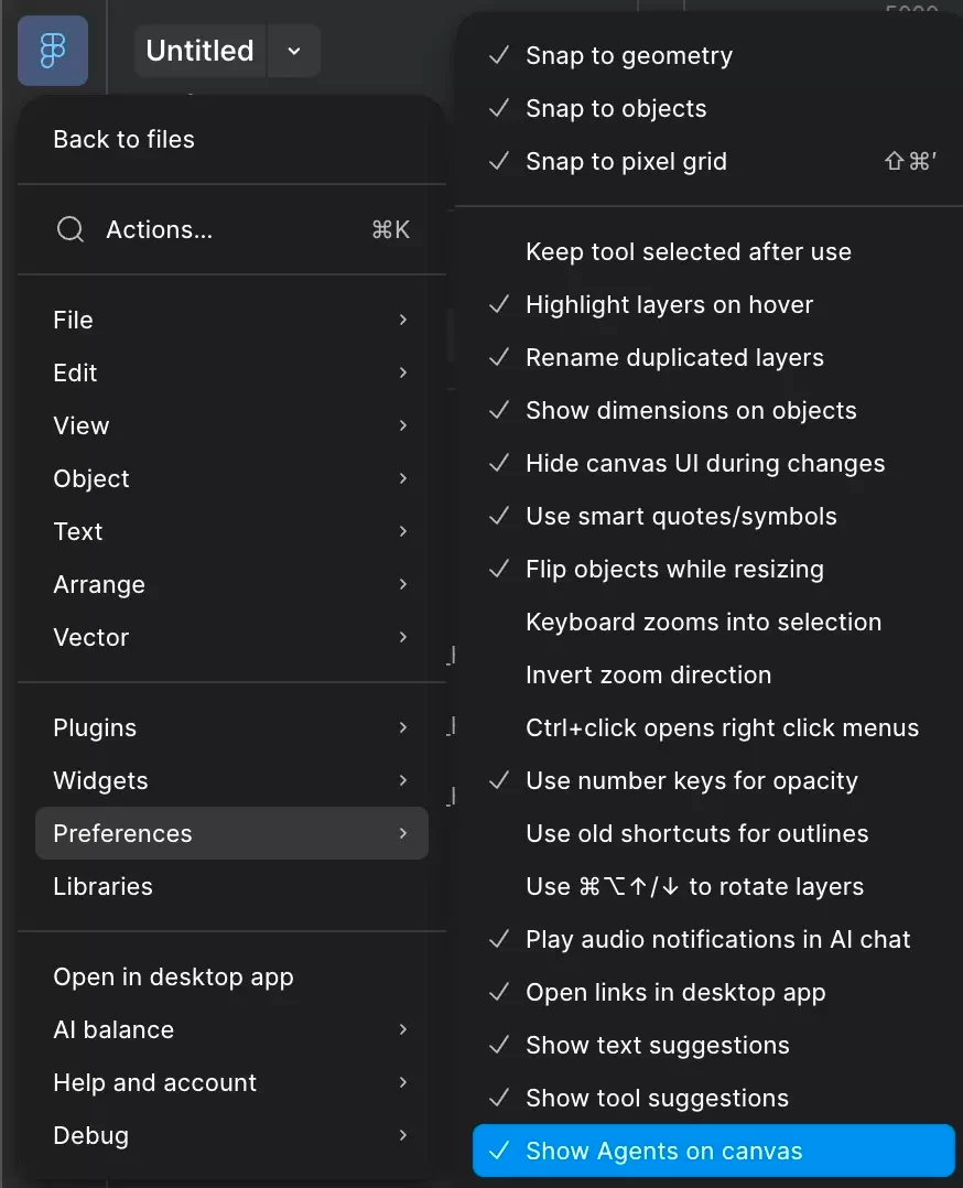
Whose idea was it to put the little icon for the new AI agent so close to the upper right corner of an object? I can’t tell you how many times I’ve gone to adjust the size of an object and accidentally opened the agent. Each instance doesn’t take that much time, but when you do it countless times a day, it makes work that normally feels fluid feel disjointed. If I want to open the agent, the option in the left nav panel is super easy to access. I don’t need the agent connected to every object I touch. I’d like to see the user research (or lack thereof) that made team Figma think this was a good idea. You’re assuming the agent is so helpful and so needed that people need it right there. That’s confirmation bias at it’s finest. Please take this away or at least move it!