

Jonathan-Liausvia
New Member
March 25, 2025

Please reconsider the mass switching of UI3 on April 30

  • March 25, 2025
  • 15 replies
  • 556 views

Hi Figma,

As the title suggests, the main use case for UI 3 as a product designer like myself is utilizing AI features, background removal, and layer renaming. However, beyond these, the UI itself presents cognitive challenges.

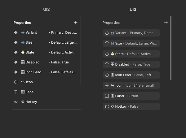
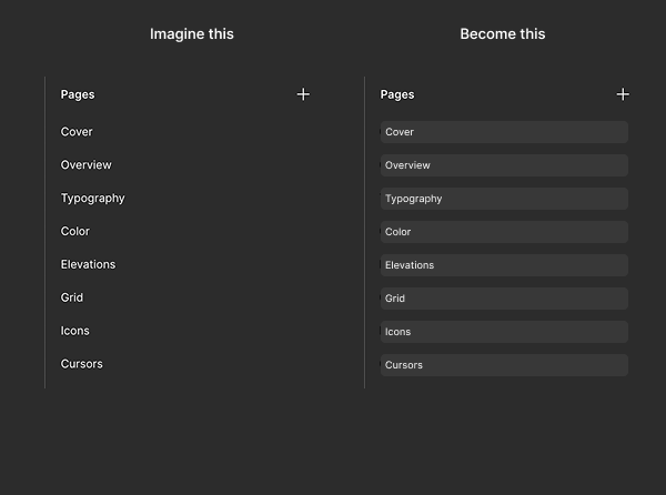
Here’s a small comparison between UI 2 and UI 3:

  • UI 3 has more complex icons. (Why use a border in the typography icon, especially in such a small space?)

  • Wasted space and visual distraction. (I don’t understand—why does everything need to be wrapped in a background? This adds unnecessary layers of complexity and distraction.)
 

This topic has been closed for replies.

15 replies

Slava_Bronevitskiy
Active Member
March 27, 2025


I don’t want to lose my productivity. As a ultra-heavy user I’ve made 10+ attempts to get used to this UI3 abomination but it simply drags my productivity down in cognitive and physical sense. 

Now this announcement is like saying to a surgeon that he has one month left operating with a scalpel. After that it’s kitchen knife.

Can you please don’t do this to us.

impactby.design?ref=nI
Dima_Novosad1
Active Member
March 27, 2025

Glad I still have 2019 macbook pro. I’ll use the touch bar for the floating bar while I parachute myself into the nearest active volcano 🪂🌋👍

Jon_Brennan1
New Participant
March 31, 2025

The dealbreaker here for me is how the Position and Layout panels aren’t fixed position at the top of the right sidebar. I am constantly directly editing the position and size of elements, particularly for design systems work but also very frequently in product work.

The fact that layer type / component properties supercede these universal properties and push them up and down the sidebar by variable amounts depending on what I have selected is like actually one of the most infuriating UX decisions in a tool that I can remember. If I could just keep these stickied to the top of the sidebar and put the component properties beneath, I would be fine with UI3. I mean, would also love to get rid of the floating toolbar or have the option to move it back to the top, it’s very annoying, but that doesn’t torpedo my workflow the way that the Position/Size jumping around does.

Please please please move component properties below the Position & Layout panels or allow this to be configurable. I’m dreading April 30.

Dan White
New Member
April 1, 2025

I created this account just to come on here and try leave feedback to stop the mass switching. I have tried several times to change to the new UI, but it is making my design process so much slower. Simple tasks that I do on a daily basis are hidden away somewhere new and I spend most of my time finding simple things like “Fill” or “Hug”.
Please do not force me to use this navigation. As per the bottom floating bar… get rid of it. It doesn’t look good on Adobe products, and it doesn’t work here either.
Not happy.

OnlyRodas
New Participant
April 2, 2025

I can't believe Figma is forcing this change on us. UI3 is, without a doubt, the most unfriendly design possible. It has made my workflow painfully slow and incredibly unproductive. What’s the harm in letting people CHOOSE which UI works best for them?

I always thought switching to UI3 was a HUGE mistake, but I never felt the need to comment on it because UI2 was still an option. Now that you're FORCING this change, I have to speak up.

This is NOT an upgrade. It’s a downgrade in usability, efficiency, and user experience. Figma was supposed to be about flexibility and user-centered design—so why ignore the feedback of those who actually use the platform every day?

Give us back the choice. Let people stick to UI2 if they want. This forced migration is a slap in the face to long-time users who built their workflow around UI2.