

Jonathan-Liausvia
New Member
March 25, 2025

Please reconsider the mass switching of UI3 on April 30

  • March 25, 2025
  • 15 replies
  • 556 views

Hi Figma,

As the title suggests, the main use case for UI 3 as a product designer like myself is utilizing AI features, background removal, and layer renaming. However, beyond these, the UI itself presents cognitive challenges.

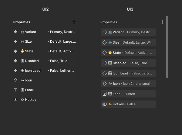
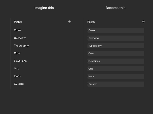
Here’s a small comparison between UI 2 and UI 3:

  • UI 3 has more complex icons. (Why use a border in the typography icon, especially in such a small space?)

  • Wasted space and visual distraction. (I don’t understand—why does everything need to be wrapped in a background? This adds unnecessary layers of complexity and distraction.)
 

This topic has been closed for replies.

15 replies

Dawid7
New Participant
March 25, 2025

Bump. Switching to UI3 is an efficiency killer.

El_Reeve1
New Member
March 25, 2025

It’s the useless floating toolbar sitting directly over my work that does it for me. I cannot believe the placement of this bar still isn’t optional, and that you can’t hide and just use shortcuts. This was not a problem that needed solving. It’s incredibly unpopular across Figma forums and Reddit. Not listening to a community of people who design for a living is wild. Please reconsider mass switch to UI3 until this issue is resolved.

erasku
New Participant
March 26, 2025

(not to mention the st-stu-stuttery transition in that useless toolbar when switching to dev mode)

erasku
New Participant
March 26, 2025

Also this (old screencap of mine but the problem still persists)


Robert16
New Participant
March 26, 2025

Not happy. This floating toolbar, which is never used by any professional designer because we use shortcuts, is super annoying. Please reconsider, I still use UI2 and whenever I try to switch, I revert back after a couple of minutes because I need to get work done, and UI3 stops me from doing that. I’ve been looking all tutorials regarding UI3 and I design very complex b2b applications for a living, so, it’s not about “getting used to it”. UI3 is simply not good for working fast.

Domino84
New Member
March 26, 2025

I signed up for this forum just to find out how to fix that broken floating toolbar in the middle of the screen. I’m frustrated and disappointed to see that it’s been months now and they’re refusing to fix it and apparently just doubling down by removing the option to use the previous UI. I’m dreading April 30th.

SomethingFishy
Active Member
March 26, 2025

For the love of everything holy, Figma, do NOT kill UI2.

UI3 is a living nightmare. I mean, just read the 15 pages of the love here: 

I will jump ship to PenPot so fast and I will drag everyone I work with along.

Figma is lipstick on a broken box layout where component interactions dissolve on contact with other pages.
Arthur Vee
New Member
March 26, 2025

Not happy with the UI3. It seems that it made my workflow about 10% slower and not because it’s new.

Type layout properties are now detached from the type section - I need to switch to the different UI block to use it.

Frame resizing - Fixed, Fill etc are now cleverly hidden within the pixel width menu - WHY do you feel the need to combine them?

Floating toolbar is very annoying, what’s the benefit of it?

UI controls for components are now even more confusing.

All these little decorations and outlines around elements - why? You just adding to a cognitive load and increasing processing time.

Such a step down honestly.

suzshu
New Member
March 27, 2025

This pervasive urge to fix what isn’t broken is the ruin of all good software. See Adobe Photoshop for reference. 🙄

Aleezhou
New Participant
March 27, 2025

The more we pay, the more they'll just spend it on pointless UI3 updates. Stop funding their bad UI3 designs—just switch to Penpot.