
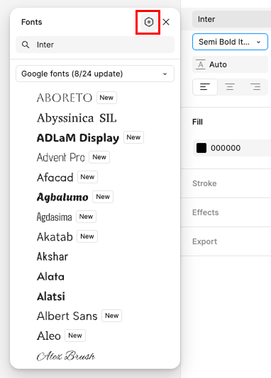
Even before the last update, i found a few inconsistencies within Figma’s interface.
The one that bothers my a lot is the properties selection menus. i’ll bring the Font family, Font weight and Font line height as examples.
When Figma is set to light mode, the font family selection menu is in “white mode” and the variable selection in nicely located at the top. easy to reach. this is perfect.
The space letter spacing is also in “light mode” with the variables button extruded on the field itself, even better,
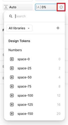
but for the rest of the menus are constantly set to dark mode and their variable selection are placed at the bottom of the list. for fonts with long list this makes navigation very hard with a lot of scrolling.
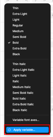
Please fix this inconsistency as specially the later one is the most inconvenience to work with.
Thank you