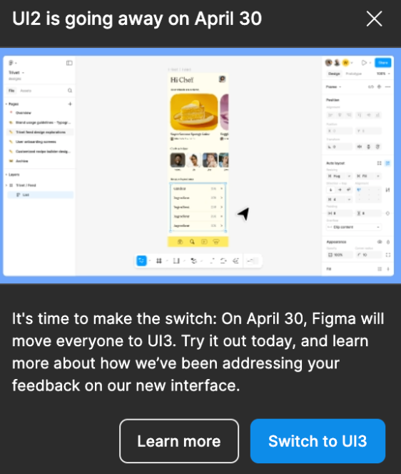
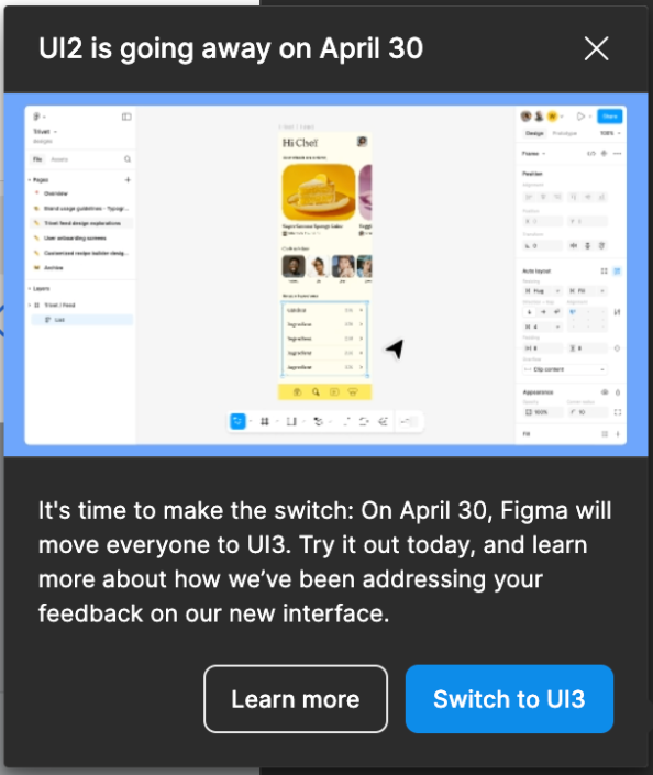
Question

Forcing UI3 on us is a HUGE mistake! Let us choose! - April 30


Show first post

60 replies

Bingyan_Li
  • New Participant
  • 5 replies
  • April 12, 2025

It's really disgusting to force users to switch to UI3. Figma is still too young.


Bingyan_Li
  • New Participant
  • 5 replies
  • April 12, 2025

I'm thinking about switching to another software. I've painstakingly written a Figma textbook, using illustrations with the UI2 interfaces.

The forced switch to UI3 means I have to replace hundreds of illustrations in my textbook that's about to be published.

I'm considering changing the drawing software used in the textbook.

Figma is really disgusting.


a2609661273
  • New Participant
  • 12 replies
  • April 13, 2025


Why is it mandatory to update to UI3? To be frank, UI3 cannot be considered a qualified product at all, and it has not even undergone sufficient user testing. It ignores the voices of users, and the newly launched version is difficult for most community users to accept. According to the current situation, about 60% of users in the community do not support UI3.

If it were a whiteboard tool, I might accept this floating design - after all, there is a blank area above that can be freely used. But Figma, as a design software and productivity tool, has never seen any 3D modeling or design software put commonly used tools at the bottom. I have always hoped to see feedback from the community that would prompt the Figma team to make adjustments, but what ultimately came was a mandatory update.

This approach undoubtedly consumes the stickiness of loyal users like you. Once similar competitors emerge, the loss of users who do not support UI3 will be inevitable. From the perspective of a UI designer, I believe that making money and improving user experience are not contradictory. I can understand why the Figma team is making changes for the long-term development of the product, but I really don't understand why they are so ignoring user needs and forcefully pushing for a clearly unverified new UI.

From the perspective of UI designers, making money and user experience are not in conflict, because all of you here are UI designers from around the world who have encountered various challenges in their daily work, such as companies making money or user experience, software upgrades, and system updates. Old code is complex and needs to be rewritten. I can understand the "changes" of the Figma team in order to upgrade the industry, but I really don't understand why they do this. They force updates without listening to user feedback. That floating design is really garbage.


a2609661273
  • New Participant
  • 12 replies
  • April 13, 2025

Why is it mandatory to update to UI3? To be frank, UI3 cannot be considered a qualified product at all, and it has not even undergone sufficient user testing. It ignores the voices of users, and the newly launched version is difficult for most community users to accept. According to the current situation, about 60% of users in the community do not support UI3.

If it were a whiteboard tool, I might accept this floating design - after all, there is a blank area above that can be freely used. But Figma, as a design software and productivity tool, has never seen any 3D modeling or design software put commonly used tools at the bottom. I have always hoped to see feedback from the community that would prompt the Figma team to make adjustments, but what ultimately came was a mandatory update.

This approach undoubtedly consumes the stickiness of loyal users like you. Once similar competitors emerge, the loss of users who do not support UI3 will be inevitable. From the perspective of a UI designer, I believe that making money and improving user experience are not contradictory. I can understand why the Figma team is making changes for the long-term development of the product, but I really don't understand why they are so ignoring user needs and forcefully pushing for a clearly unverified new UI.

From the perspective of UI designers, making money and user experience are not in conflict, because all of you here are UI designers from around the world who have encountered various challenges in their daily work, such as companies making money or user experience, software upgrades, and system updates. Old code is complex and needs to be rewritten. I can understand the "changes" of the Figma team in order to upgrade the industry, but I really don't understand why they do this. They force updates without listening to user feedback. That floating design is really garbage.


MAL
  • New Member
  • 1 reply
  • April 14, 2025

I can’t stand UI3. Especially when I switch to smaller screens, it becomes an absolute hindrance. 


Yaroslav Kravchyk

The new interface is complete crap. Small elements that are easy to miss, unnecessary rounded edges that also take up space and have no value or efficiency. The sorting of elements is pretty weird. The visual hierarchy is also very pokey. Unnecessary minimalism, all navigation elements merged into a single canvas. Maybe it's time to switch to Skech?


lkdfjgkredhgkfhdkghfdghdkjsghk

UI 3 is garbage it hides more work than the bar up top. 

ui3 is bad design


ClassyUX
  • New Member
  • 5 replies
  • April 18, 2025

I think it’s ironic that the tool that user experience designers use to improve the user experiences of their clients has one of the worst user experiences I have ever seen — and they keep making it worse with subsequent updates.


I guess it is better than Sketch — but there are so many BASIC things missing and Figma flat out does not care about their customers (as long as the customers keep paying them).


Peggy2
  • New Member
  • 1 reply
  • April 21, 2025

Please leave UI2 alone!


Ifatarg
  • New Member
  • 1 reply
  • April 21, 2025

UI3 is so unfriendly… everything is too bright! I can’t find anything it all blends together..
Let us go back to the previous UI  


Jéssica Nunes

I hate the new interface (UI3) please don't force me to use this


ant.kongz
  • New Member
  • 1 reply
  • April 28, 2025

Opening figma this morning to find out UI2 is going to be discontinued in 2 days SUCKS… the new UI is so unintuitive… please figma for the love of god don't force this shit on us


sebastian_yepes

Yesterday, I was in a meeting presenting a prototype, and making changes on the spot was incredibly frustrating due to the new UI. It slowed down my workflow significantly, and I found myself struggling in front of the team, trying to explain that the unfamiliar interface was the issue. Naturally, they expected a smooth, professional presentation—not excuses. So, thank you, UI 3, for making my job harder.


tom.crask
  • New Member
  • 1 reply
  • April 30, 2025

Why are we being forced into UI3? UI2 works. Let me revert.

UI3 is full of unnecessary outlines, curved corners and other extraneous screen distractions. It’s actually hard to see what I’m attempting to click on, not easier. Don’t tinker with what works.


Katelyn_Ernesto

Wild that a UX company is having the worst UX?? You have tons of users telling you precisely why and how awful your update it but you clearly believe in your own egos and sunk cost fallacy more… smh. End of an era, Figma dominance is over.


Just hoping they see the headline, pretty much says it all.

You’ve had a community of UX designers screaming at you that they don’t want this UX.  Your tool is made for UX designers.  The language about “it’s hard getting used to a new UI blah blah” is patronizing (we all literally understand that, it’s part of our profession).  Stop reading iconoclastic books about being “bold” and doing the “unpopular” thing and comparing yourselves to Steve Jobs.  Designers are a different breed and we rarely drink the Kool-Aid.


The fact that you've pushed this on a community despite overwhelming feedback not only undermines that community, but also undermines the fundamentals of UX process, starting with research and knowing your user.  This is pretty 101.

I love Figma, but today is almost as disappointing as the announcement that Adobe would be purchasing (phew).


manggo
  • New Member
  • 2 replies
  • May 1, 2025

When I found that Figma could no longer switch back to UI2, I was close to collapse!!! When I could switch, even though UI2 did not work properly with the proportional zoom function, I still kept using UI2. Forcing myself to use UI3 really made me want to smash my computer when designing!


manggo
  • New Member
  • 2 replies
  • May 1, 2025

I'm broken after the forced update to UI3 on ​​4.30! All UI interfaces have become strange and difficult to use! I even need to relearn how to use Figma. The main operation areas and components have become difficult to identify! The design of the floating window is even more maddening! I can't stand being forced to pay attention to the floating window at any time when designing, which is very distracting! If this bad user experience cannot be fixed, I believe most people would rather give up or find other alternative tools.


Eugen1
  • New Member
  • 1 reply
  • May 1, 2025

You know what’s funny about the new UI. The “actions” in the right panel are dynamic based on layer type you select, so you have to relearn the pattern of “where the F is that button?” all the time

The button “Ignore auto layout” is in different places depending on the layer… UX at its fines. And someone tested that and said it’s good UX :) at a multibillion dollar company

Too bad we’re too deep invested into Figma to transition to Sketch or smth else...


Shane_Schroll

Switched to Penpot today after opening up Figma today and seeing it completely wrecked on the UI and UX. Penpot has a generous free license (unlimited files and team members) and is open source - so that any changes you don’t like can be avoided entirely. Not sure what Figma is thinking but they have lost their minds if they think this is what people want.


SomethingFishy
Eugen1 wrote:

You know what’s funny about the new UI. The “actions” in the right panel are dynamic based on layer type you select, so you have to relearn the pattern of “where the F is that button?” all the time

The button “Ignore auto layout” is in different places depending on the layer… UX at its fines. And someone tested that and said it’s good UX :) at a multibillion dollar company

Too bad we’re too deep invested into Figma to transition to Sketch or smth else...

I think this is most of my frustration with this UI. There’s no consistency in that dynamically changing sidebar. That, and the number of actions that are buried beneath layers of clicks makes it exponentially more difficult to use. Just soooo many [tiny] pop-out windows under other pop-out windows… 😵


Dima_Novosad1


This needs to be memorized.


Pia_Blumenthal

The new UI3 is really bad. Some of the most important settings have been reordered lower in the list or buried beneath the contextually changing components, making them HARDER to find. UI2 was significantly better for quickly locating and selecting options. Really disappointed that this is also being forced upon us – in the middle of a design review I’m giving no less.


Wow XD
  • New Member
  • 2 replies
  • May 2, 2025

I can’t use normally figma with that new UI3. God please listen to me and return an old ui..


KennLucas
  • 224 replies
  • May 2, 2025

My brother freaked out once because he was frustrated by Windows 98 and was mad they “forced” him to upgrade from Windows 3.1. Railing against progressing software tools is sad coming from people who design new software tools.


Reply


Cookie policy

We use cookies to enhance and personalize your experience. If you accept you agree to our full cookie policy. Learn more about our cookies.

 
Cookie settings