
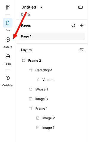
I wanted to share some honest feedback on the new left-side menu.
Right now it doesn't follow the usual patterns for side menus, and it takes up space on the canvas (which is the one area where we really need to keep things clean and simple to work well.)
I know you understand how sensitive that space is. The floating panels in the 2024 config had a similar problem, and I was glad you changed your mind on those. I'm hoping this menu can get a second look too.
We don't need the icons removed from the left menu, they can stay there. I just have a few small ideas that would keep them easy to find while giving the canvas more room:
1: Show on hover. The new left menu could appear when the mouse reaches the far-left edge of the screen, and hide again when the mouse moves away.
2: Add a pin. A simple pin button would let users choose: keep the menu always open, or only show it on hover when they need it.
3: Open by default. I know you want features to be easy to find, and there's a real worry that users won't see them. Leaving the menu open by default fixes that, users see the feature, get used to it, and can later choose to hide it on their own.
4: Move the Figma logo back above the project title. This feels like the best fix, a small change that would tie it all together and answer a lot of the feedback.
Thanks for considering it. <3