Vozhegov Ivan
New Member
August 18, 2026
Question

Figma folders

  • August 18, 2026
  • 44 replies
  • 805 views

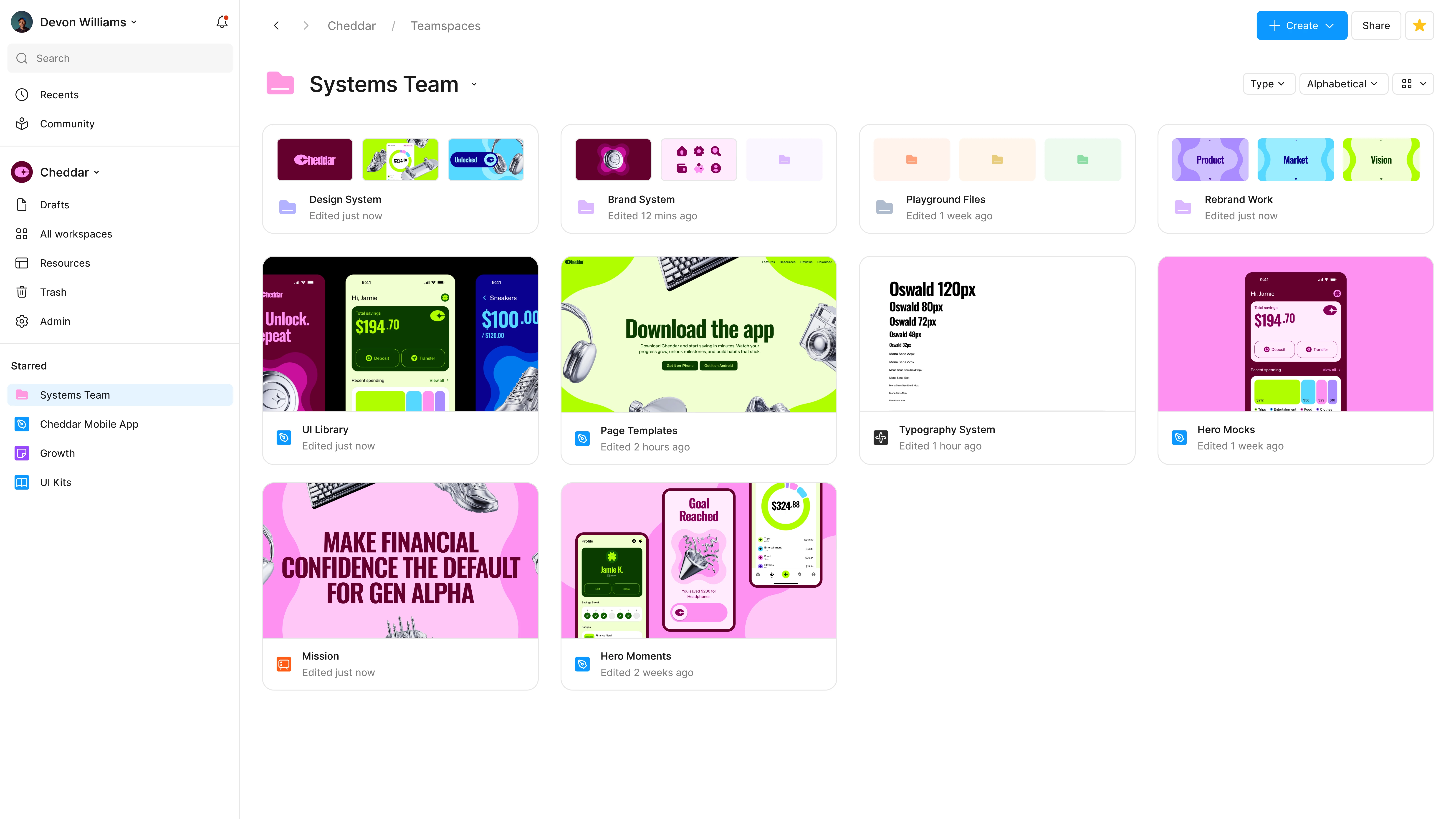
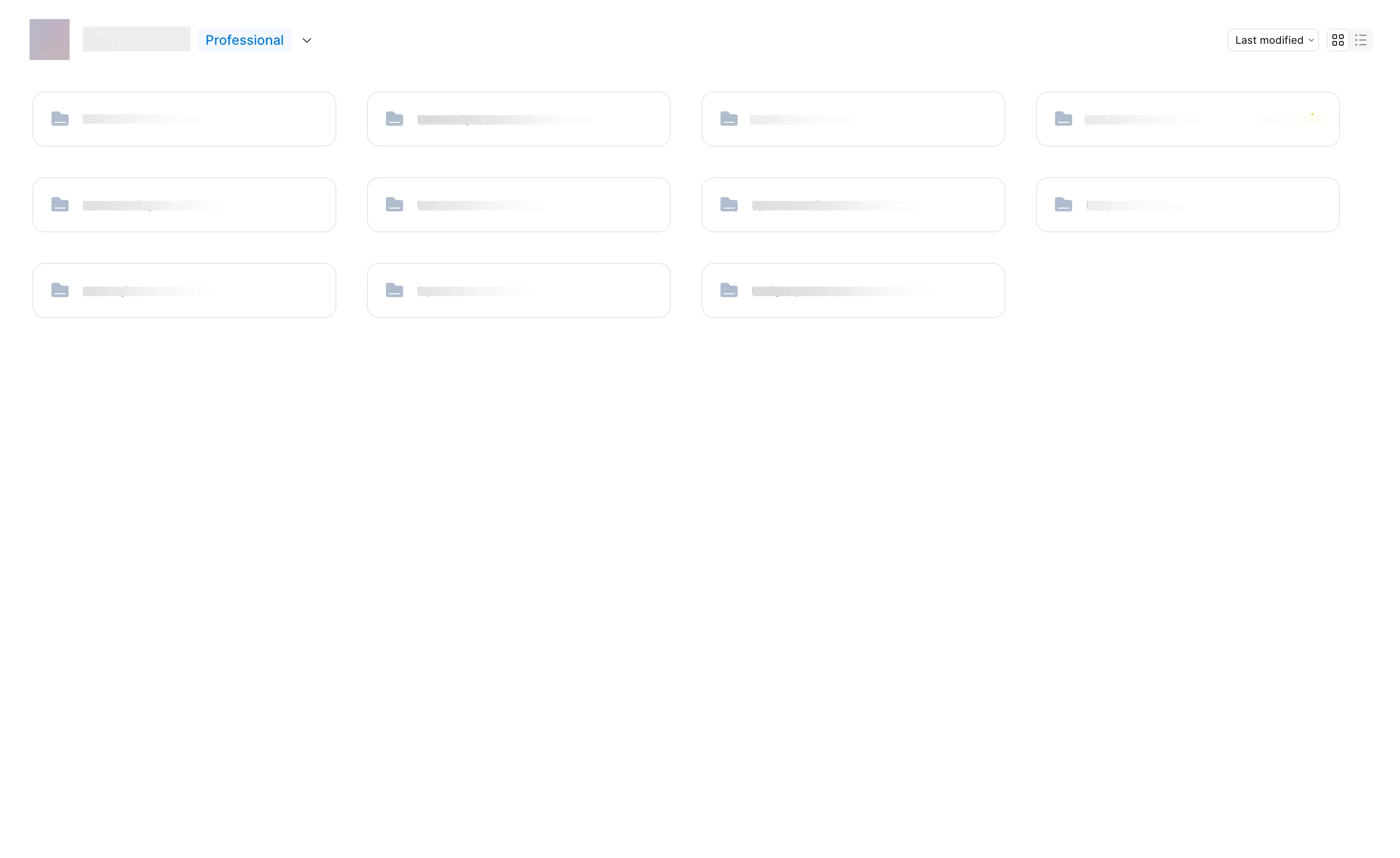
I’m working with a team on a large project, and we have a complex file structure. Removing the file previews has made it much harder to navigate our file system. Each group of files has its own color; previously, you could just glance at the main screen and understand where to go or see the file name in the preview. With only the folder icon and name, it’s much harder to remember where something is located. Please give us the option to revert to the previous interface with clear file previews.



44 replies

Vilde
New Member
August 20, 2026

The old Projects view made every project instantly recognizable. After working across the same projects for a while, you stopped reading project names altogether. You simply recognized them.

That distinction matters.

Recognition is faster and requires less cognitive effort than recall. An image can be processed almost instantly, while a list of 100+ folders forces you to repeatedly read names, interpret labels, and remember where things live.

The new folder view removes almost all of that visual information. Every project is reduced to essentially the same object: a folder icon, a name, and perhaps a color. The result may be cleaner and more structurally consistent, but it dramatically reduces information scent and scannability.

And color-coding doesn't solve this. A handful of colors cannot provide 100 projects with 100 distinct identities. A thumbnail can.

That was the brilliance of the old view: the interface showed you what was inside without requiring you to go inside.

For teams managing dozens or hundreds of client projects, those previews weren't decoration. They were navigation.

Folders and nested organization are useful additions. But they shouldn't require throwing away the visual navigation layer that made Projects so efficient.

Give folders thumbnails, covers, or previews of their contents. Or simply make the old card view an optional view.

When you're navigating 100+ clients and projects, this difference is enormous.

Jouser
New Member
August 20, 2026

I find it almost impossible to navigate these new folders compared to the projects. I used to use the thumbnails to instantly know where I needed to go, now I have no clue.
The Project and now Folder name assisted me in my file finding but it was the thumbnails that actually helped me a name alone on something meant for designing is awful.

This needs reverting or the option to have different views was any UR done on this, if so was it with a wide range of users from different disciplines and accessible needs?

Jouser
New Member
August 20, 2026

I find it almost impossible to navigate these new folders compared to the projects. I used to use the thumbnails to instantly know where I needed to go, now I have no clue.
The Project and now Folder name assisted me in my file finding but it was the thumbnails that actually helped me a name alone on something meant for designing is awful.

This needs reverting or the option to have different views was any UR done on this, if so was it with a wide range of users from different disciplines and accessible needs?

I’d like to also point out that this had brought so many “new users” to comment and react to this change. I’m not a new user to Figma and doubt any of the other people in this forum are but instead have only just made an account on the forums to actually post as I feel strongly as others do about this issue.

Gayani_S
Figmate
Community Support
August 20, 2026

Hey everyone, appreciate all of this detail! 

Here's what stood out to me, and I'm passing it straight along to the team internally:

  • The recognition vs. recall point, a picture registers almost instantly, a name-only list means reading every entry
  • The color contrast issue at small sizes, and the accessibility angle when color is the only differentiator
  • A toggle back to the old card view, custom folder icons or emoji, and a file count back on folder tiles

The team’s working through visual navigation for folders. I don't have a timeline to share yet, but I'll keep this thread open and come back as soon as I have updates.

In the meantime, Create and manage folders covers the folder color option mentioned earlier in this thread. 

Thanks again for taking the time to write this up so clearly! 

Ian Fan
New Member
August 20, 2026

I want the folder preview to be back too.


We designed our cover image so that we can quickly navigate based on the theme and visual we set up. Now it’s harder to see what’s inside. Not to mention that not everyone is familiar with the file structure. This update eliminates the functionality for new designers to quickly understand the file architecture and stockholders to navigate.

Viriart
New Member
August 20, 2026

Hey everyone, appreciate all of this detail! 

Here's what stood out to me, and I'm passing it straight along to the team internally:

  • The recognition vs. recall point, a picture registers almost instantly, a name-only list means reading every entry
  • The color contrast issue at small sizes, and the accessibility angle when color is the only differentiator
  • A toggle back to the old card view, custom folder icons or emoji, and a file count back on folder tiles

The team’s working through visual navigation for folders. I don't have a timeline to share yet, but I'll keep this thread open and come back as soon as I have updates.

In the meantime, Create and manage folders covers the folder color option mentioned earlier in this thread. 

Thanks again for taking the time to write this up so clearly! 


Please consider returning a linear mapping of this kind.

That would be very convenient.


ZGM
New Participant
August 20, 2026

Hiya Figma team! Echoing what everybody else here is saying, but perhaps as a starting point maybe s̶t̶e̶a̶l̶ put your own spin on what Dropbox does when looking at folders in their Grid & Large Grid views (see attached screen capture)

Basically, if there are loose top-level files in the folder then instead of a generic folder icon you get some preview thumbnails, and if you move your cursor across the grid icon it will cycle through previews of (some of) the contained folders/files along with their names, so you can potentially make a quicker decision about navigating down into the folder itself.

Oh, and btw Dropbox also remembers your desired view configuration and sort order when navigating through folders —something else to consider! 😆

Frern
New Member
August 21, 2026


The team’s working through visual navigation for folders. I don't have a timeline to share yet, but I'll keep this thread open and come back as soon as I have updates.


Meanwhile let us use the older version!

Bring the older folder preview back!!

Now it’s impossible to use, besides the icons being super small to see in big screens. What a downgrade. None of the available solutions are accessible or usable.

Iain M Norman
New Participant
August 21, 2026


Loving this!

Andrew_Levada
New Member
August 21, 2026

+ 1 on this, thank you! Clicking through to the file from the team page directly is what am I missing the most with the new design